| Country.of.Origin | Aroma | Aroma_binned_2 | Total.Cup.Points |
|---|---|---|---|
| Colombia | 7.67 | High | 82.42 |
| Guatemala | 7.42 | Low | 81.67 |
| Mexico | 7.75 | High | 83.17 |
| Guatemala | 7.42 | Low | 82.17 |
| Mexico | 7.25 | Low | 79.50 |
18 Linear Regression
Hypothesis testing with more statistical models
Now that we have a strategy for comparing means across any number of categories, let’s think about how we can upgrade this strategy to be used with quantitative variables.
Consider the Aroma variable, which judges used to score the smell of the brewed coffee. Do we believe that the total score given to the coffee is influenced by its aroma? Or do the judges, in the end, only care about the drinking experience and not the smell?
18.0.1 Overfitting
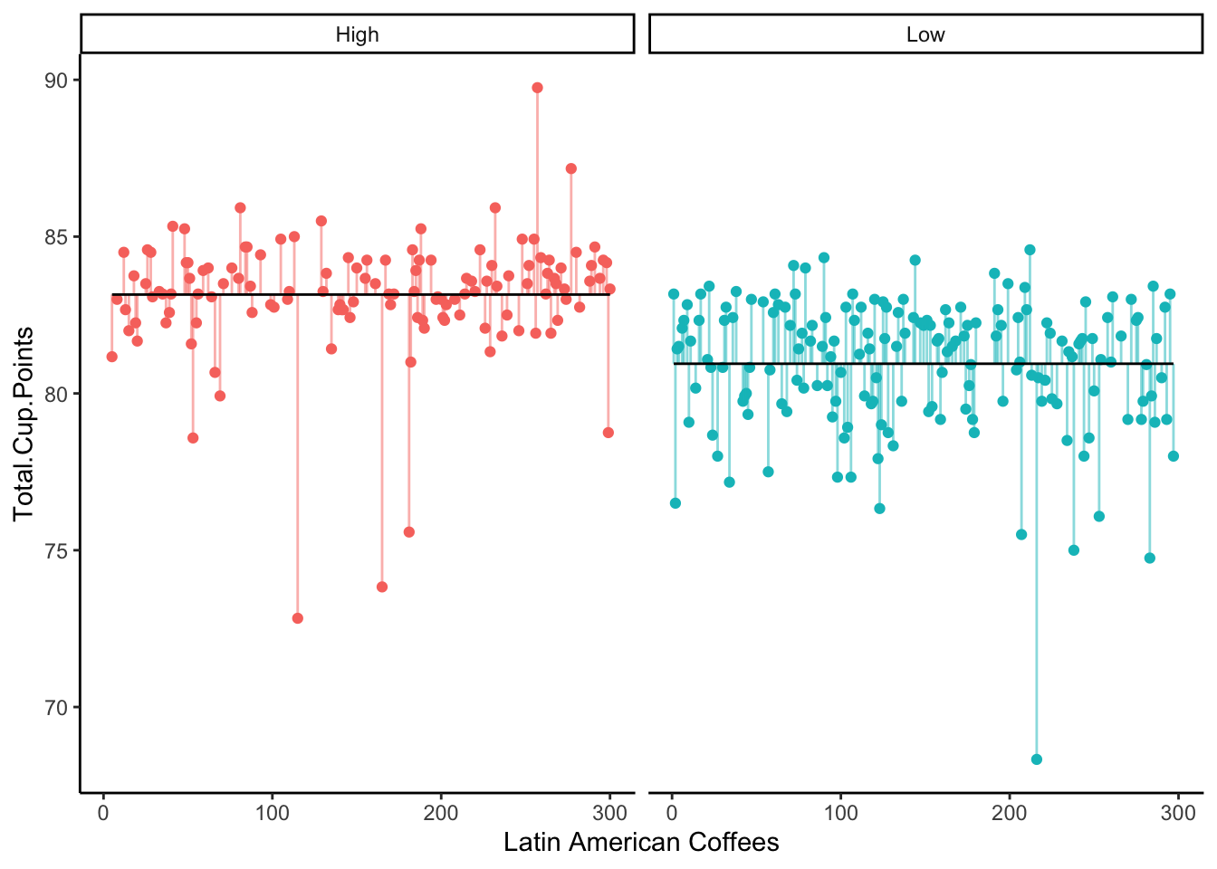
Suppose we binned the Aroma variable into “High” (above the median) and “Low” (below the median).
Of course, we could then ask the question
Do high scoring aroma coffees have a higher true mean total score than low scoring aroma coffees?
We might address this question with an ANOVA test, studying the sum of squared error from the null and alternate models:
But wait - is this really the best approach to the original research question?
We’ve lost a lot of information by binning our Aroma variable into only two categories. Should we really be treating an Aroma score of 5.1 the same as an Aroma score of 7.3, both as simply “Low”? Probably not.
Well, now we have a way to address more than 2 categories - what if we instead bin Aroma into four categories: “Very Low”, “Low”, “High”, “Very High”?
| Country.of.Origin | Aroma | Aroma_binned_2 | Aroma_binned_4 | Total.Cup.Points |
|---|---|---|---|---|
| Mexico | 7.58 | Low | Low | 82.67 |
| Mexico | 7.33 | Low | Very Low | 77.33 |
| Guatemala | 7.67 | High | High | 83.67 |
| Mexico | 7.42 | Low | Low | 81.17 |
| Guatemala | 7.92 | High | Very High | 75.58 |
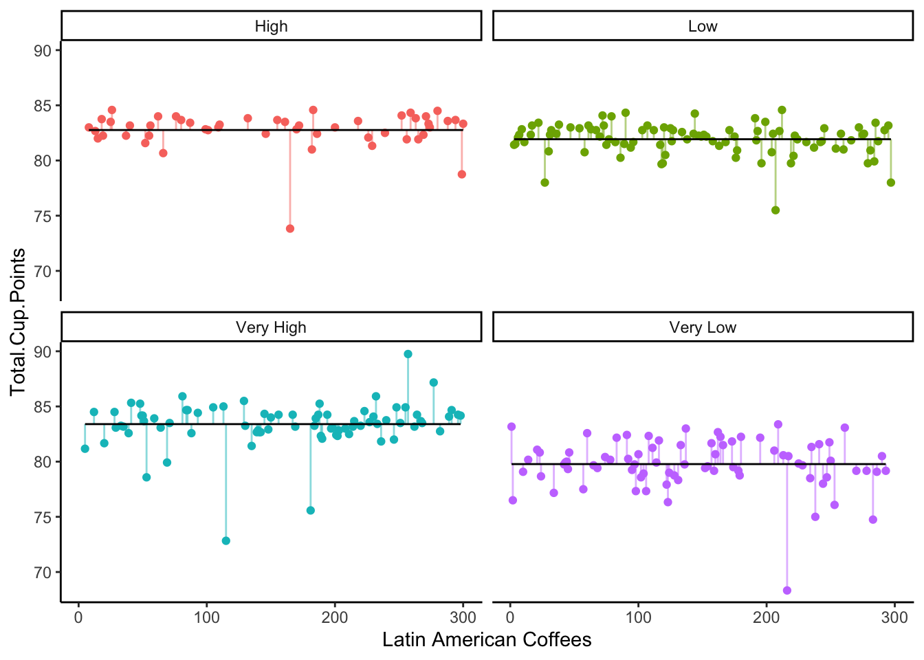
This model, with four different true means, seems to fit even better than the one with only two true means.
In fact, we can test these two models against each other, in the same way we would test them against a null model! We simply find the SSE for each model, and perform the usual ANOVA F-test.
Analysis of Variance Table

Model 1: Total.Cup.Points ~ Aroma_binned_2
Model 2: Total.Cup.Points ~ Aroma_binned_4
  Res.Df    RSS Df Sum of Sq      F    Pr(>F)
1    298 1278.7
2    296 1070.2  2    208.53 28.837 3.613e-12 ***
---
Signif. codes:  0 '***' 0.001 '**' 0.01 '*' 0.05 '.' 0.1 ' ' 1
In this output, we can see that the RSS (Residual Sum of Squares, the same thing as SSE) is 1759.2 for the model with the binary binning, and 1306.4 for the model with the four category binning.
This leads to an F-stat of 51.3, and p-value of about 0, so the four-category model is the better fit.
… But why stop there? If 4 categories was better than 2, perhaps 8 categories would be even better! Or 10? Or 100???
If we take this strategy too far, we will find that we might end up with so many categories, each of our observations has its own mean.
y_i \sim \mu_i + \epsilon_i
This means, of course, that our error for each observation is 0.
It’s a great fit, according to the SSE - but it’s a very useless model! It gives us no information about what patterns or trends or truths we might infer from the data about the real world. We would call this model overfit: the generative model structure matches the observed data closely, but does not lead us to conclusions about the world.
18.0.2 Regression
So, how can we use a quantitative variable like Aroma in a way that keeps all the richness of the quantitative data, without treating each individual observation as its own category?
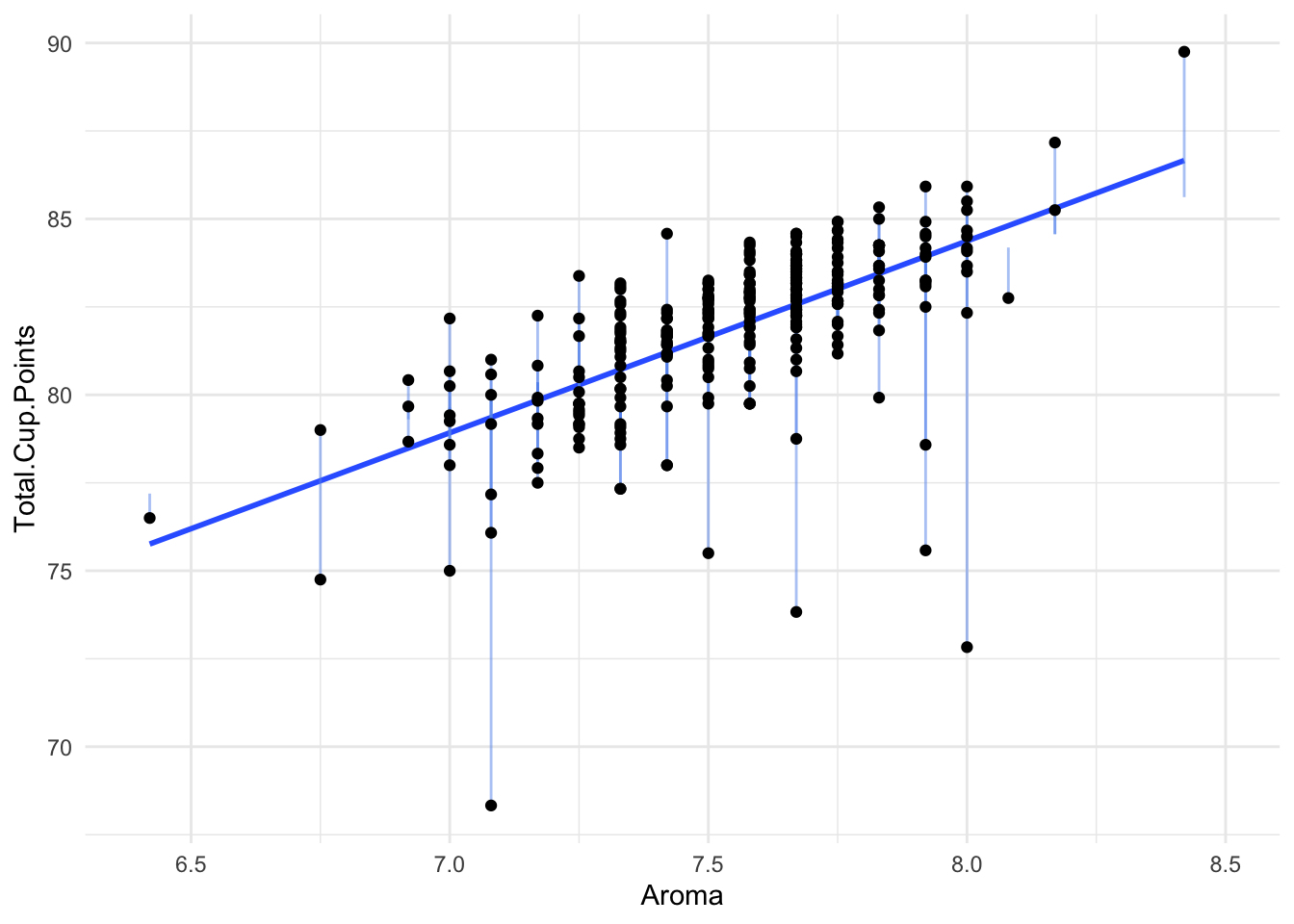
Here is a plot of Aroma and Total.Cup.Points
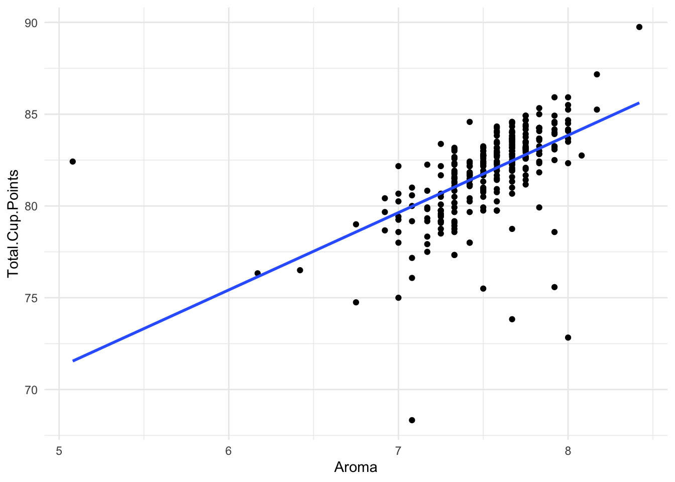
There seems to be quite a clear positive relationship: Higher Aroma scores lead to higher Total Scores. We’ve drawn a line on the graph to represent this idea.
This line is called a linear regression.
Instead of assuming that a completely different true mean generated each observation, let’s assume that these true means are somehow a function of Aroma. That is, all coffees with the same Aroma score have the same true mean Total.Cup.Points.
y_i \sim f(x_i) + \epsilon_i
To further simplify this approach, we will assume that the mean is a linear function. We start with some baseline value \beta_0. Then, as the Aroma score goes up, we add \beta_1 to the assumed true mean:
y_i \sim \beta_0 + \beta_1 x_i + \epsilon_i
The line has the equation:
y = 41.14 + 5.39x
According to our generative model setup, this means:
For coffees with an Aroma score of 0, the true mean total score is 41.14.
For coffees with an Aroma score of 1, the true mean total score is 41.14 + 5.39*1 = 46.53.
For coffees with an Aroma score of 7, the true mean total score is 41.14 + 5.39*7 = 78.87.
For coffees with an Aroma score of 8, the true mean total score is 41.14 + 5.39*8 = 84.26.
Does this mean that all coffees with an Aroma score of 7 have a Total Score of 78.87? Of course not. Our generative model assumes that the coffee may have a certain true mean score, but there is always a little bit of random uncertainty (\epsilon_i) in any particular observed value.
Let’s take a closer look at just the coffees with Aroma scores of exactly 7 or exactly 8:
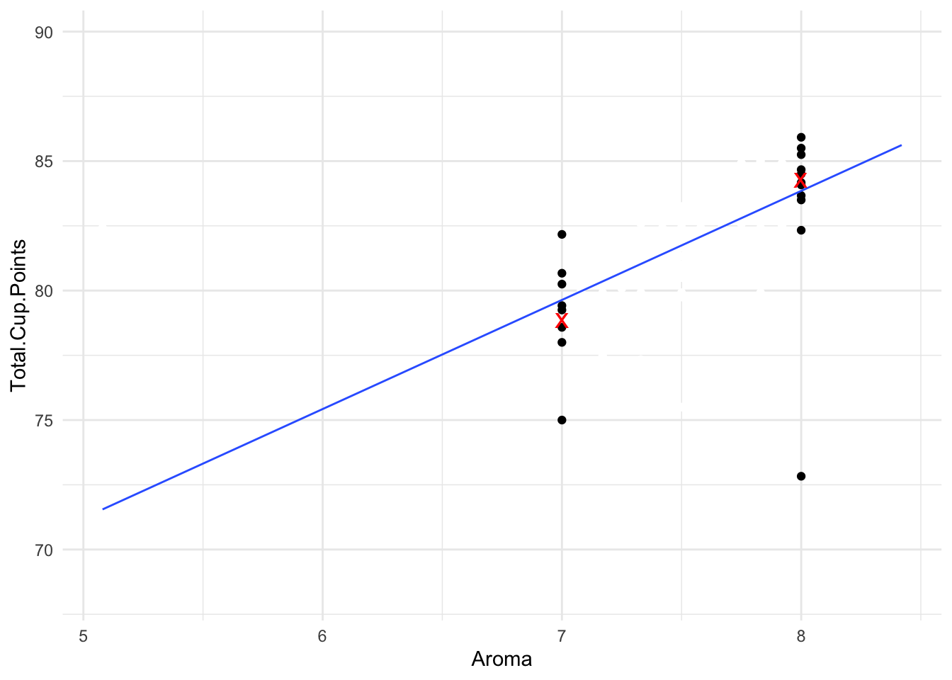
There were five coffees that received an Aroma score of 7. For all of these, we would predict their Total.Cup.Points score to be 78.87 (the red X). Of course, some of the actual scores were a bit higher than that, and some were a bit lower, because of the random error \epsilon_i.
There were eight coffees that received an Aroma score of 8. For all of these, we would predict their Total.Cup.Points score to be 84.26 (the other red X). Most of the observed values were close to this prediction, although one of them scored only 73 in total points, so this one was quite far from our prediction.
18.0.3 Residuals and Assumption Checking
We’ve proposed the generative model:
$$y_i 41.
To decide if our model makes sense, we might look at the residuals: How far our observed values fell from the predicted true mean from the model. Our model setup assumed that these residuals would be random, with values just as likely to fall a bit above the true mean or a bit below the true mean by chance. We might want to plot the residuals to see if our model assumption makes sense:
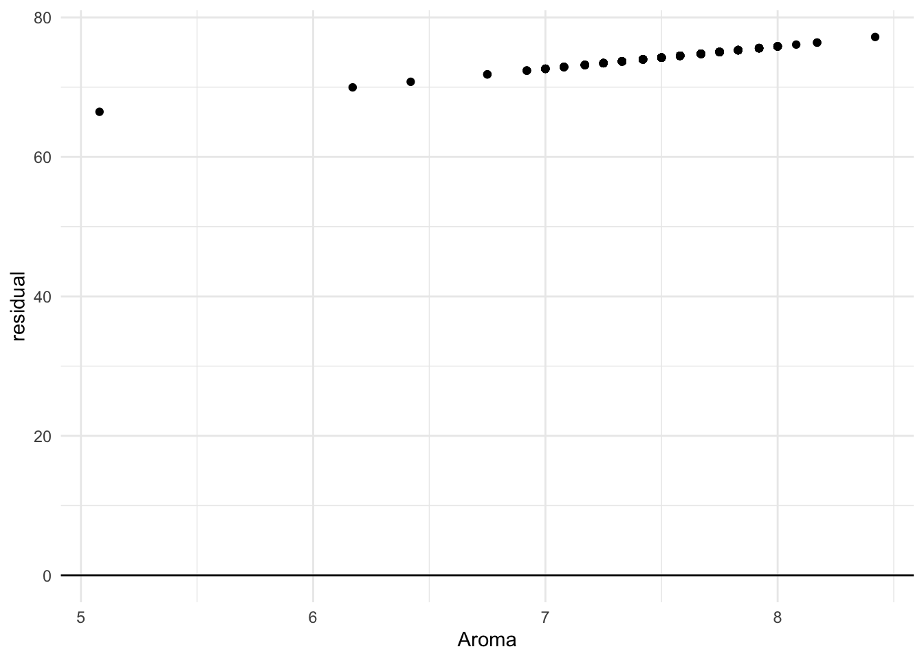
In this case, all our residuals are fairly evenly distributed around 0, which is good! We just see one concerning outlier, a coffee with an Aroma score around 5, that still managed to get a fairly high Total score:
# A tibble: 1 × 7
  Country.of.Origin Altitude Harvest.Year Variety Aroma Flavor Total.Cup.Points
  <chr>                <dbl> <chr>        <chr>   <dbl>  <dbl>            <dbl>
1 Colombia              1600 2016         Caturra  5.08   7.75             82.4
18.0.4 Least Squares
Now, the line that we drew above is not the only line we could draw through the data. For example, we could use the equation:
y = 30 + 7x
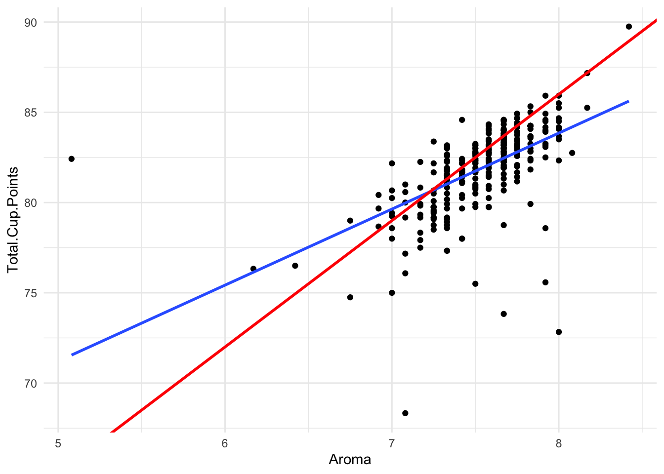
How do we decide which line is “better” for describing our data? The same way we did in Chapter 3.3! We ask which possible true mean line results in the least squared error.
Clearly, the blue line has smaller squared error overall than the red line, so we would prefer this model for explaining our data.
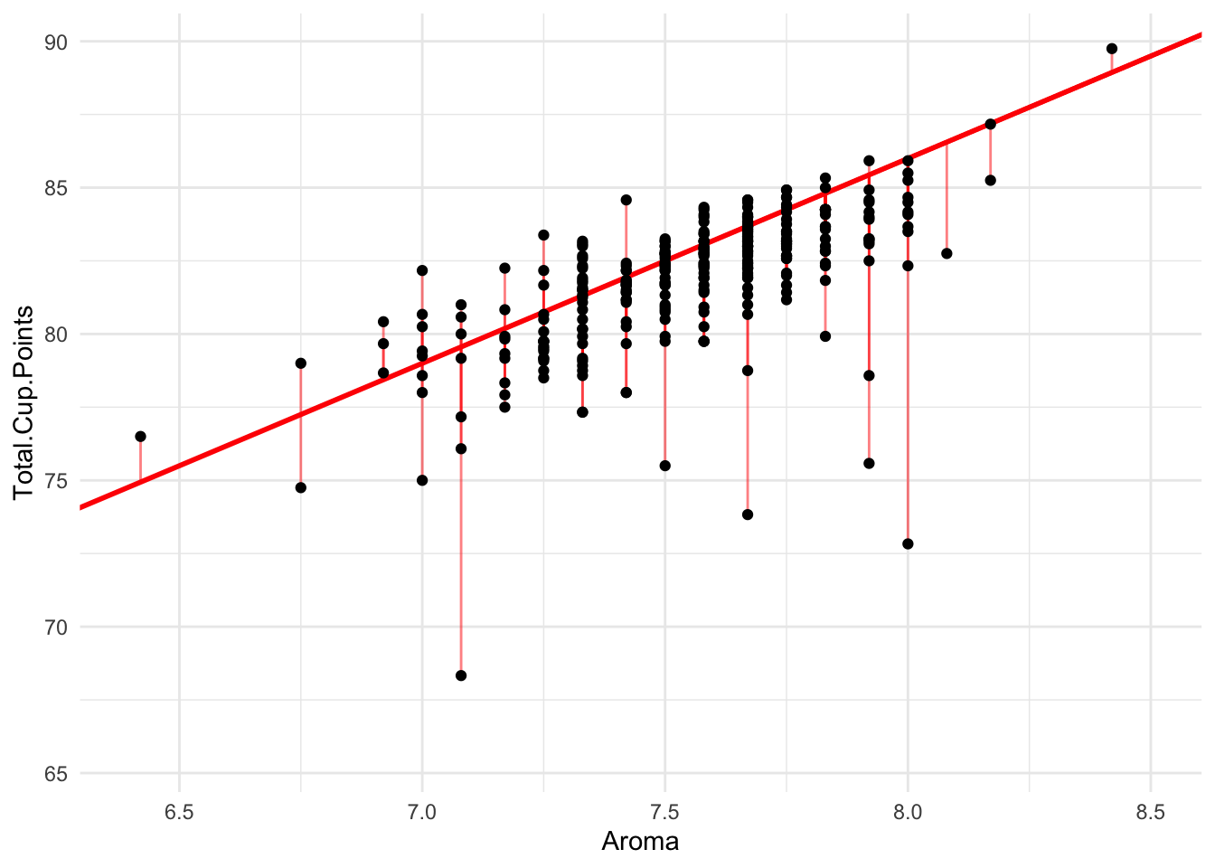
Imagine now that we could try every single possible equation for lines through the data. For each, we could calculate the squared error of the residuals. Then we could pick, as our favorite, the one that gave the smallest error.
This is exactly how we choose a Least-Squares Regression Model! (Except that we use math tricks to calculate the best line equation instead of trying every single option, of course.)
Here is the output of a computer program calculating the Least-Squares Regression model for the coffee data:
Call:
lm(formula = Total.Cup.Points ~ Aroma, data = dat)

Coefficients:
(Intercept)        Aroma
     50.151        4.212
Our best equation, therefore, is
\text{Total.Cup.Points} = 50.151 + 4.212*\text{Aroma}
The Intercept of 50.151 doesn’t tell us much that is interesting: it says that a coffee with an Aroma score of 0 would get 50.151 Total.Cup.Points. No coffees score 0 on the Aroma scale, so this isn’t very relevant as a data insight.
However, the Slope of 4.212 is very interesting. It tells us that on average, coffees with one point higher on the Aroma score tend to have 4.212 points higher on their Total.Cup.Points score!
As always, we should ask ourselves: Is this model a good estimate of reality, or could we have gotten a slope of 4.212 by pure chance, even if Aroma does not impact Total.Cup.Points? To answer the question, we perform an ANOVA F-Test:
Call:
lm(formula = Total.Cup.Points ~ Aroma, data = dat)

Residuals:
     Min       1Q   Median       3Q      Max
-11.6444  -0.6991   0.3394   1.0164  10.8703

Coefficients:
            Estimate Std. Error t value Pr(>|t|)
(Intercept)  50.1508     2.6613   18.84   <2e-16 ***
Aroma         4.2124     0.3528   11.94   <2e-16 ***
---
Signif. codes:  0 '***' 0.001 '**' 0.01 '*' 0.05 '.' 0.1 ' ' 1

Residual standard error: 1.927 on 298 degrees of freedom
Multiple R-squared:  0.3235,    Adjusted R-squared:  0.3213
F-statistic: 142.5 on 1 and 298 DF,  p-value: < 2.2e-16
With and F-stat of 142.5 and a p-value of essentially 0, we certainly find evidence that there is a relationship between Aroma and Total.Cup.Points!
18.0.5 Prediction
Now that we have our best equation, which we thing estimates how the data was generated, one way we can use it is to predict what will happen in future data.
Suppose we have a new coffee on the market, and it is advertised as scoring 8.5/10 on the Aroma scale. Wow! What do we expect the Total.Cup.Points of this coffee might be?
Well, we can simply plug it into our equation:
\text{Total.Cup.Points} = 50.151 + 4.212*8.5 = 85.953 We can use this trick for nearly any new coffee - but one thing to be careful of is extrapolation. Suppose I make a new coffee by mixing dirt and water together. This coffee gets an Aroma score of 1/10. Should I really expect my dirt coffee to score (50.152 + 4.212*1 =) 54.364 points? No way! It probably scores much lower than that.
Because the data we used to make our Linear Regression line only has Aroma scores between about 5 and 8.5, using our line to predict new coffees outside this range is outside the scope of the population that our model applies to. We have to be cautious, and not trust these predictions unless we have a very good reason to think our regression can apply to a broader scope.
18.1 Other types of hypothesis tests: Chi-Squared
In this class, you have learned two types of hypothesis tests.
z-score tests, which can be used for hypotheses about:
- The true proportion of a category in one categorical variable
- The true mean of one quantitative variable
- The true difference of proportions across two categories
- The true difference of means across two categories
- The true correlation between two quantitative variables.
ANOVA F-Tests, which are used for hypotheses about: * The true difference of proportions across many categories * The true difference of means across many categories * Linear regression models for two or more quantitative variables
For all these tests, we took the following approach:
Calculate a summary statistic that estimates the parameter and tells and interesting story about the data.
Calculate a test statistic (specifically, either a z-score or an F-stat) that summarizes our evidence for the alternate hypothesis.
Use the test statistic to calculate a p-value, usually using computer tools to do the math for you.
Many, many other hypothesis tests exist for more parameters and data scenarios. All of them follow this exact same structure! In the future, when you encounter a new and unfamiliar hypothesis test, you will still be able to interpret the p-value and come to a conclusion.
Let’s wrap up this topic by briefly examining a couple examples of other hypothesis testing scenarios.
18.1.1 Studying many categories
We’ve already seen that we can use an ANOVA F-Test to compare a mean across many categories. What about when we want to compare proportions across many categories?
For example, the table below shows the counts of each coffee variety made in each country:
 Country.of.Origin Bourbon Catuai Caturra Typica Other
          Colombia       0      0      65      1     3
         Guatemala      57      5      11      0    12
            Mexico      20      2       7     67    21
Just from glancing at the table, it’s pretty obvious that the countries don’t all grow the same amounts of each coffee! Mexico seems to be the primary grower of Typica, while Colombia primarily grows Caturra.
18.1.2 Chi-Squared Tests
How can we test this impression to see if there is statistical evidence that the locations make different types of coffee?
First, let’s establish out hypotheses. The null hypothesis is that the true proportions of Bourbon, Cataui, Caturra, Typica, and Other varieties are the same in every region. (Note that we are not saying these proportions are equal to each other; just that the distribution is identical in each of the three regions.). The alternate hypothesis is that at least one proportion is different in one of the regions.
If the null hypothesis is true, then we would estimate the sample proportions in each region to be the same. That is, we would ignore Country.of.Origin and calculate percents of Variety:
 Variety  n    percent
 Bourbon 77 0.28413284
  Catuai  7 0.02583026
 Caturra 83 0.30627306
  Typica 68 0.25092251
   Other 36 0.13284133
Then, we want to ask our usual question: If this null distribution is true, could it have generated the data we see?
Do we believe that, if there is a 28% chance that any coffee is Bourbon, we could just by chance not see any Bourbon coffees from Colombia? Probably not! There were 69 total coffees from Colombia, so it would be more reasonable to expect to see about 19 of them be Bourbon, since
0.28*69 = 19.32
We could do this same process - figuring out how many coffees we expect in each category under the null - for every region and category. Then we could compare these expected counts to the observed counts to see how closely our data resembles what we expect under the null.
The test statistic that measures, in total, how far the expected and observed counts are from each other is called the \Chi^2 (“Chi-squared”) statistic.
In this data, we find the following results from computer calculations:
    Pearson's Chi-squared test

data:  tabyl(mutate(drop_na(ungroup(dat), Variety), Variety = fct_lump(Variety,     n = 5)), Variety, Country.of.Origin)
X-squared = 289.28, df = 8, p-value < 2.2e-16
Our \Chi^2 value of 289.28 is very large, indicating that our observed counts were very far from what we would expect under the null. In fact, the p-value tells us there is a 0% chance of seeing a \Chi^2 value this big if the null is true!
We conclude, of course, that we found very strong evidence that the countries make different varieties of coffee.
Try exercises 4.2.2 now
18.2 Multiple testing
Technically, these tests across many categories don’t tell the whole story by themselves. They only answer one yes or no question, such as:
Do the countries all have equally high scoring coffees?
or
Do the countries all make the same varieties of coffees?
Once we perform a hypothesis test on these top-level questions, if we do reject the null hypothesis, we may choose to follow this up with further analysis, such as:
Does Mexico or Colombia tend to have higher scoring coffees?
or
Does Mexico or Guatemala make more Bourbon variety coffees?
Fortunately, we already know how to do these types of two-category analyses with a z-score test! However, there is one small nuance we need to consider.
    Welch Two Sample t-test

data:  Total.Cup.Points by Country.of.Origin
t = 6.3071, df = 208.56, p-value = 8.363e-10
alternative hypothesis: true difference in means between group Colombia and group Mexico is greater than 0
95 percent confidence interval:
 1.301096      Inf
sample estimates:
mean in group Colombia   mean in group Mexico
              82.93109               81.16818
    Welch Two Sample t-test

data:  Total.Cup.Points by Country.of.Origin
t = 3.5624, df = 149.12, p-value = 0.0002469
alternative hypothesis: true difference in means between group Colombia and group Guatemala is greater than 0
95 percent confidence interval:
 0.6001553       Inf
sample estimates:
 mean in group Colombia mean in group Guatemala
               82.93109                81.81011
    Welch Two Sample t-test

data:  Total.Cup.Points by Country.of.Origin
t = 1.8677, df = 183.9, p-value = 0.0317
alternative hypothesis: true difference in means between group Guatemala and group Mexico is greater than 0
95 percent confidence interval:
 0.07374037        Inf
sample estimates:
mean in group Guatemala    mean in group Mexico
               81.81011                81.16818
Wow, all three tests were significant at the 0.05 level. Should we conclude that Mexico has the highest scores, followed by Guatemala, then Colombia?
18.2.1 The problem with many hypothesis tests
Imagine this: you are using a dating app, where you swipe left to reject a possible match and right to accept one. You’ve gotten pretty good at this by now, so you can predict with 95% accuracy whether someone will be a good date, just based on their profile.
If you swipe right on one person, what are the chances that you go on a bad date?
If you swipe right on 100 people, what are the chances that you go on a bad date?
The same principle applies with hypothesis testing. If you do one test, and your significance threshold is 0.05, you are saying “I’m okay with taking a 5% risk of Type I error.”
If you do three hypothesis tests, as we did to compare scores by country, and your significance threshold for each is 0.05, you are saing “I’m okay with taking a 14% chance of Type I error.” That’s a pretty high chance of making a wrong conclusion!
18.2.2 Bonferroni correction
There are many strategies for dealing with multiple testing, but the easiest is simply to lower your significance threshold.
A Bonferroni correction refers to dividing your significance threshold by the number of tests. In the example above, we found three p-values:
Mexico vs. Colombia: p-value of 0
Mexico vs Guatemala: p-value of 0.03
Guatemala vs Colombia: p-value of 0.0002
Our significance threshold will be 0.05/3 = 0.017. Thus, we conclude that there is evidence that Mexico and Guatemala score higher than Colombia, and there is not statistical evidence that Mexico and Guatemala are different.