number | game | release_date | price | owners | developer | publisher | average_playtime | median_playtime | metascore | release_year |
|---|---|---|---|---|---|---|---|---|---|---|
316 | Decisive Campaigns: Case Blue | 2012-07-16 | 39.99 | 0 .. 20,000 | VR Designs | Slitherine Ltd. | 0 | 0 | 2012 | |
270 | Clones | 2010-11-18 | 0.99 | 100,000 .. 200,000 | Tomkorp Computer Solutions Inc. | Tomkorp Computer Solutions Inc. | 0 | 0 | 2010 | |
379 | Midvinter | 2016-05-05 | 4.99 | 0 .. 20,000 | Talecore Studios | Talecore Studios, Valiant Game Studio AB | 0 | 0 | 2016 | |
6929 | Quest room: Hanon | 2018-10-25 | 2.99 | 0 .. 20,000 | BURRIK | BURRIK | 0 | 0 | 2018 | |
7271 | ReHack | 2018-03-23 | 1.99 | 0 .. 20,000 | EasyWays Team | EasyWays | 0 | 0 | 2018 |
1.3 Exercises
The following exercises refer to a dataset containing information about video games sold between 2004 and 2018. A few rows of the data are shown below.
Exercise 1.3.1
The following bar plot shows how many games were published in each of the years in this dataset:
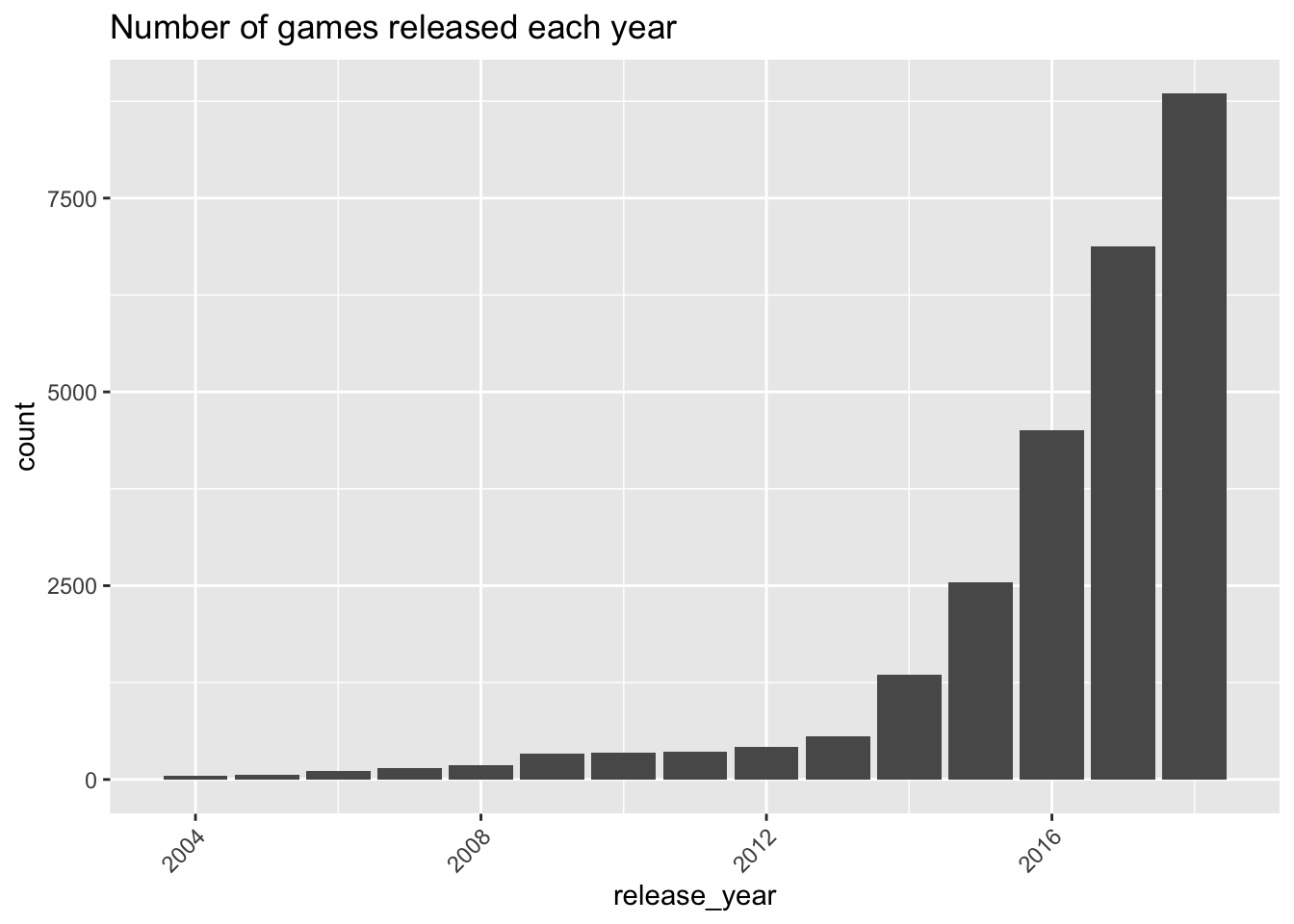
- Which of the following would be a reasonable conclusion from this plot? (Check all that apply)
- Half of all games in the dataset were published in 2018
- The number of video games published has been increasing over the years.
- There were probably more games published in 2019 than 2018.
- There were more games published in 2010 than in 2009
Hint: Remember that this dataset is a sample, that we use to draw conclusions about the population.
- Which of the following is a way we could improve this plot:
- Take away the axis labels
- Take away the title
- Put the years in order from most games to least games
- Change the y-axis from counts to percents
- Label all the bars, not just 2004, 2008, 2012, and 2016.
Exercise 1.3.2
Consider the following plot, showing the publisher variable, i.e., which company released the game. Only the top 10 most common publishers are shown.
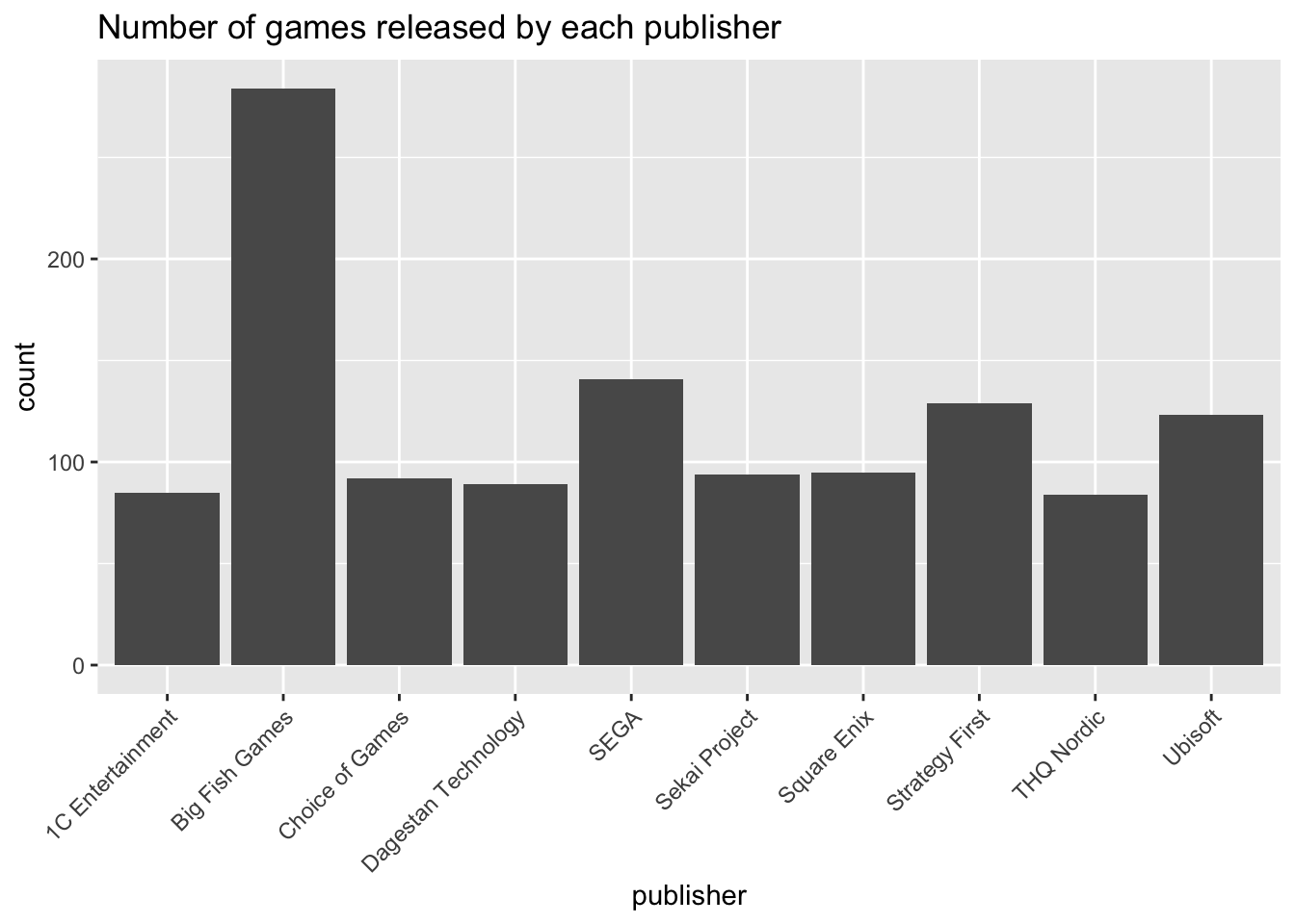
- Which of the following would be a way to improve the y-axis of this plot?
- Change the label from “count” to “counts of games”
- Remove the label entirely
- Change the scale from counts to percents
- Make the axis start at 50 instead of 0, so we don’t waste space
- Which of the following would be a way to improve the x-axis of this plot?
- Change the label from “publisher” to “video game publisher”
- Remove the label entirely
- Reorder the publishers so the bars are from biggest to smallest
- Which of the following would be a way to improve the color choices of this plot?
- Make the background white instead of grey
- Make each bar a different color, from a colorblind-friendly palette
- Add a background color to the white area around the plot
- Change the title to be an eye-catching color
- Which of the following would be a way to improve the titles and captions of this plot?
- Remove the title
- Include a subtitle stating that these are the top 10 publishers only
- Include a caption stating that the data is from 2004 to 2018
- Include a caption with a link to the original data source
Exercise 1.3.3
Consider the following histogram, which shows the metascore (i.e., average player rating) for the games in this dataset:
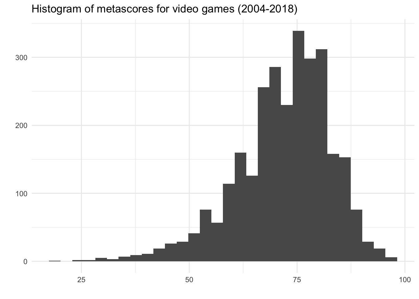
- What can we conclude from the histogram? (Check all that apply)
- The mean metascore is around 73.
- The median metascore is around 73.
- The median is probably bigger than the mean.
- This variable is right-skewed.
- There are four modes in this variable.
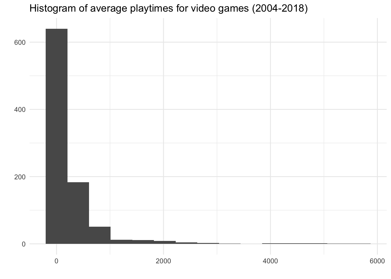
Now consider the following histogram, showing the average playtime of games in this dataset.
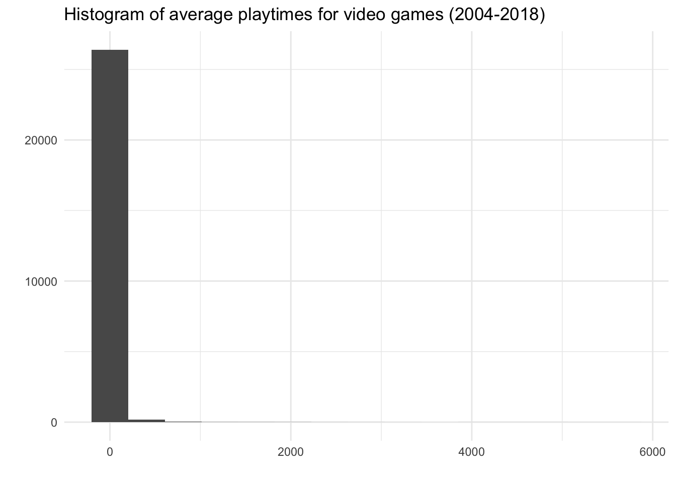
- It appears that there are only three bins in the histogram: one tall one around zero, and two short ones next to it. However, the x-axis goes all the way to 6000. What is going on here?
- We need to use a smaller binwidth, so we can see more bins.
- We need to use a bigger binwidth, so we can capture more observations in each bin.
- We should cut off the part of the plot to the right, because none of our data is there.
- This variable is extremely right-skewed, and the bins at the high numbers are too small to see.
Now consider the same plot, but with all the games with an average playtime of 0 (meaning nobody has played it yet) removed:
- What can we conclude from the histogram? (Check all that apply)
- The mean playtime is around 1000
- The median playtime is around 1000.
- The median is probably bigger than the mean.
- This variable is right-skewed.
- There are no modes in this variable.
Exercise 1.3.4
Consider the following visualization, from the webcomic xkcd:
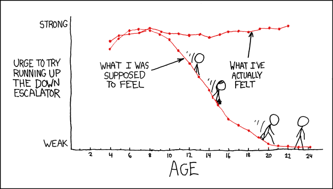
- Which of the following is part of the aesthetic (or mapping) of the plot?
- There is no title
- The x-axis is age
- The y-axis is “Urge to run up the down escalator”
- The y-axis ranges from “Weak” to “Strong”
- This is a line graph
- The dots probably represent an average over the year he was a certain age.
- There are two lines: one for “What I was supposed to feel” and “What I’ve actually felt”
- The lines are labeled with text (“What I was supposed to feel” and “What I’ve actually felt”)
- Only even ages are labelled
- Stick figure people are sliding down the line
- Which of the following is part of the geometry of the plot?
- There is no title
- The x-axis is age
- The y-axis is “Urge to run up the down escalator”
- The y-axis ranges from “Weak” to “Strong”
- The dots probably represent an average over the year he was a certain age.
- This is a line graph
- There are two lines: one for “What I was supposed to feel” and “What I’ve actually felt”
- The lines are labeled with text (“What I was supposed to feel” and “What I’ve actually felt”)
- Only even ages are labelled
- Stick figure people are sliding down the line
- Which of the following is part of the facets of the plot?
- There is no title
- The x-axis is age
- The y-axis is “Urge to run up the down escalator”
- The y-axis ranges from “Weak” to “Strong”
- The dots probably represent an average over the year he was a certain age.
- This is a line graph
- There are two lines: one for “What I was supposed to feel” and “What I’ve actually felt”
- The lines are labeled with text (“What I was supposed to feel” and “What I’ve actually felt”)
- Only even ages are labelled
- Stick figure people are sliding down the line
- Which of the following is part of the statistics of the plot?
- There is no title
- The x-axis is age
- The y-axis is “Urge to run up the down escalator”
- The y-axis ranges from “Weak” to “Strong”
- The dots probably represent an average over the year he was a certain age.
- This is a line graph
- There are two lines: one for “What I was supposed to feel” and “What I’ve actually felt”
- The lines are labeled with text (“What I was supposed to feel” and “What I’ve actually felt”)
- Only even ages are labelled
- Stick figure people are sliding down the line
- Which of the following is part of the coordinates or scale of the plot?
- There is no title
- The x-axis is age
- The y-axis is “Urge to run up the down escalator”
- The y-axis ranges from “Weak” to “Strong”
- The dots probably represent an average over the year he was a certain age.
- This is a line graph
- There are two lines: one for “What I was supposed to feel” and “What I’ve actually felt”
- The lines are labeled with text (“What I was supposed to feel” and “What I’ve actually felt”)
- Only even ages are labelled
- Stick figure people are sliding down the line
- Which of the following is part of the theme of the plot?
- There is no title
- The x-axis is age
- The y-axis is “Urge to run up the down escalator”
- The y-axis ranges from “Weak” to “Strong”
- The dots probably represent an average over the year he was a certain age.
- This is a line graph
- There are two lines: one for “What I was supposed to feel” and “What I’ve actually felt”
- The lines are labeled with text (“What I was supposed to feel” and “What I’ve actually felt”)
- Only even ages are labelled
- Stick figure people are sliding down the line
Exercise 1.3.5
Recall the Star Wars dataset from Exercises 1.2:
name | height | mass | hair_color | eye_color | age | gender | homeworld | from_tatooine |
|---|---|---|---|---|---|---|---|---|
Luke Skywalker | 172 | 77.0 | blond | blue | 19.0 | masculine | Tatooine | 1 |
Darth Vader | 202 | 136.0 | none | yellow | 41.9 | masculine | Tatooine | 1 |
Leia Organa | 150 | 49.0 | brown | brown | 19.0 | feminine | Alderaan | 0 |
Owen Lars | 178 | 120.0 | brown | blue | 52.0 | masculine | Tatooine | 1 |
Beru Whitesun Lars | 165 | 75.0 | brown | blue | 47.0 | feminine | Tatooine | 1 |
Biggs Darklighter | 183 | 84.0 | black | brown | 24.0 | masculine | Tatooine | 1 |
Obi-Wan Kenobi | 182 | 77.0 | auburn | blue-gray | 57.0 | masculine | Stewjon | 0 |
Wilhuff Tarkin | 180 | auburn | blue | 64.0 | masculine | Eriadu | 0 | |
Han Solo | 180 | 80.0 | brown | brown | 29.0 | masculine | Corellia | 0 |
Wedge Antilles | 170 | 77.0 | brown | hazel | 21.0 | masculine | Corellia | 0 |
Palpatine | 170 | 75.0 | grey | yellow | 82.0 | masculine | Naboo | 0 |
Boba Fett | 183 | 78.2 | black | brown | 31.5 | masculine | Kamino | 0 |
Lando Calrissian | 177 | 79.0 | black | brown | 31.0 | masculine | Socorro | 0 |
Lobot | 175 | 79.0 | none | blue | 37.0 | masculine | Bespin | 0 |
Mon Mothma | 150 | auburn | blue | 48.0 | feminine | Chandrila | 0 | |
Arvel Crynyd | brown | brown | masculine | |||||
Raymus Antilles | 188 | 79.0 | brown | brown | masculine | Alderaan | 0 |
Match the following research questions about this dataset to one of the plots below:
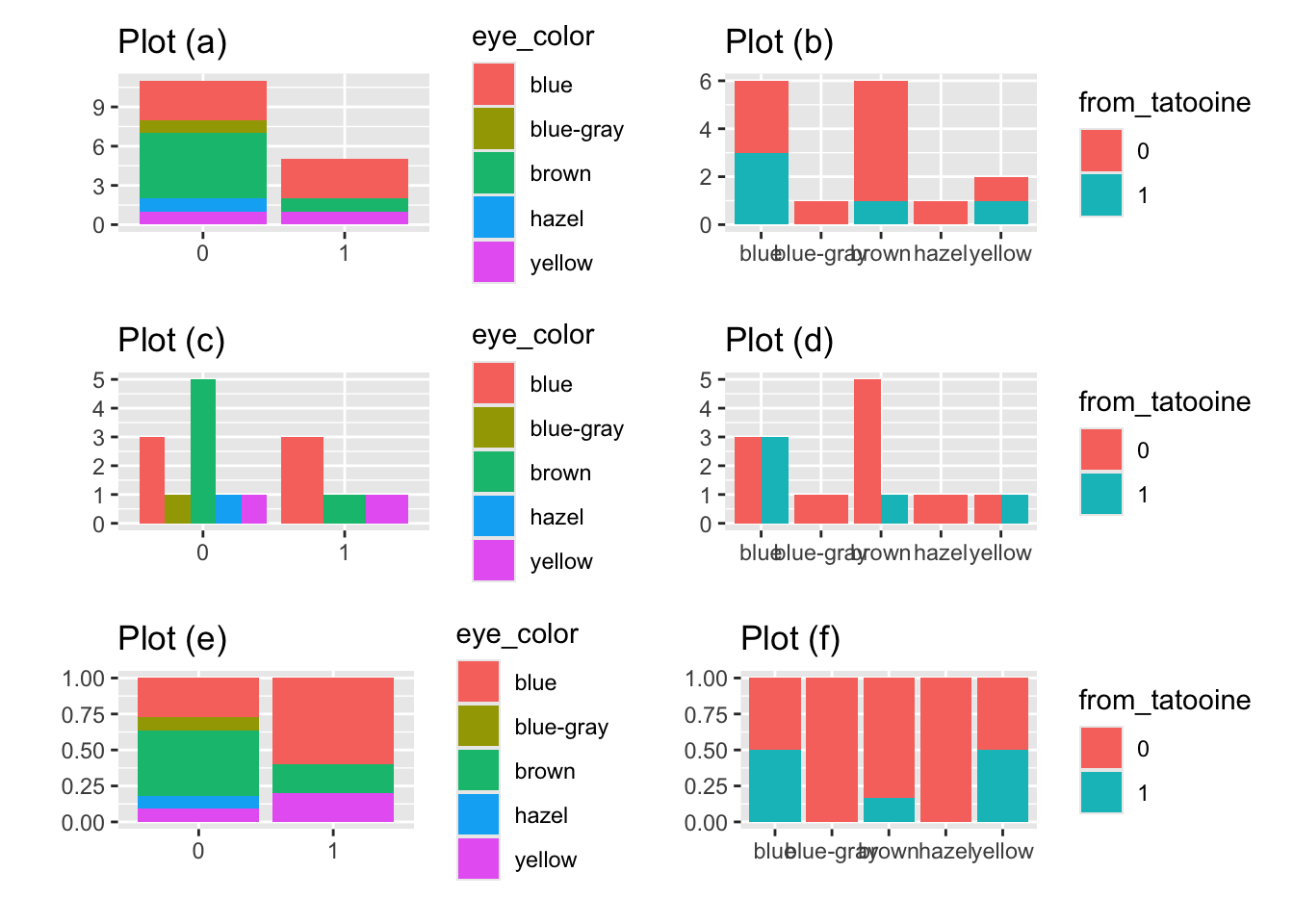
- Do characters from the planet Tatooine have different eye colors than characters not from Tatooine?
- Is a blue-eyed character more likely to be from Tatooine, or not?
- Are there more blue-eyed Tatooine natives, or more brown-eye Tatooine natives?
- Are more characters from Tatooine or not from Tatooine?
Exercise 1.3.6
The following plot shows information from the video games dataset:
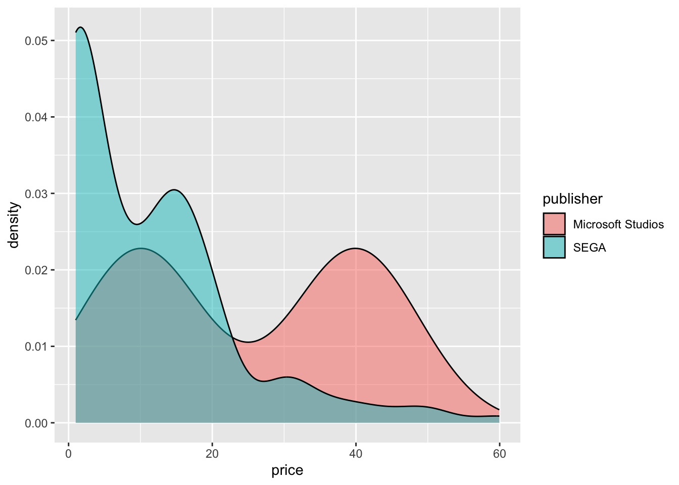
Comment on this plot. Include:
- What research question it addresses, and how you would answer the question.
- Descriptions of the shape of the quantitative variable in each category.
- Any improvements you would make to the plot.