Country.of.Origin | Altitude | Harvest.Year | Variety | Aroma | Flavor | Total.Cup.Points |
|---|---|---|---|---|---|---|
Colombia | 442.0 | 2012 | Caturra | 7.67 | 7.33 | 82.42 |
Guatemala | 1219.2 | 2017 | Bourbon | 7.42 | 7.33 | 81.67 |
Mexico | 700.0 | 2012 | Typica | 7.75 | 7.50 | 83.17 |
Guatemala | 1500.0 | 2014 | Bourbon | 7.42 | 7.42 | 82.17 |
Mexico | 1100.0 | 2012 | Typica | 7.25 | 7.33 | 79.50 |
Mexico | 1100.0 | 2012 | Other | 7.58 | 7.58 | 82.67 |
14 Review
The Normal Distribution and the Central Limit Theorem
“If there is an equation for a curve like a bell, there must be an equation for a bluebell.”
― Tom Stoppard, Arcadia
In this chapter, we will study the quality of coffees made in three countries of North/Central America: Mexico, Colombia, and Guatemala. Researchers sampled coffees from producers across the country, and rated the coffee’s aroma and flavor (on a scale of 1-10). They then gave the cup of coffee an overall score out of 100. Information was also recorded about the variety of coffee bean and the altitude at which it was grown. A few rows of this dataset are shown below:
Suppose we were to ask the research question,
Does Mexico or Guatemala receive higher ratings for their coffee?
We first state our null and alternate hypotheses:
H_0: \mu_M = \mu_G
H_a: \mu_M \neq \mu_G
Then we compute our summary statistics:
# A tibble: 2 × 4
  Country.of.Origin mean_score sd_score num_obs
  <chr>                  <dbl>    <dbl>   <int>
1 Guatemala               81.8     2.46      87
2 Mexico                  81.2     2.43     121
\bar{x}_M - \bar{x}_G = -0.65 \;\;\; SD(\bar{x}_M - \bar{x}_G) = 0.343 \text{z-score} = -1.89
We then generate observations from the null distribution:
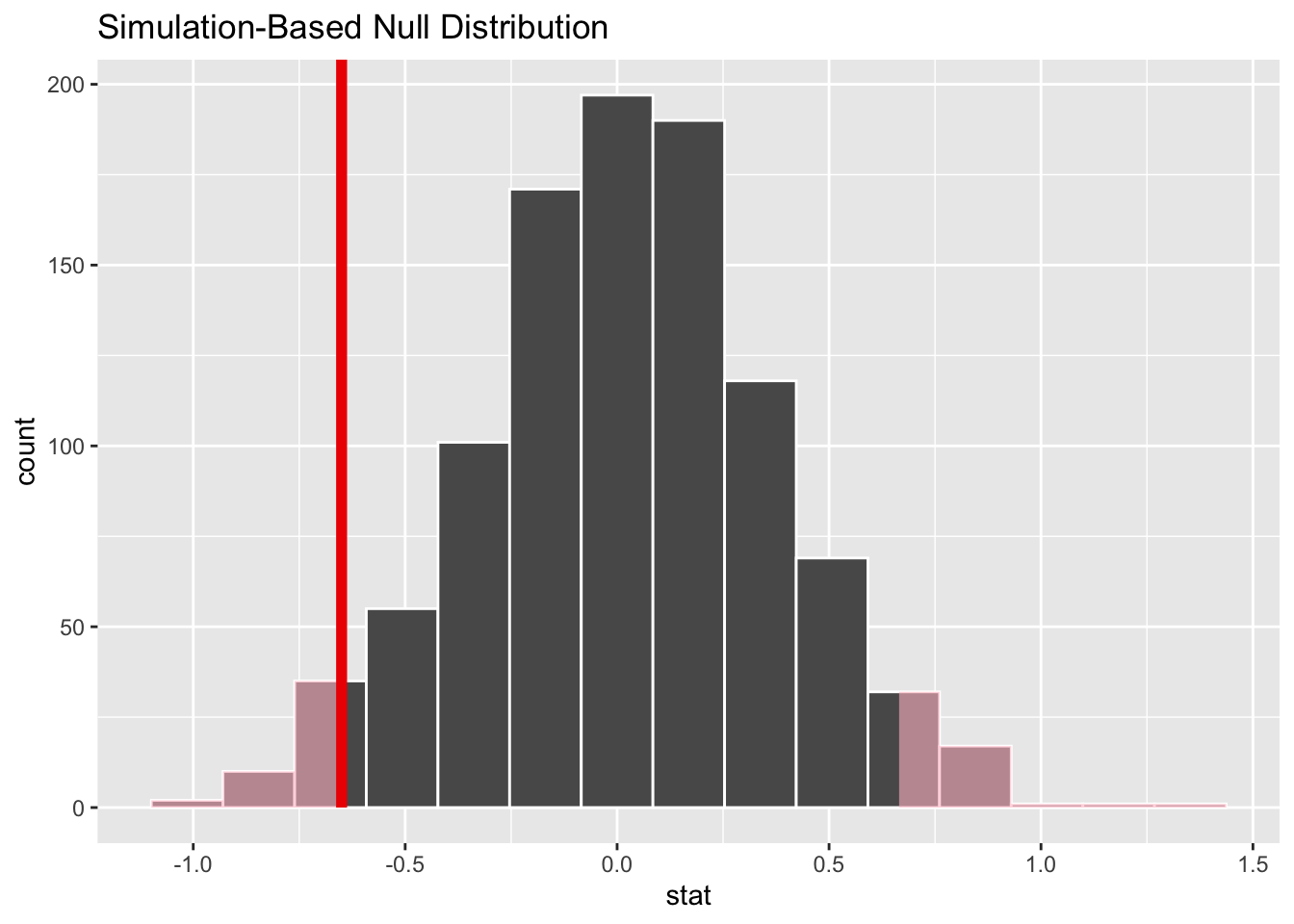
This gives us a p-value of 0.068. We do not reject the null hypothesis at the 0.05 level, although we did find some weak evidence that perhaps Guatemala coffee is rated higher than Mexican coffee.
Thus far, the step where statistics are simulated from the null distribution has been provided for you by a mysterious process. Let’s now de-mystify that procedure.
14.1 The Bell Curve
We will start by thinking about the shape of the null-simulated statistics. How exactly can we claim to know what values are likely or unlikely in a universe where the null is true?
You may have picked up on an interesting pattern in our analyses so far. Although our summary statistics have all been very different from each other depending on the dataset we are studying - from price differences around $5 to a sample proportions around 0.46 - the distributions of values from the null simulation all seem to have the same overall shape. It looks something like this:
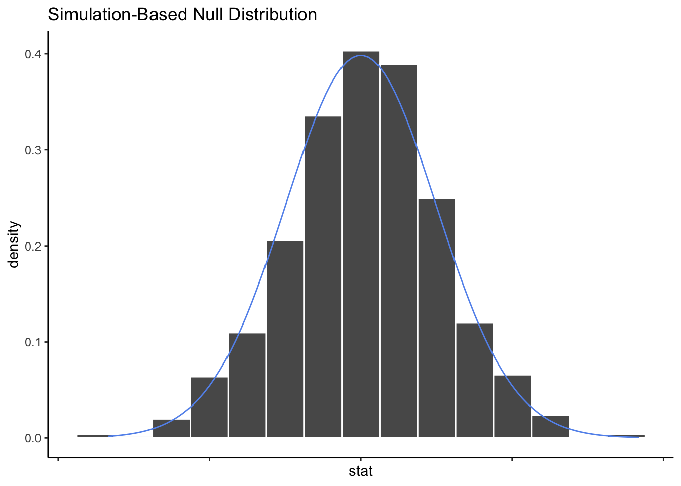
We call this shape the Bell Curve, because it looks a bit like a large bell.
In our example above, when we simulated 1000 statistics from the null distribution, we found that 68 of them were more extreme than -1.89. This gave us a p-value of 0.068. But what if we generated 1000 new null statistics? We might get a slightly different p-value, since the simulated statistics are random.
What if, instead, we are willing to assume that our generated statistics from the null universe will always follow a Bell Curve shape? Then there would be no need to actually generate 1000 simulated statistics - we already know what the histogram would look like. Instead of asking how many simulated values were more extreme than our observed statistic, we could ask how much area under the curve fell in the “more extreme” zone:
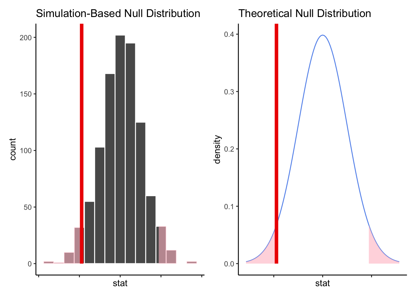
The shaded part of the density curve is sometimes called the tails of the distribution. Of course, while we can certainly “eyeball” the area in the tails, we’d ideally like a little more solid of an answer.
Because the Bell Curve is very common in statistics - more on that in a moment - it has been studied closely by mathematicians and statisticians.
The Bell Curve has two very important properties:
It is symmetric; values are just as likely to fall above the mean as below it.
Most values are very close to the mean; it gets increasingly less likely to see a particular value the further it is from the mean.
Using just these properties (and a lot of fancy math theory) it is possible to derive a very specific equation that makes the shape of the blue line in the density curve above. The equation itself is not particularly interesting to a Data Scientist; what is important is the fact that the shape of the Bell Curve is exactly known. That means, with the right amount of calculus, we can find the exact area under parts of the curve.
In the age of computers, there’s no need for calculus “by hand”, of course. Using a computer, we find that the shaded area under the density curve in our example above is 6% of the total area under the curve. Therefore, our exact p-value is 0.06, which is not very far from the simulated p-value of 0.068.
14.2 The Central Limit Theorem
A question you are probably wondering about right now is: why do all of our histograms of simulated statistics seem to fit a Bell Curve shape?
The answer to that question is a bit of mathemagic that we like to call The Central Limit Theorem (CLT). This theorem states that if your statistic is a sample mean from a reasonably large number of samples, then the distribution of its possible values will fit a Bell Curve shape.
Why is this true? Well, the detailed math behind it is more complicated than we need to know to be good Data Scientists - but the basic idea is that when you take a sample mean of many samples, two things happen:
Extreme values get “balanced out”, so we no longer need to worry about outliers and skew. The sample mean is just as likely to fall a little above the true mean as a little below the true mean.
The more observations that are averaged, the less sampling variability we have - so the sample mean is more likely to fall close to the true mean than far from it.
You should notice that these two facts match the defining features of the Bell Curve!
14.2.1 Sample size and the CLT
Recall from Exercises 2.1 that the distribution of incomes in the United States is extremely skewed. If we made a histogram of all incomes, it would look a bit like this:
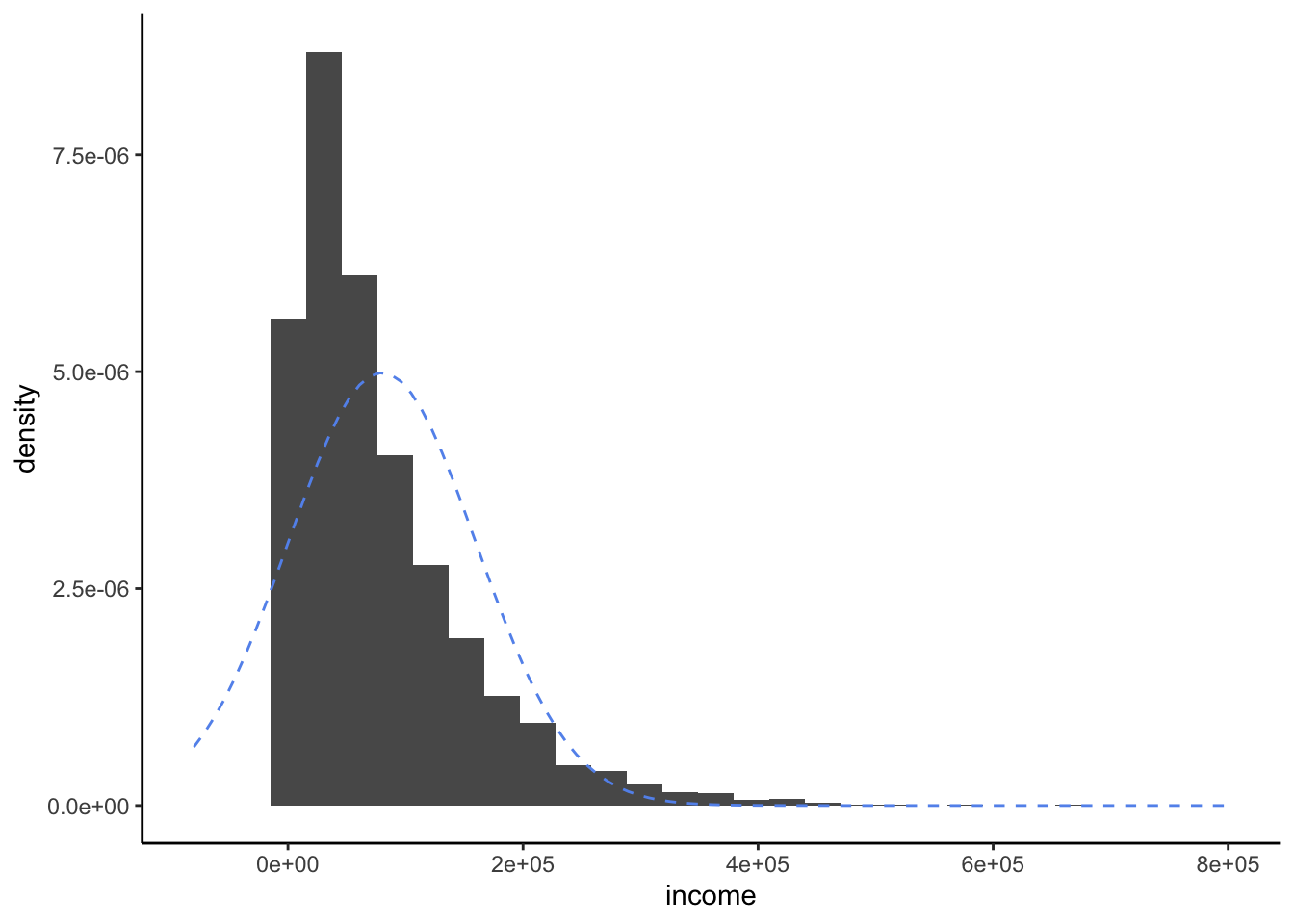
As we can see, the distribution is quite skewed to the right, due to some people having extremely high incomes. Of course, it does not at all fit a Bell Curve shape, as shown by the dotted blue lines.
Suppose now we decide to sample three people and find the sample mean of their incomes.
income |
|---|
50601.05 |
44794.41 |
75192.77 |
Here we sampled one very large income (around $280,000) and one very small income (around $2,000). The average of our three incomes is $100,965.
Now suppose we did this process - taking a sample of three people and averaging their incomes - many times:
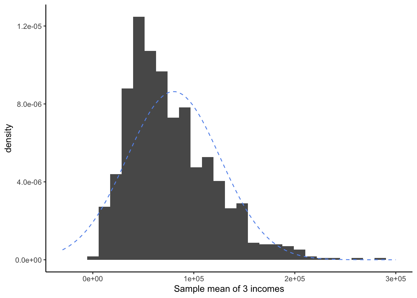
This distribution for sample means of 3 observations shows much less skew and fewer extreme values than the original distribution of incomes. However, it doesn’t quite look like a Bell Curve yet.
Did the CLT stop working? Of course not! It is simply that three observations is not very many. We still are quite likely to sample, by luck, three very high incomes or three very low incomes.
Now let’s try the same procedure, but this time we will take samples of ten people’s incomes, instead of three.
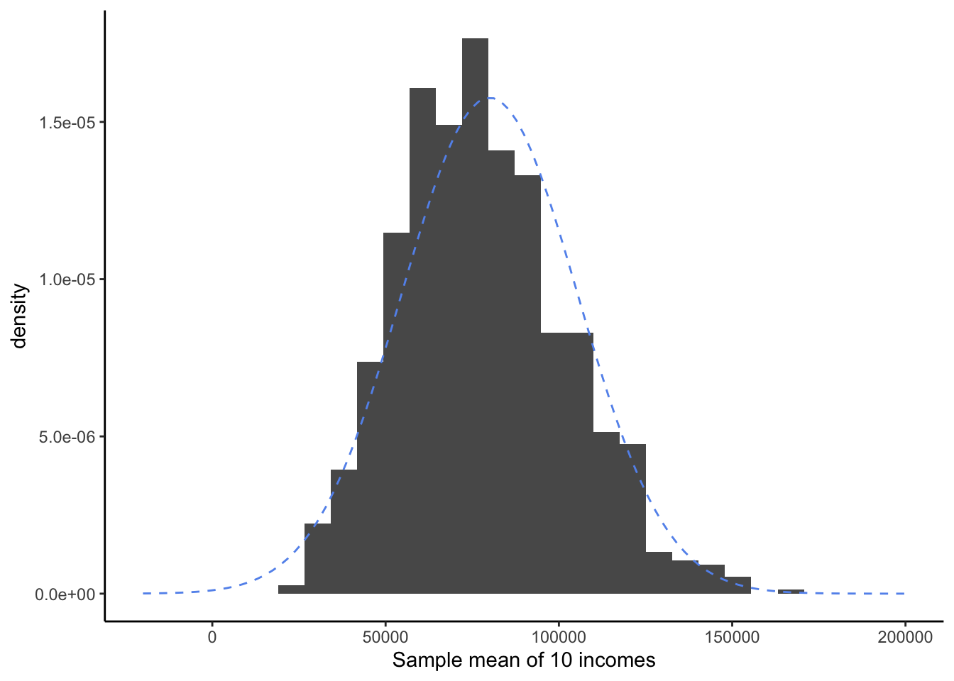
Now our sample means are beginning to fit a Bell Curve shape! Arguably, there is still a very slight right-skew; it’s not a perfect fit. But it might be reasonable to use the “shortcut” of the Bell Curve instead of trying to generated simulated samples a different way.
Finally, let’s try taking sample means of 100 observations:
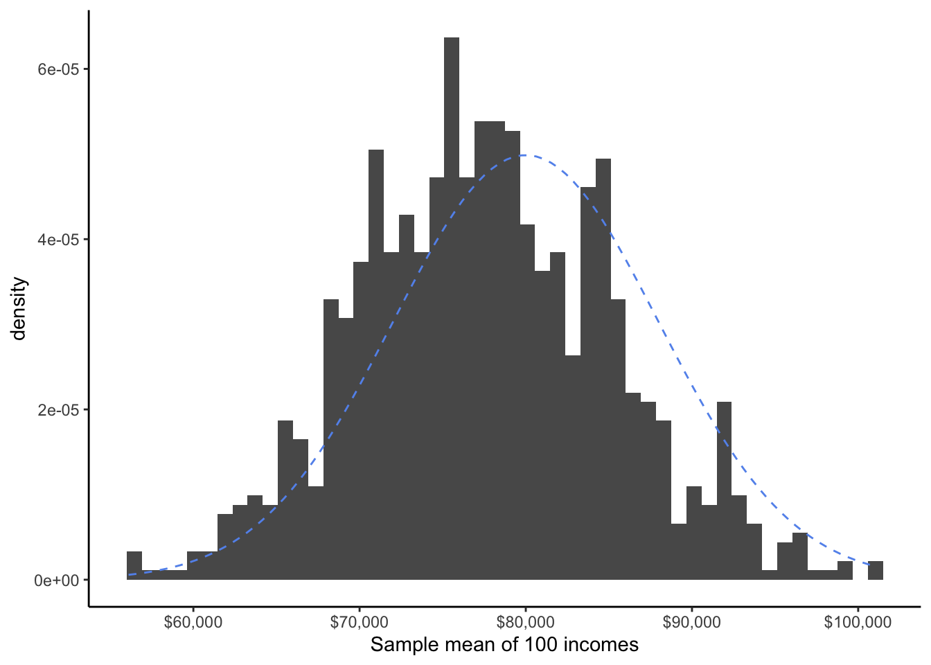
At last, the shape of the distribution of all of our sample means seems to fit nicely to the Bell Curve.
So, how do we know when the number of observations is “enough” that we can reasonably use the Bell Curve shortcut? There is no sudden cutoff - as we saw above, a mean of three observations was pretty far from a Bell Curve, a mean of 10 observations was closer, and a mean of 100 observations was almost perfect. As we have a larger and larger sample size, our assumption that the sample means fit a Bell Curve gets more and more reasonable.
The statistical community has come up with two “rules of thumb” for when it’s acceptable to use the Bell Curve trick:
If the distribution of one observation is mostly symmetric, with no outliers or extreme values, a sample size of n = 15 is enough.
If the distribution of one observation is skewed, or has outliers or extreme values, a sample size of at least n = 30 is needed.
Looking back at our coffee ratings study, we find that we have 121 observations from Mexico and 87 observations from Guatemala. Both of these are well above even the conservative cutoff of 30, so we feel very comfortable assuming that null simulations for \bar{x}_M and \bar{x}_G come from a Bell Curve shape. Since both of these qualify for the CLT, their difference \bar{x}_M - \bar{x}_G also qualifies. Thus, the p-value we calculated using the Bell Curve, 0.06, is a reasonable one!
14.2.1.1 Proportions and Correlations
Does this trick work for the other summary statistics we have been studying? The answer is mostly yes!
In the case of sample proportions, recall that a proportion is simply a mean of a dummy variable. Since it is a type of sample mean, it qualified for the CLT.
In the case of sample correlations, it’s a bit trickier - but it turns out that because the sample correlation is an average of multiplied deviances between two variables, it too will follow a Bell Curve shape when the null hypothesis \rho = 0 is true.
Warning
While the magic of the CLT works in many situations, it is not always true that any statistic we might study will follow a Bell Curve when the null hypothesis is true. For example, this does not work for the median.
However, it does work for a sample mean or a difference of sample means; a sample proportion or difference of sample proportions; and for a sample correlation or difference of sample correlations - which is why we typically use these statistics to make arguments.
14.3 Standard Normal Distribution
Let’s consider another research question about coffee in Latin America:
Are most Mexican coffees from the Typica variety?
Variety | n | percent | valid_percent |
|---|---|---|---|
Typica | 67 | 0.553719008 | 0.572649573 |
Bourbon | 20 | 0.165289256 | 0.170940171 |
Other | 10 | 0.082644628 | 0.085470085 |
Caturra | 7 | 0.057851240 | 0.059829060 |
Mundo Novo | 6 | 0.049586777 | 0.051282051 |
Pacamara | 3 | 0.024793388 | 0.025641026 |
Catuai | 2 | 0.016528926 | 0.017094017 |
Blue Mountain | 1 | 0.008264463 | 0.008547009 |
Marigojipe | 1 | 0.008264463 | 0.008547009 |
4 | 0.033057851 |
Our null hypothesis is that the Typica variety accounts for half (or less) of all Mexican coffees, i.e. H_0: \pi = 0.5. Our alternate hypothesis is that more than half of Mexican coffees are Typica variety, H_a: \pi > 0.5.
Our summary statistics are:
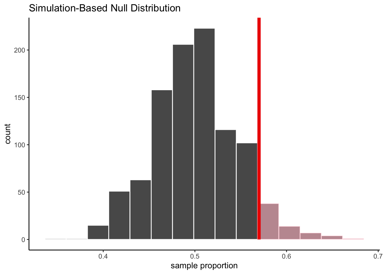
\hat{p} = 0.57, \;\;\; SD(\hat{p}) = 0.045 z = \frac{0.57}{0.045} = 1.56
If we generate 1000 simulated statistics from the null distribution, we get:
Let’s take a closer look at the first 10 simulated proportions:
replicate | stat |
|---|---|
1 | 0.5470085 |
2 | 0.4957265 |
3 | 0.5042735 |
4 | 0.4957265 |
5 | 0.4957265 |
6 | 0.5128205 |
7 | 0.4188034 |
8 | 0.5042735 |
9 | 0.4786325 |
10 | 0.4871795 |
According to the null hypothesis, the mean of the simulated proportions is 0.5. Our observed statistic, 0.57, is 0.07 away from this hypothesized mean. What if we also center our simulated statistics, by subtracting 0.5 from each of our simulated proportions?
replicate | stat | prop_centered |
|---|---|---|
1 | 0.5470085 | 0.047008547 |
2 | 0.4957265 | -0.004273504 |
3 | 0.5042735 | 0.004273504 |
4 | 0.4957265 | -0.004273504 |
5 | 0.4957265 | -0.004273504 |
6 | 0.5128205 | 0.012820513 |
7 | 0.4188034 | -0.081196581 |
8 | 0.5042735 | 0.004273504 |
9 | 0.4786325 | -0.021367521 |
10 | 0.4871795 | -0.012820513 |
Let’s see how the resulting histograms look:
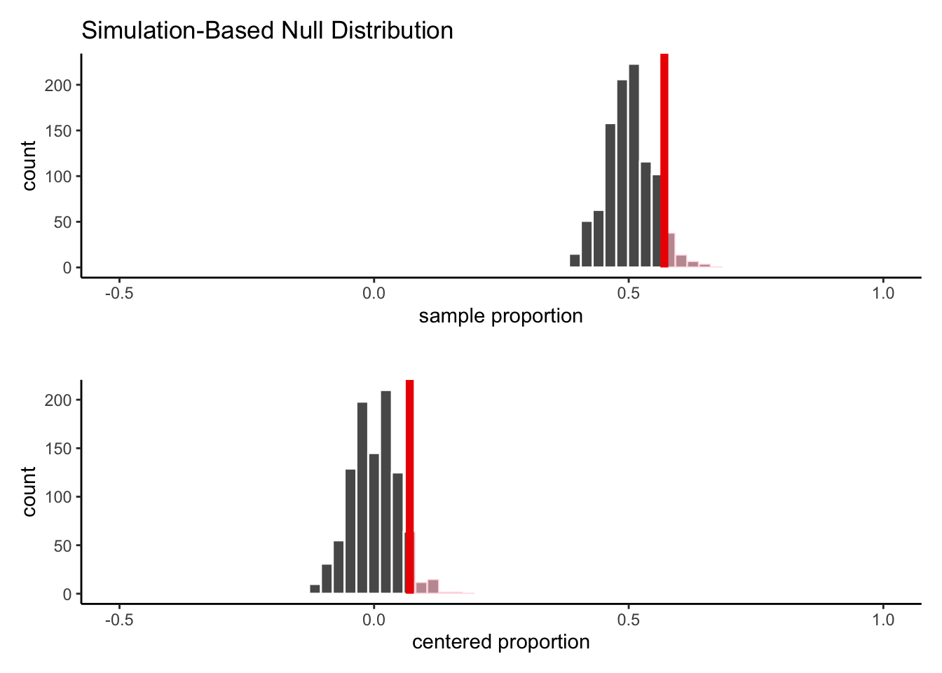
As we can see, the shape of the histogram has not changed, nor has the area in the shaded part of the curve. We have simply shifted the whole shape over to have a mean of 0 instead of a mean of 0.5.
Now, let’s take this one step further. If the null hypothesis is true, the standard deviation of the simulated proportions is:
S_{\hat{p}_{null}} = \sqrt{\frac{0.5*0.5}{117}} = 0.046 We’ll now scale our centered statistics by dividing each one by 0.046:
replicate | stat | prop_centered | prop_scaled |
|---|---|---|---|
1 | 0.5470085 | 0.047008547 | 1.02192493 |
2 | 0.4957265 | -0.004273504 | -0.09290227 |
3 | 0.5042735 | 0.004273504 | 0.09290227 |
4 | 0.4957265 | -0.004273504 | -0.09290227 |
5 | 0.4957265 | -0.004273504 | -0.09290227 |
6 | 0.5128205 | 0.012820513 | 0.27870680 |
7 | 0.4188034 | -0.081196581 | -1.76514307 |
8 | 0.5042735 | 0.004273504 | 0.09290227 |
9 | 0.4786325 | -0.021367521 | -0.46451133 |
10 | 0.4871795 | -0.012820513 | -0.27870680 |
Let’s see how the histograms look now:
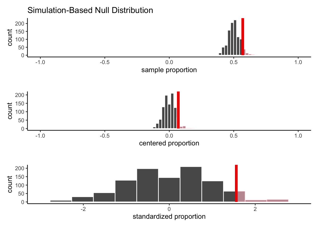
Once again, the shape of the histogram has not changed, nor has the shaded area. We have simply rescaled the values, so that the histogram spreads out further on the x-axis.
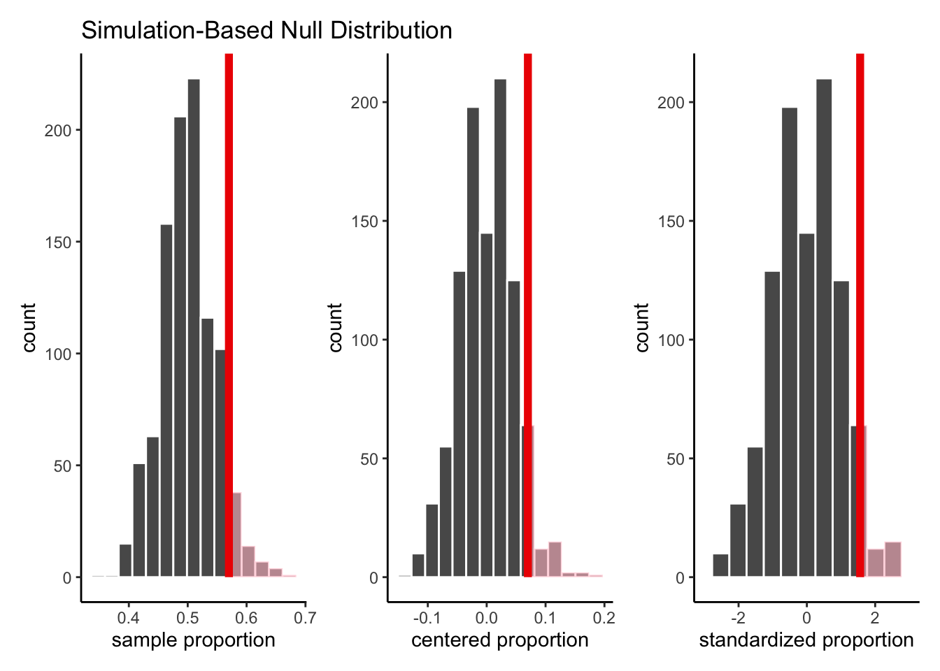
In other words, if we plot each of the three histograms on its own separate axis, they would look exactly identical!
So, why have we gone to all this trouble?
Well, by centering and scaling each of our simulated statistics, we have standardized them. The resulting histogram is centered at 0 and has a standard deviation of 1.
We can then compare this null distribution of possible z-scores to the one we saw in our data! That is, the red line on the third plot, which determines which section should be shaded to represent the extreme values, is the z-score from our data, 1.56.
This saves us a bit of work for future analyses. Instead of calculating the area under the curve for lots of different Bell Curves, we only have to worry about one: The Standard Normal Distribution, which refers to the Bell Cure with a mean of 0 and standard deviation of 1.
Then, we simply mark the z-score from our analysis on this curve, and find the area in the more extreme tails:
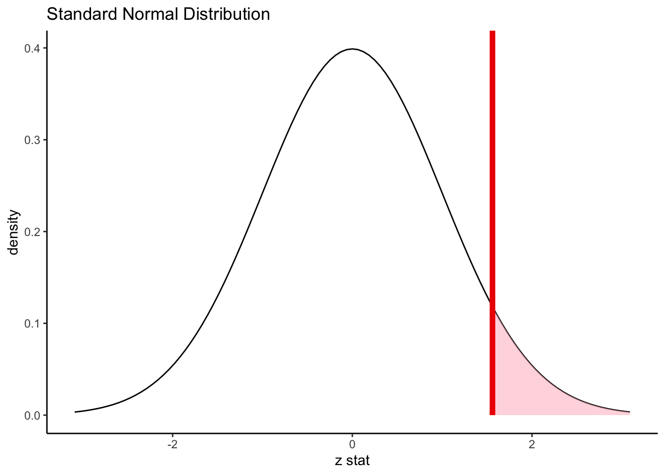
In this example, we find (using computers) that the shaded area is 0.059.
14.3.1 The Empirical Rule
Although we typically use computers to do the hard work in calculating exact p-values from a Bell Curve, it’s sometimes important to be able to quickly estimate areas under the Bell Curve without the help of technology.
Since the Standard Normal Distribution is always the same, mathematicians have computed some “checkpoints” that help us estimate areas:
About 68% of the area is between -1 and 1; that is, within 1 standard deviation of the mean.
About 95% of the area is between -2 and 2; that is, within 2 standard deviations of the mean.
About 99.7% of the area is between -3 and 3; that is, within 3 standard deviations of the mean.
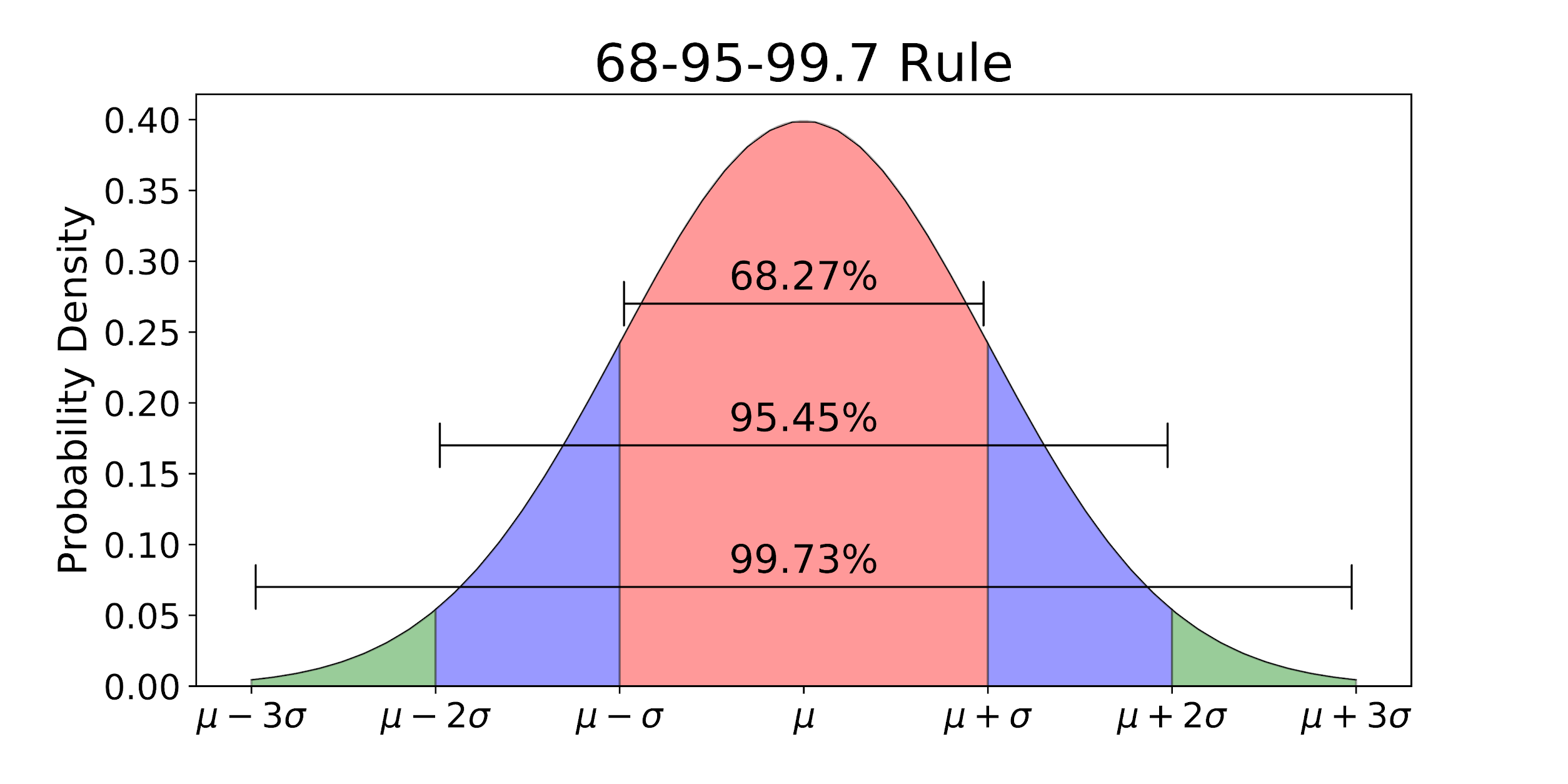
It can sometimes be useful to think of this in terms of only one half of the curve:
About 34% of the area is between 0 and 1.
About 47.5% of the area is between 0 and 2.
About 49.4% of the area is between 0 and 3.
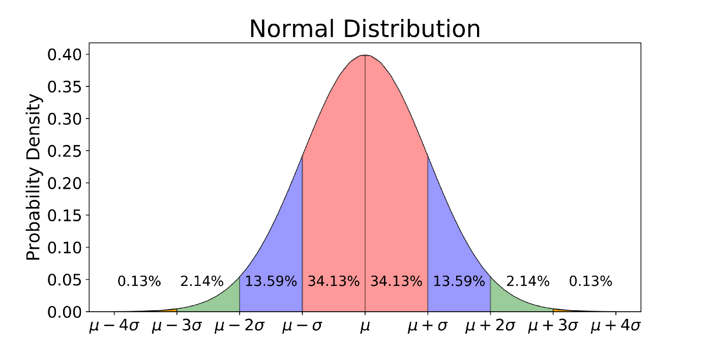
Or, we can think about the tails of the distribution:
About 16% of the area is above 1.
About 2.5% of the area is above 2.
About 0.1% of the area is above 3.
In our example studying varieties of Mexican coffees, we found a z-score of 1.56. This is somewhere between 1 (p-value = 0.16) and 2 (p-value = 0.025) standard deviations from the mean. We therefore might “guesstimate” that our p-value will be something around 0.05 to 0.1 - and indeed, since our exact p-value is 0.059, this guessing strategy would do pretty well!
14.4 Confidence Intervals
Let’s now flip the script on how we think about the Normal Distribution and the CLT. Instead of thinking about what values of a statistic the null distribution would be likely to produce, lets think about what values of the paraemter we might believe could be true if we observe a particular statistic.
The Empirical Rule tells us that 95% of the area under the curve is between +2 and -2 standard deviations from the true mean. This tells us that there is a 95% chance that the statistic we observe, for any given sample we might collect, will fall within 2 standard deviations of the true parameter.
In our study of the Typica type coffee, we found a sample proportion of \hat{p} = 0.57.
We estimate that the standard deviation of this sample proportion is
S_{\hat{p}_{null}} = \sqrt{\frac{0.57*(1-0.57}{117}} = 0.045 We believe that this observed statistic is probably not more than 2 standard deviations above the true proportion, \pi. That is, we are 95% confident that, whatever \pi may be equal to,
\hat{p} < \pi + 2*S_{\hat{p}} Moving that equation around, we get:
\pi > \hat{p} - 2*S_{\hat{p}}
Therefore, the smallest \pi that we believe (at the 95% confidence level) could have produced the data we saw is:
0.57 - 2*0.045 = 0.48
Similarly, the largest \pi that we believe (at the 95% confidence level) could have produced the data we saw is:
0.57 + 2*0.045 = 0.66
Therefore, our 95% confidence interval for \pi is (0.48, 0.66).
Previously, we called this the reasonable range. Why is it reasonable? Because 95% of the samples we could take will lead to a range that contains the true \pi!
Of course, as with hypothesis tests, there is always the chance that we just got unlucky and got a more extreme sample. In this case, there is a 5% chance that we could get a \hat{p} of 0.57 from data with a true \pi outside the range (0.48, 0.66). We can never know for sure what \pi our data came from!
But if we want to be more confident, we can simply change the confidence level
What would be an approximate 99% confidence interval for \pi? That’s right, about 3 standard deviations away from \hat{p}!
0.57 + 3*0.045 = 0.705 0.57 - 3*0.045 = 0.435
Our new interval is (0.435, 0.705) is wider than the 95% confidence one. This should make sense: the more guesses we allow ourselves to make, the more confident we are that one of them will be right. It’s a trade-off, though; believing that our true percent of Typica coffees is between 43.5% and 80.5% is less precise information than believing it’s between 48% and 66%.
In all statistical analyses, we need to balance our certainty with the strength of our claim: the more specific of a claim we make about the parameter, the less sure we can be that it is correct!
Warning
Remember that the thing that is random in this scenario is the value of \hat{p}. We calculate one number from our data, but we could have calculated a different number if we had taken a different random sample.
Therefore, we want to be careful not to say “There is a 95% chance that \pi will be between 0.48 and 0.66.” \pi is just one, fixed, unknown number. Instead, we would say:
“I am 95% confident that \pi is between 0.48 and 0.66.”
or
“There is a 95% chance that the interval 0.48 to 0.66 contains the true value of \pi.”
14.5 Generative models
We have just learned that if one takes many samples and finds the sample mean (or proportion or correlation) of each, the histogram of resulting values is approximately Bell Curve shape.
In real life, though, we don’t have the luxury of collecting samples over and over. We collect one single sample of many observations - one dataset - and we calculate one summary statistic and standardized statistic to address a research question.
What do we mean, then, when we say that a z-score follows a Standard Normal Distribution, when there is only one z-score we can calculate?
The answer is that we assume a statistic model for the world: a process by which we believe the data was generated.
14.5.1 Probabilities of categories
Take, for example, our study of the percentage of Mexican coffees that are Typica variety. Our null hypothesis was that the true percentage is 50%, i.e.,
H_0: \pi = 0.5
Instead of thinking of \pi, our parameter, as a mysterious truth description, let’s think of it as way of describing a process. When a new Mexican coffee is created, which variety will the creator choose to use? The null hypothesis says that the creator will, in essence, “flip a coin” - there is a 50% chance that they will make a Typica coffee, and a 50% chance that they will not. That is, the value \pi = 0.5 determines the generative process for each new coffee.
Thinking of our parameters in this way allows us to ask: Is it more likely that our observed data was generated from the null process, or from a process in the alternate hypothesis?
In the data, we observed that 57% of Mexican coffees in our dataset were Typica variety. There are two explanations for this number:
The true probability of Typica is 50%; we simply happened to “flip more coins” for Typica when this data was generated.
The true probability of Typica is more than 50%, and that’s why more than half the generated data was Typica.
We might visualize this generative scenario like this:
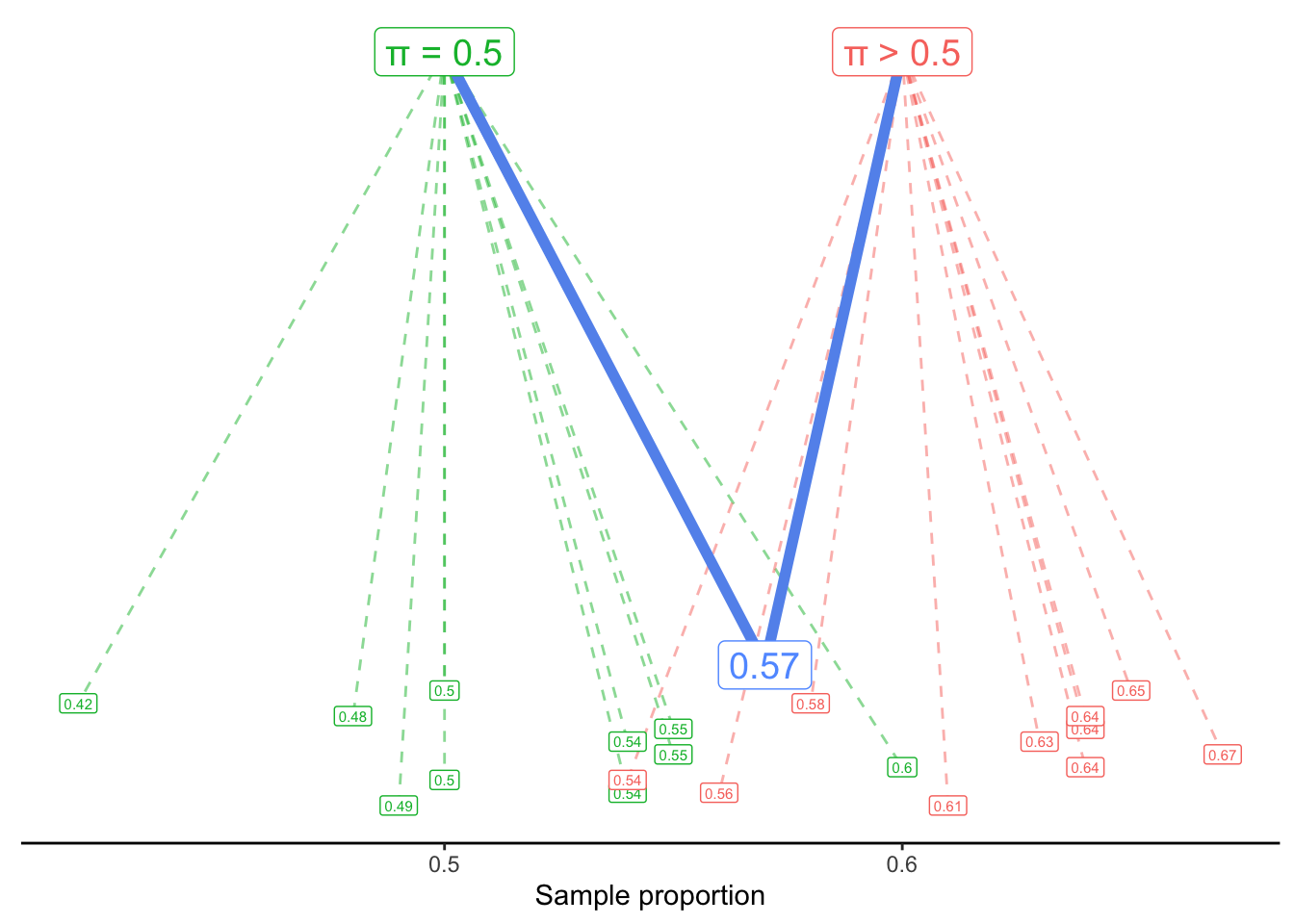
A process with \pi = 0.5 usually generates sample proportions around 0.5 - but sometimes it randomly generates proportions as low as 0.42 or as high as 0.6. Similarly, a process with a value of \pi larger than 0.5 tends to generate larger values - but it could also generate values like 0.54 or 0.56.
Our question, then, is: Would it be reasonable to think that our observed proportion, 0.57, came from the \pi = 0.5 process? Or is that so unlikely to happen, that we should instead assume it came from an alternate process with \pi > 0.5?
Note that we are not asking which process is more likely to generate 0.57. Of course, the process most likely to generate a sample proportion of 0.57 would be \pi = 0.57. Instead, we are asking if the proposal of \pi = 0.5 is plausible or not. If it is found to be implausible, only then are we comfortable rejecting the null hypothesis in favor of the alternate.
14.5.2 Quantitative variables and Sum of Squared Error
Thinking about generative models for a categorical variable is reasonably straightforward: we can imagine, for example, flipping a fair coin (with a 50% chance of heads) 121 times to see what sample proportion is generated.
But what about when our variable of interest is quantitative? For example, let’s ask the question:
What is the true mean Flavor score of coffees from Latin America?
How can we frame this question as a generative model? We assume that the Flavor score of a particular coffee is generated by adding random noise to a true mean.
In symbols, we write that as:
y_i \sim \mu + \epsilon_i
The symbol ~ is called “tilde”, and it can be read as “is generated by” or “is distributed as”. This equation says that the Flavor score of a particular coffee (y_i) is generated by starting with the true mean (\mu) and then adding a random amount \epsilon_i. The random error is centered at 0 but might be positive or negative; that is, we might see a Flavor score slightly above or slightly below the true mean, just by chance.
Our question, then, is what value of \mu probably generated the y_i’s that we observe in our dataset?
14.5.3 Least-Squares Estimation
In the following visualizations, we plot on the y-axis the Flavor score for each of our coffees. (The x-axis is meaningless; it is simply the order the coffees happen to appear in the dataset.)
In the first plot, we draw a horizontal line at 7.2. The vertical lines show the errors (\epsilon_i) for each observed flavor score (y_i), if the true mean were in fact 7.2. We sometimes call these vertical lines the residuals. They might be positive (above the horizontal line) or negative (below it).
In the second plot, our horizontal line is at 7.8. In the third plot, it is drawn at 7.47 - which is the sample mean of the Flavor variable in this dataset.
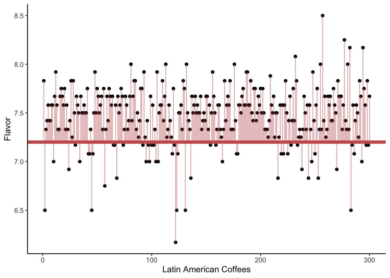
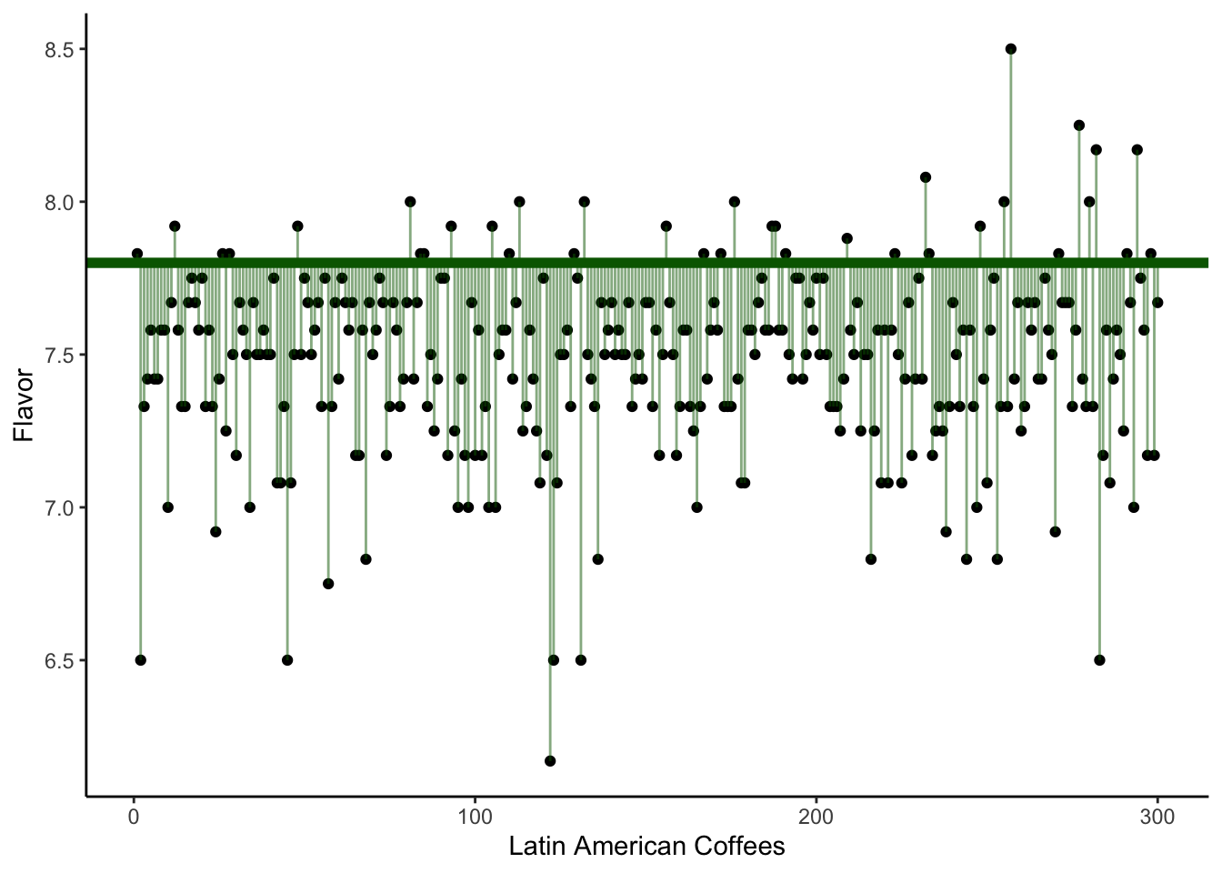
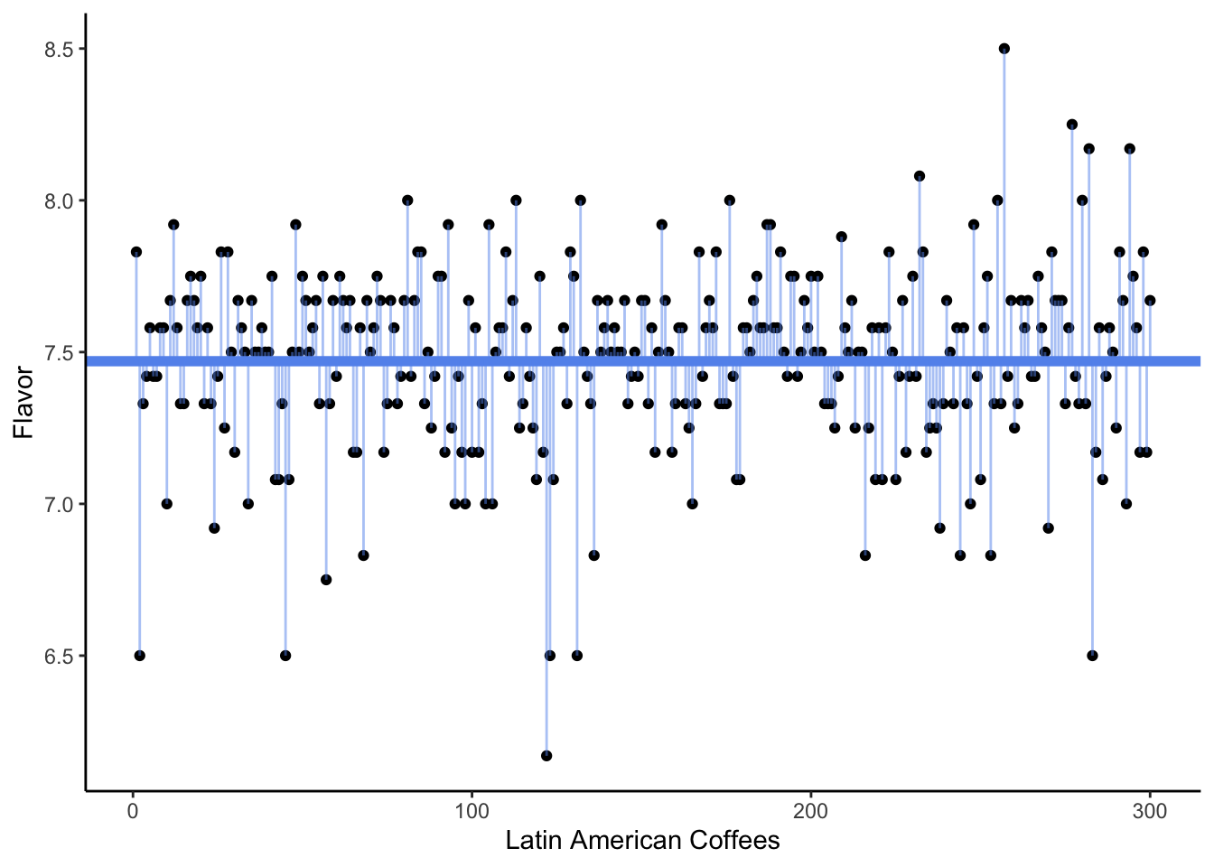
Which of the three plots seems to show the smallest average squared error? That is, we are interested in getting small distances (the square of the residuals) between the observed Flavor scores and the proposed mean \mu. Which possible value of \mu gave the smallest sum of distances?
The answer, of course, is the third plot - the one where the horizontal line is drawn at the sample mean.
We often say that the sample mean is the best guess for the true mean. What do we mean by “best”? Typically, we choose an estimate that would give us the smallest sum of squared error (SSE) or smallest sum of squared residuals (SSR). This is sometimes called the least-squares estimate.
14.5.4 Null and Alternate models
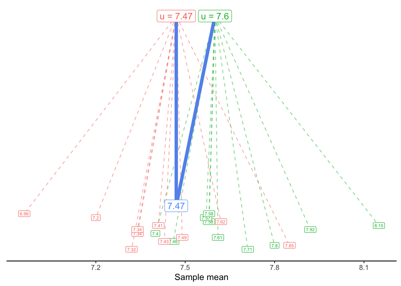
Although the sample mean, 7.47, was our best estimate based on the data we see, we know that it is probably not the exact true mean. Instead of asking “What is our best guess for the true mean?”, perhaps we want to ask “What is a reasonable guess for the true mean?”. For example, would 7.5 be a reasonable guess? 7.6? 7.7?
Once again, we turn to our generative model. We can now proposed a possible truth, i.e., a null hypothesis, in the context of a model:
Null model: y_i \sim 7.6 + \epsilon_i
Alternate model: y_i \sim \bar{y} + \epsilon_i
Or, in this specific data,
y_i \sim 7.47 + \epsilon_i
We can visualize these two generative models as follows: