16 Generative models
Generative statistical models
“Have you ever wondered if there was more to life other than being really, really, ridiculously good looking?”
– Derek Zoolander, model
In the previous chapter, we learned that if one takes many samples and finds the sample mean of each, the histogram of resulting values is approximately Bell Curve shape.
In real life, though, we don’t have the luxury of collecting samples over and over. We collect on single sample of many observations - one dataset - and we calculate one summary statistic and standardized statistic to address a research question.
What do we mean, then, when we say that a standardized statistic follows a Standard Normal Distribution, when there is only one standardized statistic to work with?
The answer is that we assume a statistical model for the world: a process by which we believe the data was generated.
Take, for example, our study of the percentage of Mexican coffees that are Typica variety. Our null hypothesis was that the true percentage is 50%, i.e.,
H_0: \pi = 0.5 Instead of thinking of \pi, our parameter, as a summary description, let’s think of it as input to a process. When a new Mexican coffee is created, which variety will the creator choose to use? The null hypothesis says that the creator will, in essence, “flip a coin” - there is a 50% chance that they will make a Typica coffee, and a 50% chance that they will not. That is, the value \pi = 0.5 determines the generative process for each new coffee.
Thinking of our parameters in this way allows us to ask: Is it more likely that our observed data was generated from the null universe, or from the universe of the alternate hypothesis?
For example, we observed that 57% of Mexican coffees in our dataset were Typica variety. There are two explanations for this number:
The true percentage of Typica is 50%; we simply happened to sample more of them in this particular dataset.
The true percentage of Typica is more than 50%.
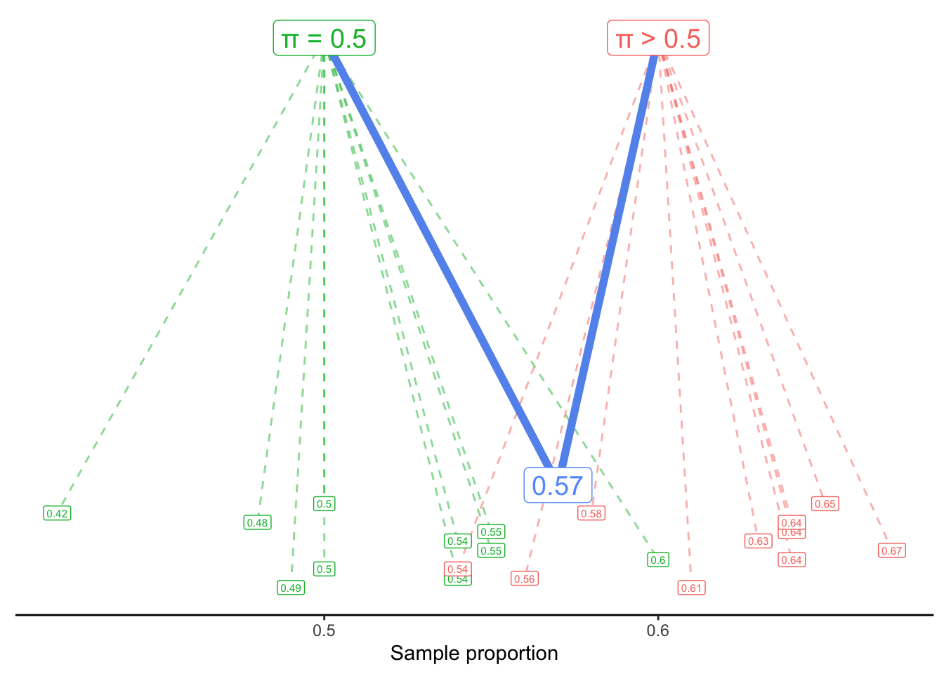
We might visualize this generative scenario like this:
A process with \pi = 0.5 usually generates sample proportions around 0.5 - but sometimes it generates proportions as low as 0.42 or as high as 0.6. Similarly, a process with a value of \pi larger than 0.5 tends to generate larger values - but it could also generate values like 0.54 or 0.56.
Our question, then, is: Would it be reasonable to think that our observed proportion, 0.57, came from the \pi = 0.5 process? Or is that so unlikely to happen, that we should instead assume it came from an alternate process with \pi > 0.5?
Note that we are not asking which process is more likely to generate 0.57. Of course, the process most likely to generate a sample proportion of 0.57 would be \pi = 0.57. Instead, we are asking if the proposal of \pi = 0.5 is plausible or not. If it is found to be implausible, only then are we comfortable rejecting the null hypothesis in favor of the alternate.
16.1 Sum of Squared Error
Thinking about generative models for a categorical variable is reasonably straightforward: we can imagine, for example, flipping a fair coin (with a 50% chance of heads) 121 times to see what sample proportion is generated.
But what about when our variable of interest is quantitative? For example, let’s ask the question:
What is the true mean Flavor score of coffees from Latin America?
How can we frame this question as a generative model? We assume that the Flavor score of a particular coffee is generated by adding random noise to a true mean.
In symbols, we write that as:
y_i \sim \mu + \epsilon_i
The symbol ~ is called “tilde”, and it can be read as “is generated by” or “is distributed as”. This equation says that the Flavor score of a particular coffee (y_i) is generated by starting with the true mean (\mu) and then adding a random error value \epsilon_i. The random error is centered at 0 but might be positive or negative; that is, we might see a Flavor score slightly above or slightly below the true mean, just by chance.
Our question, then, is what value of \mu probably generated the y_i’s - the observed Flavor scores - that we saw in our dataset?
16.1.1 Least-Squares Estimation
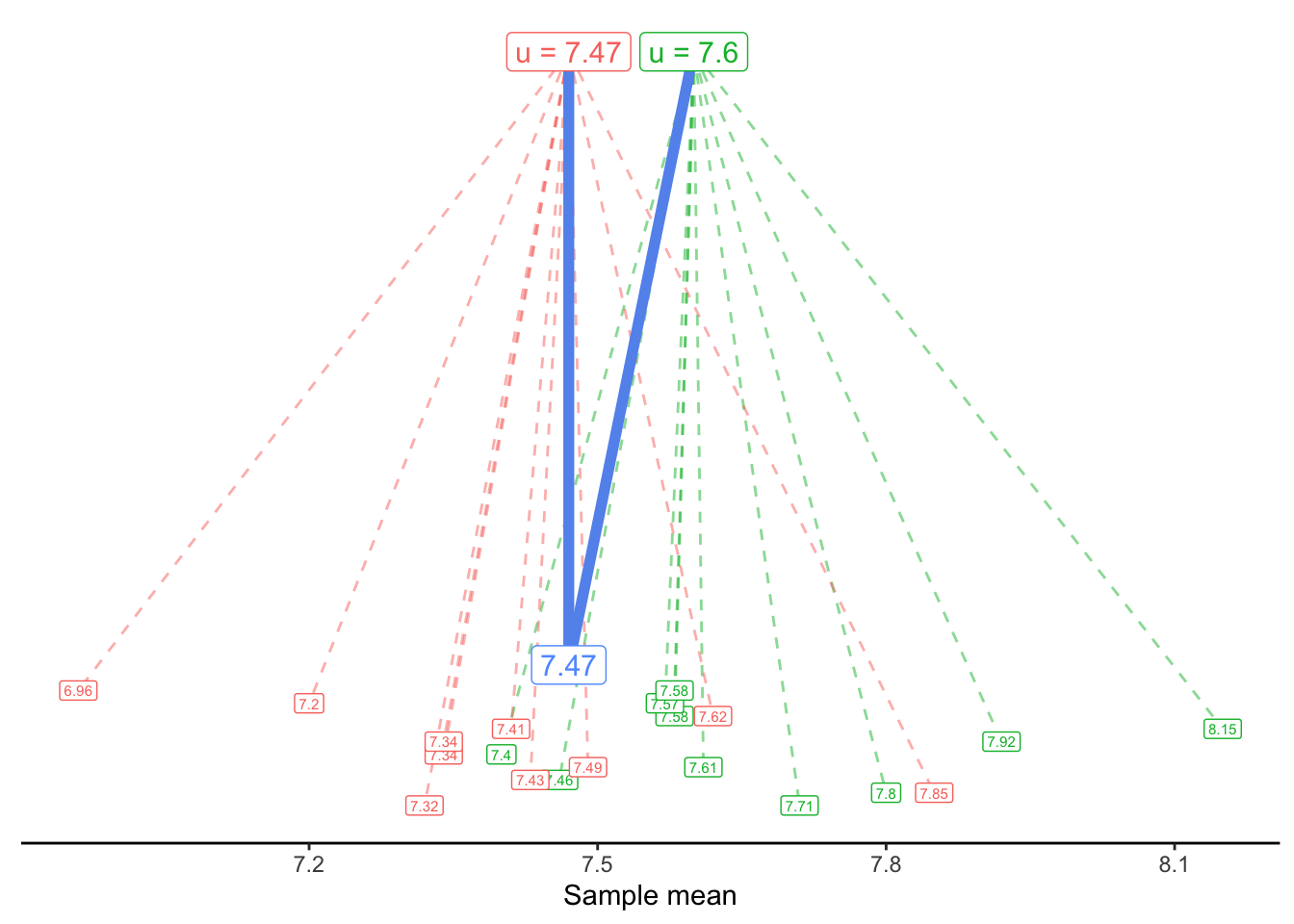
In the following visualizations, we plot on the y-axis the Flavor score for each of our coffees. (The x-axis is meaningless; it is simply the order the coffees happen to appear in the dataset.)
In the first plot, we draw a horizontal line at 7.2. The vertical lines show the errors (\epsilon_i) for each observed flavor score (y_i), if the true mean were in fact 7.2. We sometimes call these vertical lines the residuals. They might be positive (above the horizontal line) or negative (below it).
In the second plot, our horizontal line is at 7.8. In the third plot, it is drawn at 7.47 - which is the sample mean of the Flavor variable in this dataset.
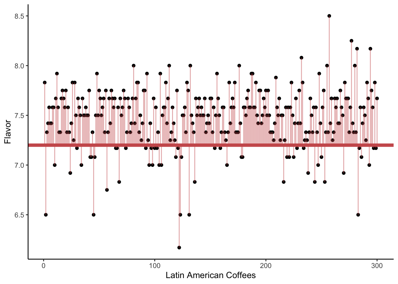
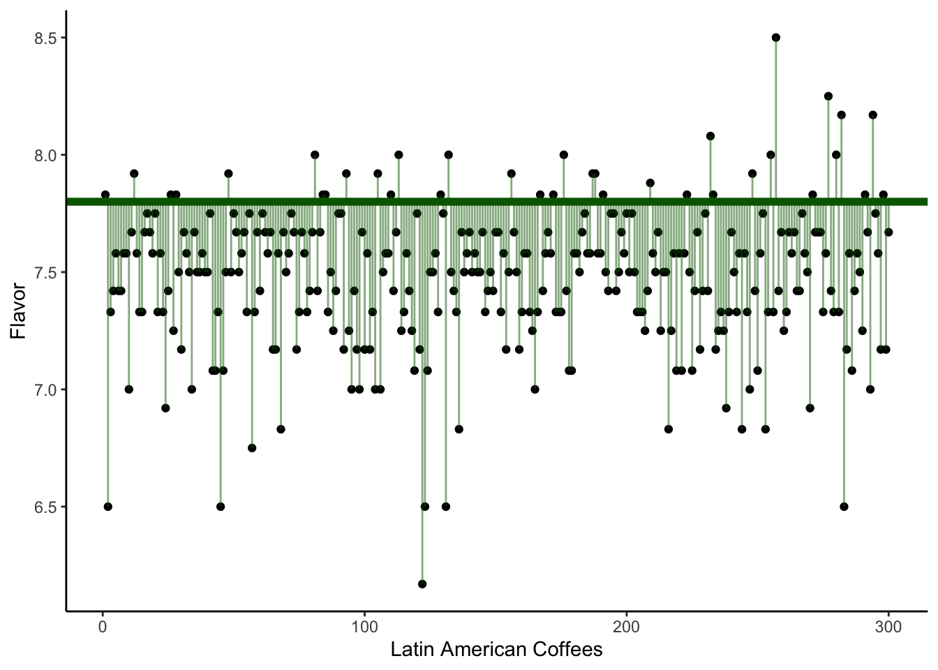
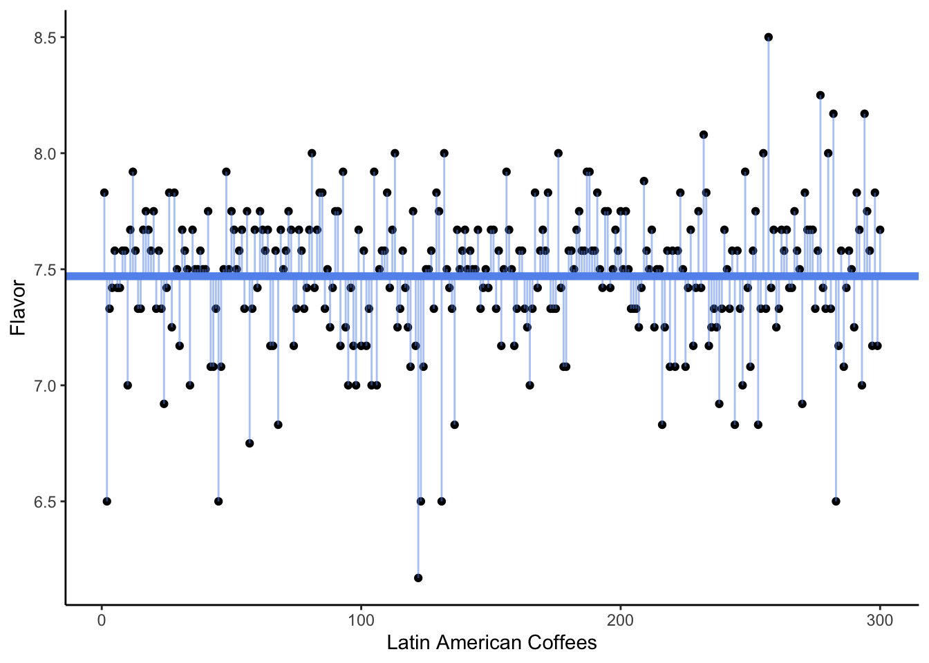
Which of the three plots seems to show the smallest average squared error? That is, we are interested in getting small distances between the observed Flavor scores and the assumed mean \mu, i.e., the square of the residuals. Which possible value of \mu gave the smallest sum of distances?
The answer, of course, is the third plot - the one where the horizontal line is drawn at the sample mean.
We often say that the sample mean is the best guess for the true mean. What do we mean by “best”? Typically, we choose an estimate that would give us the smallest sum of squared error (SSE) or smallest sum of squared residuals (SSR). This is sometimes called the least-squares estimate.
16.1.2 Null and Alternate models
Although the sample mean, 7.47, was our best estimate based on the data we see, we know that it is probably not the exact true mean. Instead of asking “What is our best guess for the true mean?”, perhaps we want to ask “What is a reasonable guess for the true mean?”. For example, would 7.5 be a reasonable guess? 7.6? 7.7?
Once again, we turn to our generative model. We can now proposed a possible truth, i.e., a null hypothesis, in the context of a model:
Null model: y_i \sim 7.6 + \epsilon_i
Alternate model: y_i \sim \bar{y} + \epsilon_i Or, in this specific data,
y_i \sim 7.47 + \epsilon_i
We can visualize these two generative models as follows:
16.2 ANOVA
16.2.1 R-squared
In the above analysis, we should not be surprised to see that the smallest SSE comes from the alternate model, where \mu = \bar{y} = 7.47. But how much more error is there if we instead use the null model, with \mu = 7.6? That is, what is the reduction in error between our proposed guess of 7.6 and our “best” guess of 7.47?
We measure this reduction in error with a test statistic called the R-squared. It is measured by
R^2 = 1 - \frac{\text{Total Squared Error from Alternate Model}}{\text{Total Squared Error from Null Model}}
Remember that the null model will always have more error! The alternate model is always better - the question we want to ask is whether it is enough better for us to justify choosing it over the null.
If the R-squared value is very close to 1, this tells us that the “best” model - the alternate model - results in much smaller error. That is, it tells us that the ratio of alternate error divided by null error is close to 0. This suggests that the null model is not a great explanation of the data generation process, compared to the best alternative explanation!
If the R-squared value is not too far from 0, this tells us that the null and alternate models have nearly the same total squared error. If both models are nearly equally good explanations, we are forced to stick with the null.
16.2.2 p-values from F-Statistics
So far, we have conducted hypothesis tests by following these steps:
- State the hypotheses.
- Calculate a test statistic (z-score).
- Find the p-value from the test statistic (using the Bell Curve trick).
We have now proposed a different way of measuring our evidence. Instead of the z-score, we can compute an R-Squared. Now, we would like to also use the R-Squared value to get a p-value. In other words, we ask the usual question:
If the null hypothesis were true, how often would we get an R-Squared like the one we saw, or bigger, just by luck?
Now, since the R-Squared value does not directly involve sample means, it not follow a Bell Curve shape. Fortunately, with a little bit of tweaking, we can turn it into a test statistic that does follow a “known” shape - that is, mathematicians have been able to write down an equation to find the area under the curve. This tweaked statisic is called an F-statistic.
We can get the F-statistic from the R-squared value like this:
F = \frac{R^2}{1- R^2}*\frac{df_{alt}}{df_{null}}
In this equation, df_{alt} and df_{null} refer to the degrees of freedom in the alternate model. This is a measurement that is related to the sample size and properties of the model - it isn’t something we need to worry about calculating or interpreting, but the general idea is that if we have larger sample sizes, our F-statistic will be larger.
Realistically, we’ll never use this equation - a computer will always calculate the R-squared and F-stat for us! So why does the F-stat even exist? Well, ultimately we want to be able to answer the question,
If the null hypothesis were true, how often would we get an F-Statistic like the one we saw, or bigger, just by luck?
Neither the R-Squared nor the F-Stat follow a Bell Curve, but fortunately, the F-Stat does follow a shape that is known to mathematicians, called the F Distribution. (Not so creative with their names, these mathematical statisticians…)
We could try to learn some “Empirical Rules” about the F Distribution, like we did for the Normal Distribution, but this isn’t really necessary. Instead, we’ll rely on computers to calculate p-values.
Let’s return to our question:
Is the true mean flavor score equal to 7.6?
Adding up all the squared errors for the model y_i \sim 7.6 + \epsilon_i gives us
\text{SSE}_{null} = 33.49
Adding up all the squared errors for the model y_i \sim 7.47 + \epsilon_i gives us
\text{SSE}_{alternate} = 28.59
Therefore, the reduction in variance we get by using the alternate model instead of the null model is
\frac{33.49}{28.59} = 0.85
This ratio is smaller than 1 - that is, the error in our alternate model is 85% the size of the error in the null model - but is it enough smaller than 1 for us to be willing to reject the null in favor of the alternate?
Our R-Squared value is
R^2 = 1 - 0.85 = 0.15
This tells us that 15% of the error in the null model goes away when we switch to the alternate model.
We use the computer to find an F-stat of 52.7647059. This F-Stat is very large: although our R-Squared was not very close to 1, because we have such a large sample size (300 coffees), we are extremely convinced that the null model is worse.
The probability that this F stat occurs by chance, from data generated by the null model of y_i \sim 7.6 + \epsilon_i, is
\text{p-value} = 3.2809311\times 10^{-12} Essentially, a p-value of 0.
We conclude:
If the null model is true, there is a 0% chance of seeing an F-stat of 52.7647059 or more, just by chance. Therefore, we reject the null. We found very strong evidence against the hypothesis that the true mean Flavor score is 7.6.
Because this test used reduction in variance to measure the plausibility of the null hypothesis (rather than a standardized score), we call it an Analysis of Variance test, or ANOVA for short.
16.3 Comparing means across categories
In the previous section, we tested the null hypothesis that the true mean Flavor score was 7.6. Realistically, though, we rarely have a specific number in mind that we need to test. More often, we want to compare categories, and discover if they are meaningfully different.
Let’s see how to set this up in a generative modeling context.
16.3.1 Two Categories
Recall from Chapter 3.2 that we asked the research question
Does Mexico or Guatemala receive higher ratings for their coffee?
We addressed this question by testing the null hypothesis:
H_0: \mu_M = \mu_G
versus the alternate hypothesis
H_a: \mu_M \neq \mu_G.
From a generative modeling perspective, we can express this as two possible options for the production of coffees:
Null: Mexican and Guatemalan coffee scores are generated the same true mean.
That is, the i-th observed coffee score is simply some true mean plus random error, regardless of whetehr that coffee is from Mexico or Guatemala:
y_i \sim \mu + \epsilon_i
Alternate: Mexican and Guatemalan coffee scores are generated from different true means.
To write this model in symbols, we’ll need to learn one more symbol:
I_M = 1 \text{ if the coffee is from Mexico} I_M = 0 \text{ if the coffee is from Guatemala}
In statistics, we call the symbol I_M an indicator, because it indicates if the observation is in a particular category.
You can also simply think of this as representing a dummy variable column - a column where the values are 1 when the coffee is Mexican and 0 otherwise.
# A tibble: 5 × 4
  Country.of.Origin Indicator_Mexico Indicator_Guatemala Total.Cup.Points
  <chr>                        <int>               <int>            <dbl>
1 Guatemala                        0                   1             80.2
2 Mexico                           1                   0             80.8
3 Guatemala                        0                   1             82.8
4 Colombia                         0                   0             82.4
5 Mexico                           1                   0             83.1
With this symbol in hand, we can then write our generative model:
y_i \sim \mu_M \; I_{M} + \mu_G \; I_{G} + \epsilon_i
If the coffee in the i-th row is from Mexico, then I_{M, i} = 1 and I_{G, i} = 0, so this equation becomes:
y_i \sim \mu_M + \epsilon_i
If the coffee in the i-th row is from Guatemala, then the equation becomes:
y_i \sim \mu_G + \epsilon_i
In other words, we are assuming that Mexican and Guatemalan coffees are generated from models with different true means, \mu_M and \mu_G.
16.3.1.1 Sum of Squared Error
As in our simple model from Chapter 3.3, we will compare these models by looking at the reduction in variance that we get by using the alternate model.
If we assume the null model, all our observations come from the same true mean, \mu. Our best guess about this true mean value is simply the sample mean of all the scores of all the Mexican and Guatemalan coffees, \bar{y} = 81.43. We then can find the sum of squared error from our observed values to this line:
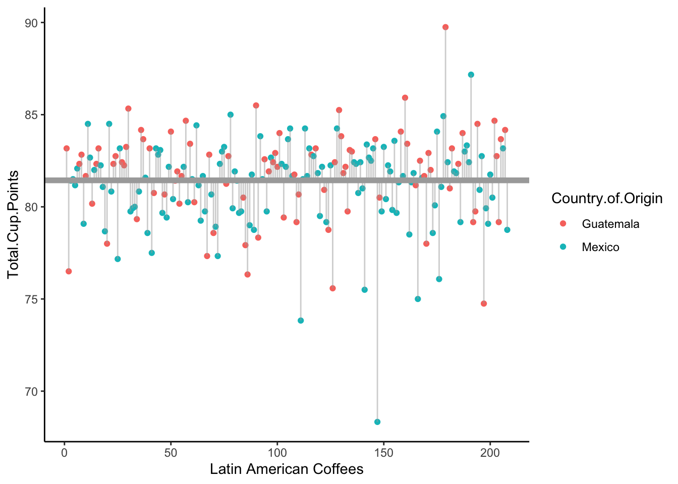
This turns out to be
SSE_{null} = 1246.87.
Now, under the alternative model, we have separate means for the Mexican and Guatemalan coffee scores, \mu_M and \mu_G. Our best guess for these is, of course, the sample means in each category:
\bar{y}_M = 81.17 \bar{y}_G = 81.81
Let’s rearrange the observed coffee scores to put the Mexican coffees and Guatemalan coffees together:
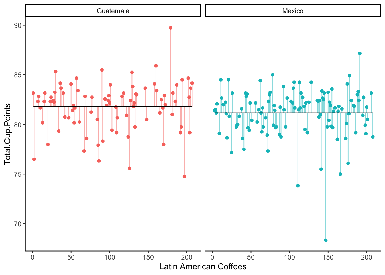
Does splitting the coffees up by country of origin lead to smaller error?
# A tibble: 2 × 2
  Country.of.Origin   sse
  <chr>             <dbl>
1 Guatemala          520.
2 Mexico             706.
SSE_{alt} = SSE_{G} + SSE_{M} = 520 + 706 = 1226
Therefore, the ratio of our errors is:
\frac{SSE_{alt}}{SSE_{null}} = \frac{1226}{1246} = 0.98.
Yikes - our alternate model didn’t have much less error than our null model. Perhaps it’s not worth the effort to treat Mexico and Guatemala as having different mean coffee scores.
The R-squared value is:
R^2 = 1 - 0.98 = 0.02.
This tells us that the alternate model explained 2% more of the error than the null model.
16.3.2 ANOVA F-Test and P-values
This R^2 is very small, but the question we need to ask is whether it is significantly different from R^2 = 0? That is, do we have evidence against the null hypothesis (\mu_M = \mu_G), even if the difference is small? Or could this R^2 have happened by chance?
To answer this, we run an ANOVA F-Test. We get an F-Statistic of 3.5, and a p-value of 0.06.
So, we didn’t quite clear our typical 0.05 threshold, but we were close! That is, although the alternate model is only slightly better than the null model, we may have found weak evidence that they are not the same.
In the context of modeling, we might say that the alternate model is a weakly better fit to the data than the null model.
16.3.3 More than two categories
You are probably wondering why we are going to all this trouble, when we already know how to do a hypothesis test to compare two mean values.
What if we want to examine all three countries of origin: Mexico, Guatemala, and Colombia? We can still state our null and alternate hypotheses:
H_0: \text{The true mean score of coffees is the same in all three countries.}
vs
H_a: \text{The true mean score of coffees is not the same in all three countries.}
But how can we test this with a z-score? We can’t study a difference of means, because we have three differences to compute: Mexico vs. Guatemala, Mexico vs. Colombia, and Colombia vs. Mexico.
However, if we take the generative model approach, this is easy!
Our null model is still that all the countries come from the same true mean:
y_i \sim \mu + \epsilon_i
Our alternate model is that the three countries each have a different mean:
y_i \sim \mu_M \; I_{M} + \mu_G \; I_{G} + \mu_C \; I_{C} + \epsilon_i Consider the following computer output for running an ANOVA test on these models:
Call:
lm(formula = Total.Cup.Points ~ Country.of.Origin, data = dat)

Residuals:
     Min       1Q   Median       3Q      Max
-12.8382  -1.0671   0.3318   1.2563   7.9399

Coefficients:
                           Estimate Std. Error t value Pr(>|t|)
(Intercept)                 81.1682     0.2025 400.911  < 2e-16 ***
Country.of.OriginGuatemala   0.6419     0.3130   2.051   0.0412 *
Country.of.OriginColombia    1.7629     0.3081   5.723 2.56e-08 ***
---
Signif. codes:  0 '***' 0.001 '**' 0.01 '*' 0.05 '.' 0.1 ' ' 1

Residual standard error: 2.227 on 297 degrees of freedom
Multiple R-squared:  0.0998,    Adjusted R-squared:  0.09374
F-statistic: 16.46 on 2 and 297 DF,  p-value: 1.657e-07
By default, the computer will choose one category to be the “Baseline” - in this case, we are using “Mexico” as the base. We can see that the sample mean score of Mexican coffees was 81.17.
Compared to Mexican coffees, the Guatemalan coffees were 0.64 points higher on average; that is, the sample mean for Guatemalan coffees was 81.17 + 0.64 = 81.81. In terms of our original hypothesis testing approach, we saw a difference of sample means, \bar{x}_M - \bar{x}_G = 0.64.
Compared to Mexican coffees, the Colombian coffees were 1.76 points higher on average; that is, the sample mean for Colombian coffees was 81.17 + 1.76 = 82.93.
In the output, we see an R-Squared value of 0.099, so 9.9% of the variance is reduced when we use the alternate model. We see an F-stat of 23.16, which leads to a p-value of about 0.
We conclude that we found strong evidence that not all the means are equal!