species | island | bill_length_mm | bill_depth_mm | flipper_length_mm | body_mass_g | sex | year |
|---|---|---|---|---|---|---|---|
Gentoo | Biscoe | 45.3 | 13.7 | 210 | 4300 | female | 2008 |
Adelie | Biscoe | 37.6 | 19.1 | 194 | 3750 | male | 2008 |
Gentoo | Biscoe | 47.5 | 14.2 | 209 | 4600 | female | 2008 |
Gentoo | Biscoe | 50.1 | 15.0 | 225 | 5000 | male | 2008 |
Gentoo | Biscoe | 46.8 | 14.3 | 215 | 4850 | female | 2009 |
Chinstrap | Dream | 50.9 | 17.9 | 196 | 3675 | female | 2009 |
Adelie | Dream | 37.0 | 16.5 | 185 | 3400 | female | 2009 |
Chinstrap | Dream | 42.5 | 17.3 | 187 | 3350 | female | 2009 |
Gentoo | Biscoe | 46.5 | 14.8 | 217 | 5200 | female | 2008 |
Gentoo | Biscoe | 46.2 | 14.9 | 221 | 5300 | male | 2008 |
3 Visual summaries of categorical variables
Answering research questions with visualization
Seeing is believing and believing is knowing and knowing beats unknowing and the unknown.
Philip Roth
It has been said that the best data analyses are the ones that require no analysis, because the graphical presentation of the data is so compelling. Thus far, we have learned to identify variables in a dataset, and to answer research questions about them using appropriate summary statistics. Now, let’s get started on one of the most important ways of communicating data results: data visualization.
For this chapter, we will study a famous dataset called palmerpenguins, which contains information about 344 penguins studied in the Palmer Archipelago region. A few rows of this dataset are shown below.
The first visualization we create when we begin a data analysis are usually exploratory: rather than answering a specific research question, our goal is to get a sense of the patterns and trends in our variables.
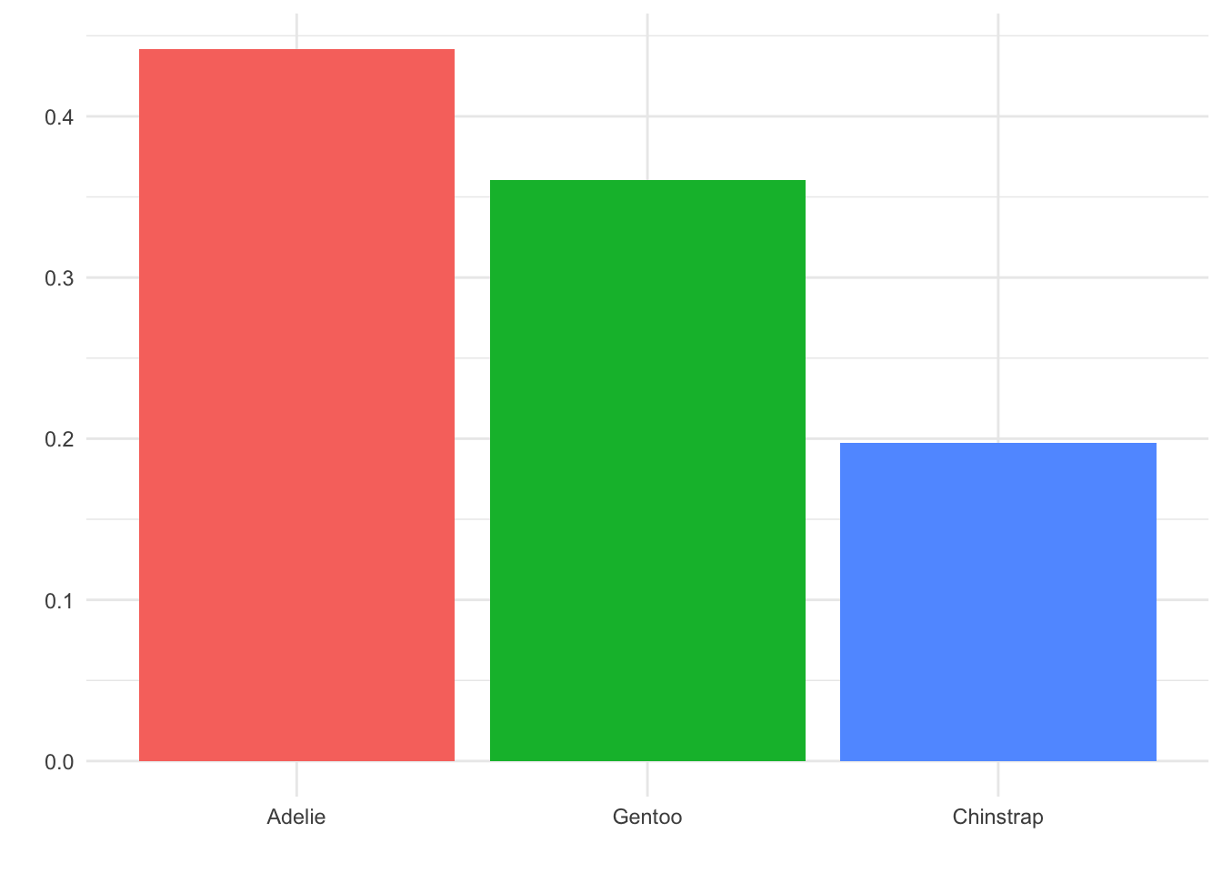
In the palmerpenguins dataset, we have three categorical variables: species, island, and sex. Recall from Chapter 1.2 that we would summarize these numerically by finding the counts and percentages for each category. Let’s begin with the species variable:
species | n | percent |
|---|---|---|
Adelie | 152 | 0.4418605 |
Chinstrap | 68 | 0.1976744 |
Gentoo | 124 | 0.3604651 |
It is fairly easily see from this table that Adelie is the most common species in our dataset, followed by Gentoo, and then Chinstrap. However, although these summaries are relatively succinct, it did take a little effort on our part to read and interpret the table.
Let’s present these data summaries visually instead. We will make a bar plot, where the height of each bar indicates how many of our observations fell into the corresponding category:
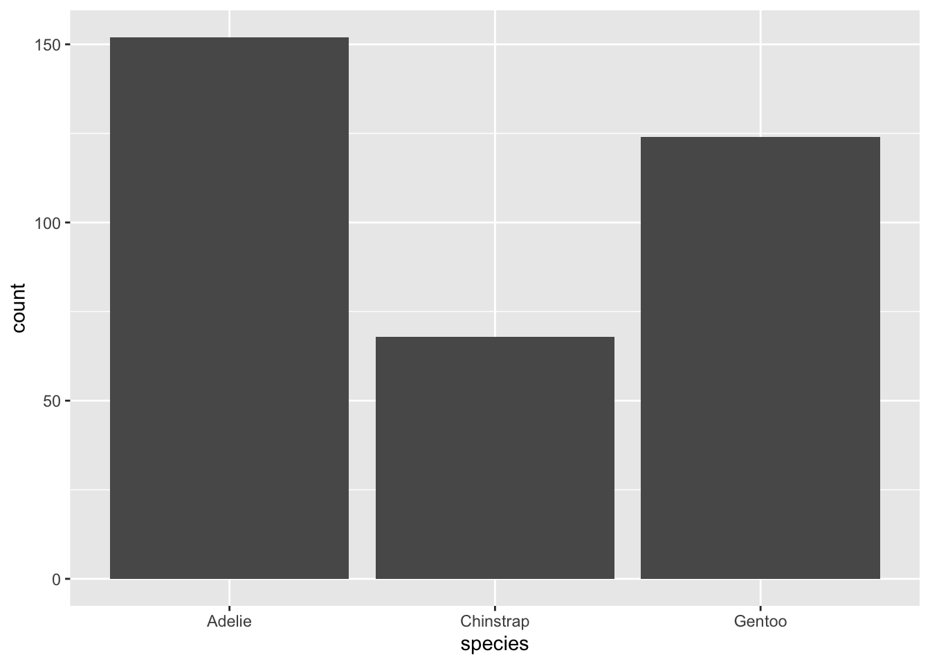
That’s more like it! The idea that Adelie is more frequently represented in this data than Gentoo and Chinstrap jumps out to us right away.
3.0.1 Improving bar plots
There are a few ways make this visual more compelling to a reader, though. First, recall that the count is usually not very useful as a summary statistic, since it depends on the size of the sample represented in our dataset. If I say to you, “152 penguins in this dataset are the Adelie species,” does that mean much to you? Probably not. But if I say “44% of penguins in this data are Adelie,” you immediately have a sense of the proportion of the sample of penguins taken up by this category. Thus, we’d like to change the y-axis (the vertical part of the plot) to represent percents instead of counts.
Another way to upgrade our plot is to think carefully about the order of the levels in this categorical variable. Right now, the order is shown as Adelie, Chinstrap, Gentoo. Why do you think that order might have been chosen? If you guessed “alphabetical order”, you’re right!
Now, do we think that alphabetical order matters in this data? Of course not. These are simply names given to species; the letters have no inherent meaning. Perhaps instead, we can put them in order from most common to least common:
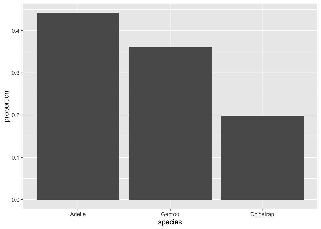
Now we have a clear picture of which species are most common, how much more common they are than the next one, and what percent of the whole sample they represent!
3.0.1.1 Try it!
On a piece of paper, sketch a bar plot for the island and sex variables, which are summarized for you below:
Island:
island | n | percent |
|---|---|---|
Biscoe | 168 | 0.4883721 |
Dream | 124 | 0.3604651 |
Torgersen | 52 | 0.1511628 |
Sex:
sex | n | percent | valid_percent |
|---|---|---|---|
female | 165 | 0.47965116 | 0.4954955 |
male | 168 | 0.48837209 | 0.5045045 |
11 | 0.03197674 |
3.1 Principles of visualization
Our barplot of the penguin species certainly contains all the relevant information for summarizing the variable. However, we always want to be thinking of ways to make our visual even more clear, attractive, and easy to interpret.
Although there is no official set of rules for making the “best” visual, there are a few principles that are generally agreed upon by data scientists:
3.1.0.1 Use color only when it’s meaningful
Using color in a plot can make it more eye-catching to a reader. However, using color for no reason can be extremely distracting and confusing. Consider the following two plots, and compare them to the bar plot in the first section:
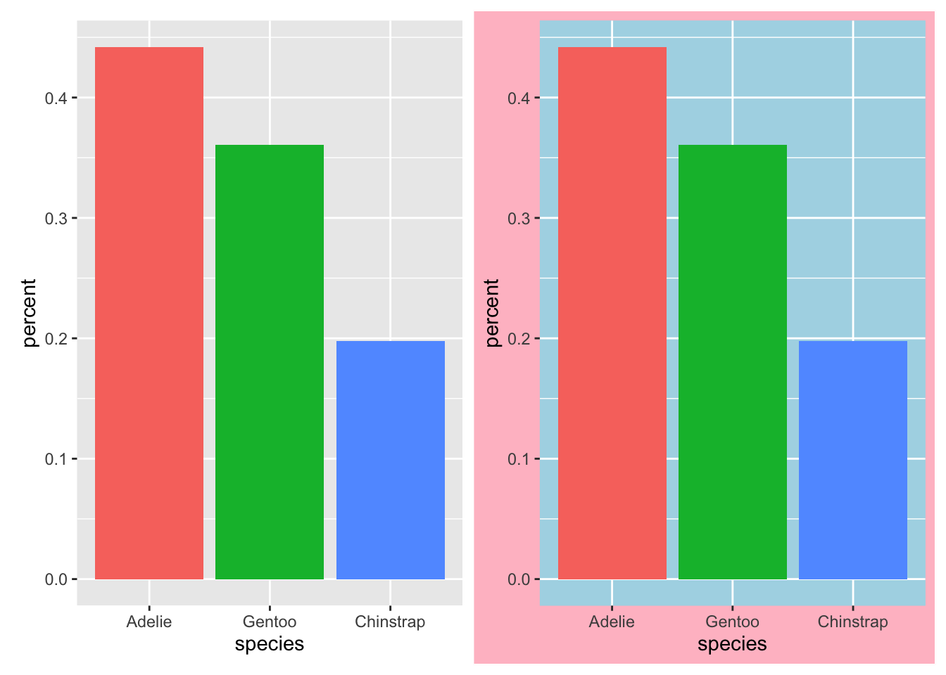
Notice how the plot on the right, while fun, is also a little overwhelming! Your eye is not immediately drawn to the message of the visualization - which species are most common - but to the colors themselves. In the plot on the left, we have used color to enhance the comparision between the species, making each bar stand out from the others. This way, the addition of color helps to emphasize our main message, rather than distracting from it.
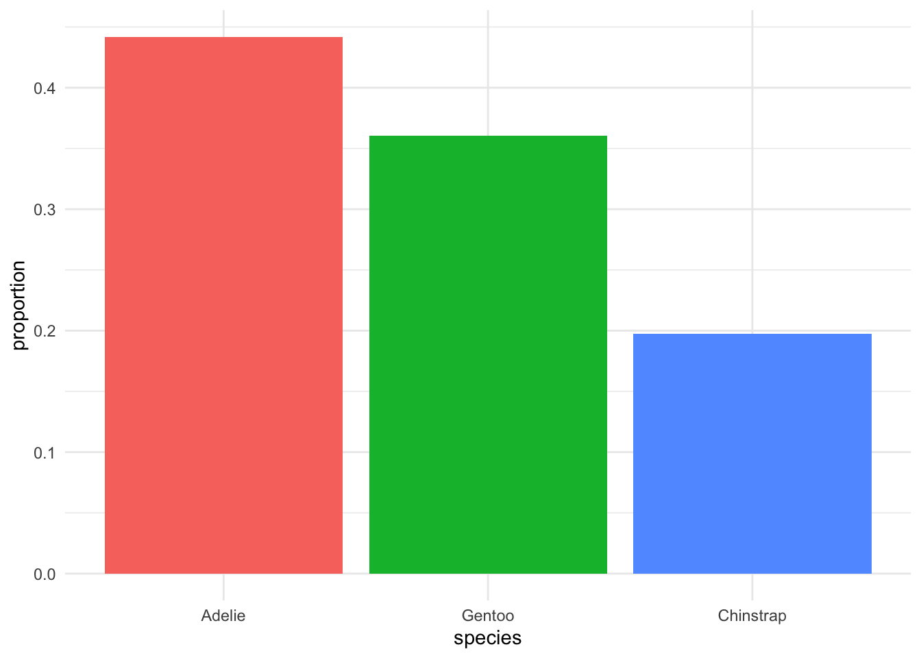
3.1.0.2 Simple is best
We want our visualizations to cause the reader to get one obvious message at first glance. They should be as simple as possible while still getting the message across.
Consider the following two plots. We have made no changes to the data displayed, only to the various small details of the plot area.
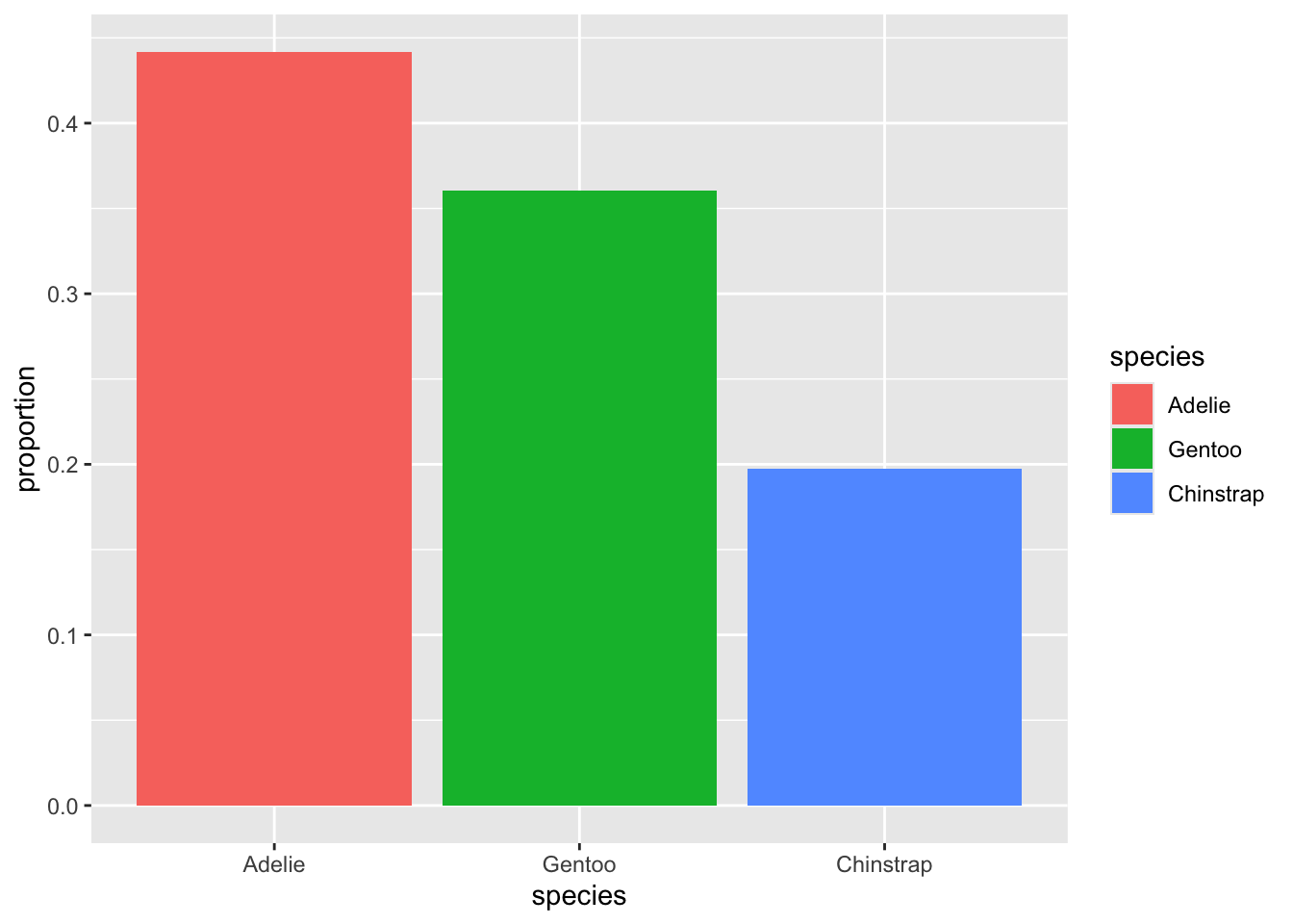
Three changes were made between these two plots: First, we removed the legend on the right. That information is already displayed in the species names on the x-axis, below the bars, so we don’t need it displayed again. Second, we removed the axis labels, “proportion” and “species”. By having fewer words near each other, it is easier to see the focus of the plot, which is the names of the three species. Finally, we have changed the background of the plot from grey to white. This may feel trivial, but more whitespace is nearly always a good thing for a visualization. It helps isolate and emphasize the parts of the plot that the reader is meant to see.
3.1.1 The area principle
Our goal in making these visualizations is for the reader to get a correct “story” from what they see. A very important rule to follow to achieve this goal is called the area principle: The area that a reader sees on the plot should match up to the numbers it represents.
For example, suppose we looked at our penguin species barplot and thought, “Hmmm, all the species have at least 50 observations. We can save some space by cutting off the y-axis at 50 instead of at 0.” Here is how the result would look:
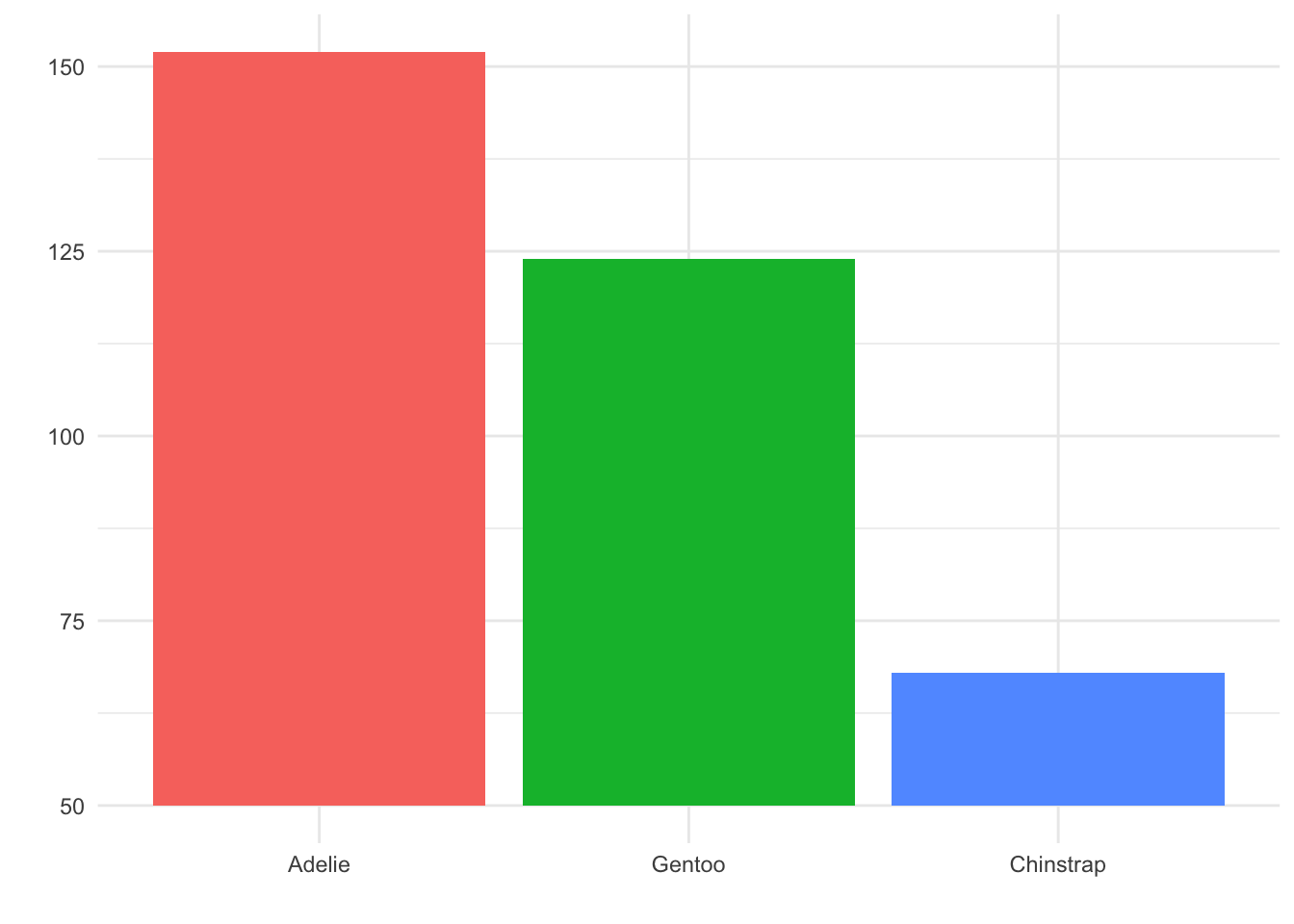
Although this may look clean and clear at first glance, it is a misleading plot. It appears as though there are about three times as many Gentoo penguins as Chinstrap penguins in the dataset! In fact, as we know from the previous plots, there are only about twice as many Gentoo.
Thus, this visualization choice has lead to the reader formulating a belief about the data that is not correct! This happened because the area of the Chinstrap and Gentoo bars in the truncated plot did not match up with the actual counts of these categories - the area principle was violated.
3.1.2 Use titles and captions, not axis labels
In the past, you may have been told to always label your axes. Now, it’s time to evolve that advice to a more sophisticated principle: Always make it clear what your axes represent, and where your data came from. Usually, this can be achieved by giving your visualization a title that tells the reader what the plot shows. We can also avoid axis labels by using appropriate units in our axes. Finally, it is always good to provide - usually as a caption or subtitle - some context for the data that created the plot.
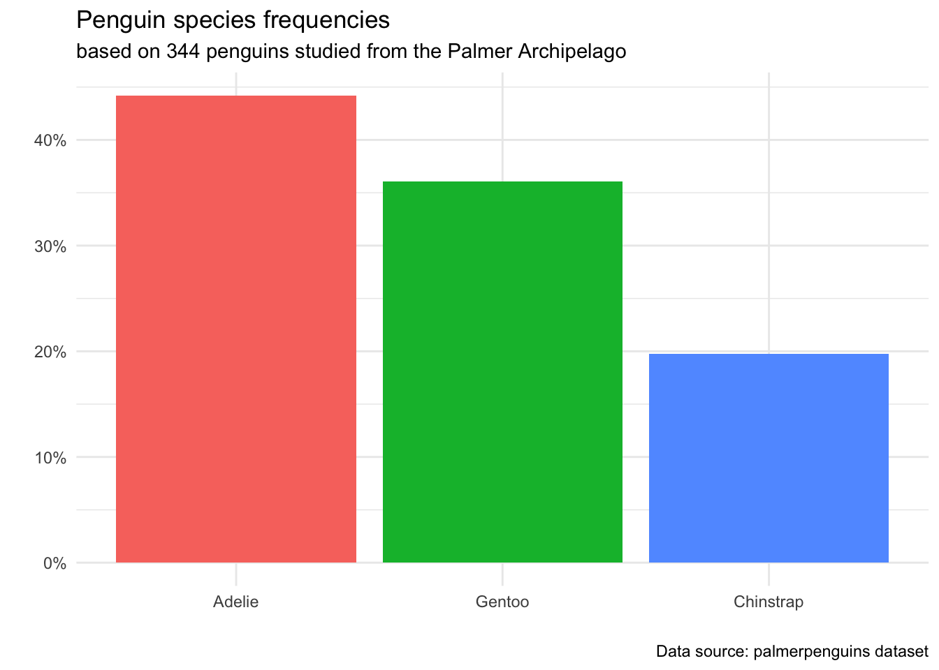
Notice that by adding the % sign to our y-axis markers, we no longer needed to use words to clarify that the axis represents a proportion/percent. Additionally, since our title makes it apparent that we are studying species of penguins, we don’t need an x-axis label to further tell the reader what “Adelie”, “Chintoo” and “Chinstrap” mean.
The extra information in the subtitle and caption does detract from the simplicity of the plot - but it is our responsibility as Data Scientists to make sure any claim we make has a proper context and source. A reader should be given the information about how we came to the conclusions in this plot: how many observations did we study (344), what is the population (penguins from Palmer archipelago), and where we can find documentation about the data collection (the palmerpenguins dataset has publicly searchable documentation).
These pieces of information are crucial to make our analysis reproducible: that is, another Data Scientist reading our work should be able to find the data and re-create the same plot themself, to verify that we have not misrepresented the data in any way.
3.2 Visualizations for quantitative variables
Now that we know how to create an eye-catching, simple, and well-labelled visualization, let’s apply these ideas to summaries for quantitative variables.
3.2.1 Dotplots
Recall from Chapter 2 that we displayed the Coins and Time variables from the Super Sisters dataset on a number line, to see where the values were close or far from each other. We used a dot on the number line to show an observed value, and when two of the same values were observed, we put the dots above each other.
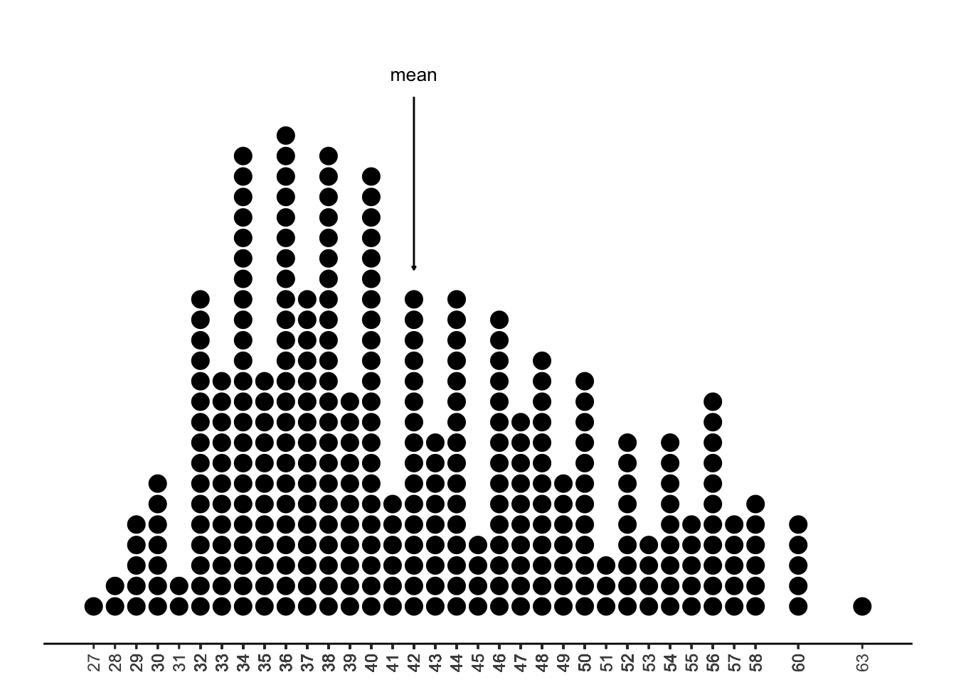
Let’s do this same process for the body_mass_g variable in the palmerpenguins dataset, which contains the weight of the penguin in grams:
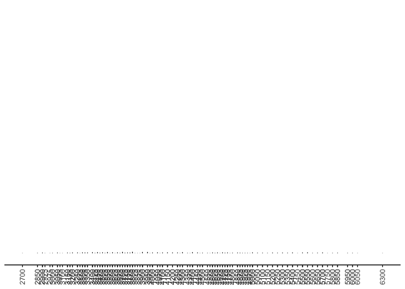
Yikes! This is not very informative! What happened here?
In this case, we are studying 344 penguins. Two of the values of body_mass_g are missing - which leaves us with 342 observations to plot as dots. Since there are so many different possible weights of penguins, we have a lot of different spots on the number line with dots, and so we can’t see much of a pattern.
What’s the solution? Suppose we rounded each of these weights to the nearest 100. Then, our number line looks like this:
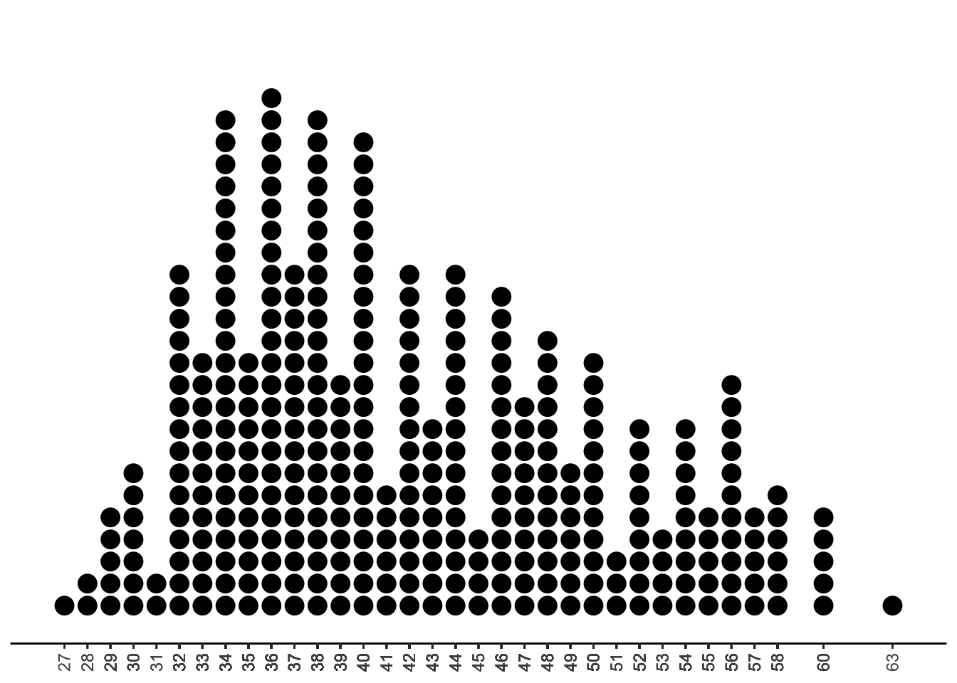
Much better! Now we can see the shape of our data: a lot of the observed values fall in the 32 to 44 range, so perhaps it is reasonable to think that penguins often weigh around 3200 to 4400 grams. We also see some right-skew in this data, since the observed values are a bit more spread out and less frequent at the upper end of the number line.
We call this type of plot a stacked dotplot
3.2.1.1 Summary Statistics
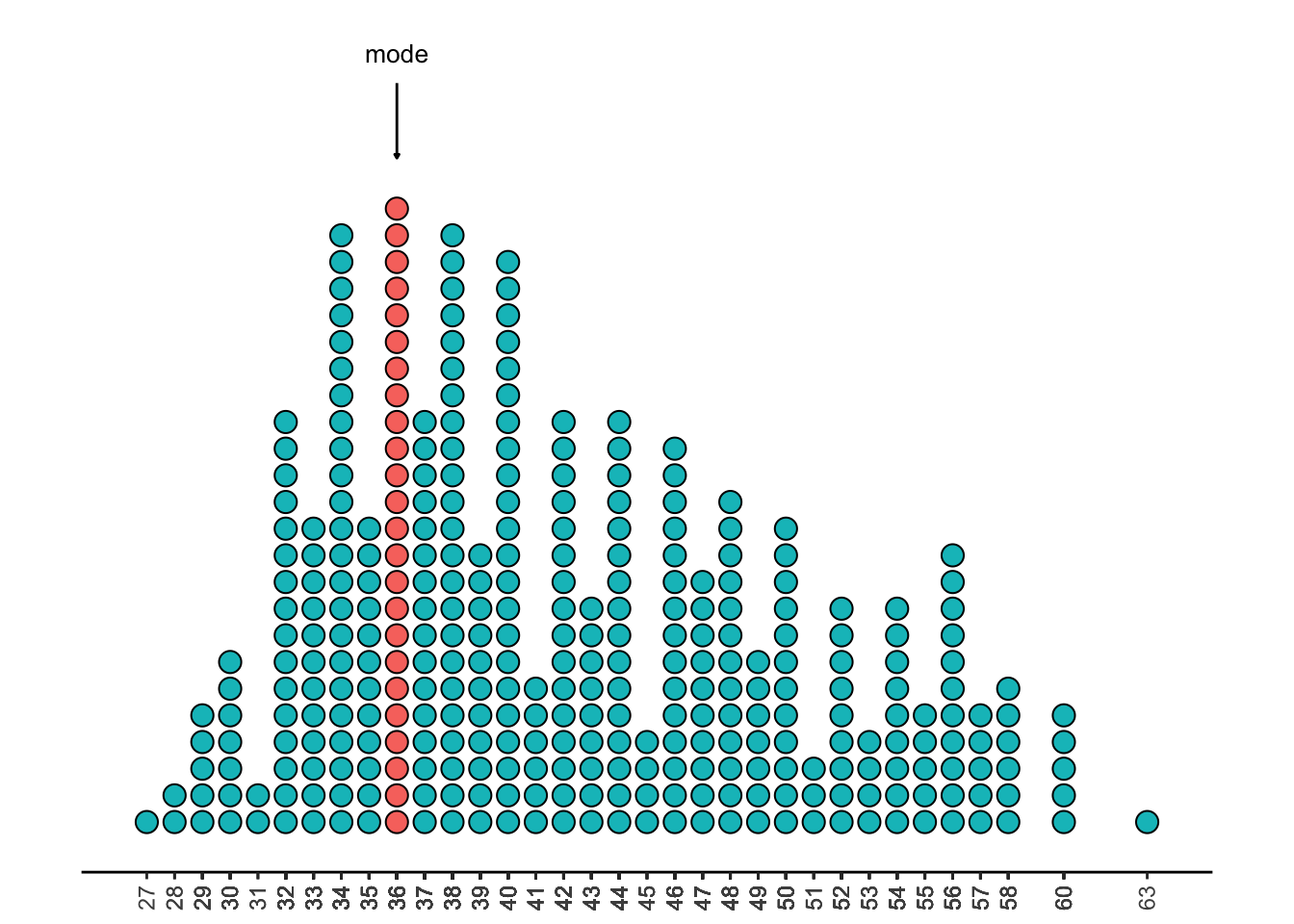
We can use this dotplot to estimate some summary statistics. The mode is the value with the most observations. This is 3600.
The median is the value with half the dots above it, and half the dots below it. This is around 40.5, or 4050 grams.
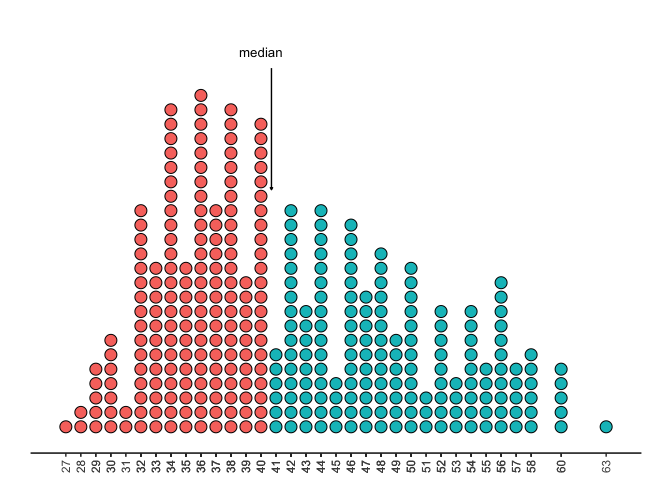
The mean is a bit harder to eyeball in a plot. One way to think about it is to imagine that the x-axis (the number line) is a plank of wood, and the dots in the plot are all balls that have been carefully balanced on the plank. Where would you need to hold the plank with one hand to keep everything in balance? Because the balls on the right are a little further out, you’ll need to move your hand a bit to the right to keep the balance. (Recall from Chapter 2 that when data is right-skewed, the mean is bigger than the median, because it is not robust!)
Note
While we would generally never rely on visualizations to get exact values of the mean or median, it is good to be able to approximate their values by looking at a plot.
3.2.2 Histograms
Consider taking the stacked dotplot above, and drawing boxes around each of the stacks of dots. We’d end up with a visualization that looks something like this:
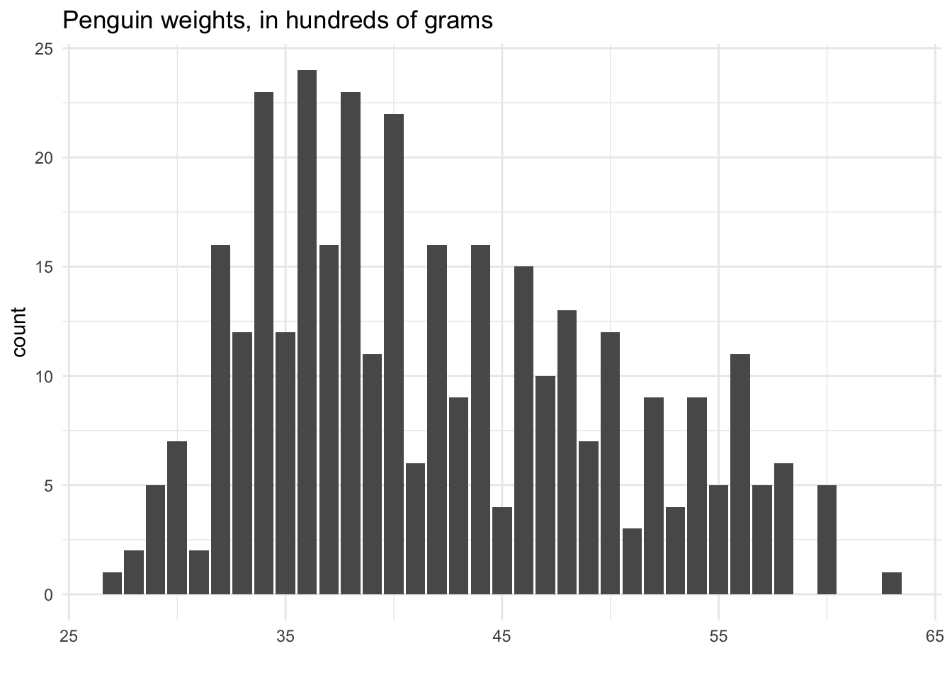
This type of plot is called a histogram. One way to think of it is that it is a stacked dotplot, but with bars drawn over the dots. Another way to think of it is that it is a barplot, with categories defined by the rounded numbers: In the above, one category is “27”, the next category is “28”, etc.
3.2.2.1 Binning
The trick we used with this dotplot, rounding each penguin weight to the nearest 100 so that we could stack the dots, is something we’ve already talked about: binning! We created several “bins”, each covering a range of 100 on the number line. For example, the first bin was 2650 to 2749 - i.e., all the weights that would round to 2700. The second bin was 2750 to 2849, etc.
Although it feels natural to round number to the nearest 1, 10, 100, etc., there’s no reason we need to have bins of these sizes. We could just as easily have made bins of size 74: the first bin would be 2650 to 2724, etc.
Really, the size of the bins doesn’t matter - it’s just a trick we use to get a better visualization of the shape of the variable. As we tweak the size of the bins used for our histogram, we get a different sense of the shape of the data:
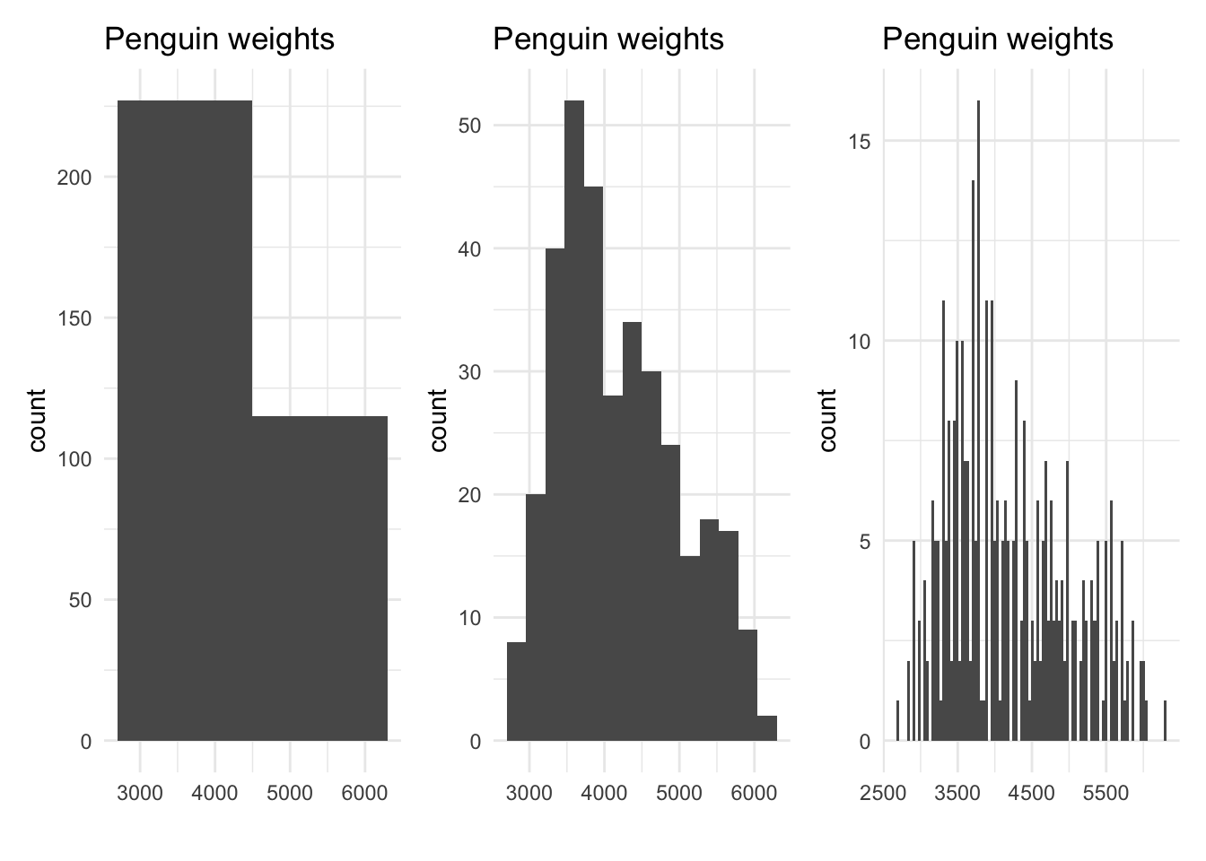
Which of these plots do you prefer? The one on the left uses bins that are too big; we can’t really see the shape of the data, apart from seeing that there are more observations in the 2000 to 4000 range than in the 4000 to 7000 range. The one on the right uses bins that are too small. Although we can see the approximate shape, we don’t have much smoothness - it looks like the value of 3650 is very common, but a value around 3660 is not at all. This doesn’t make sense! It’s also hard to pick a mode, since so many of the bars are near the highest one.
The one in the middle strikes a good balance: it shows enough different bars to see the approximate values we observed, but large enough bins that a clear overall shape emerges.
There is no single right answer to the number of bins; we typically use trial and error until we find a bin width that seems to communicate the information best.
3.2.3 Density Curves
Recall that the data represented in our visualizations is only a sample from the population. Our goal in summarizing and visualizing our observed data is to make claims about the patterns and trends that we think are truly present in the whole population. For example, we would never look at our histograms of penguin body mass and write an article titled “Out of these 344 penguins, 24 of them have a body mass of around 3600 grams!” Instead, we want to say something about the general penguin population; we might say, “Based on our study, we expect penguin body mass to be around 3600 grams.”
Thus, we should think of all of our visualizations as an estimate for the population, much like the sample mean or sample proportion are estimates for parameters.
It can sometimes be helpful, then, to imagine what the histogram would look like if we could observe the whole population.
Let’s think about how the histogram changes as we get more and more observations in our sample data. Recall the flights dataset from Exercises 1.3, which contains information about flights leaving New York area airports in 2013. This dataset contains 336,776 unique observations.
In the plots below, we will make a histogram to study the air_time variable, tells how long the flight took in minutes. We will start with only 10 of our 336,776 observations, then 100, then 1000, then all the observations:
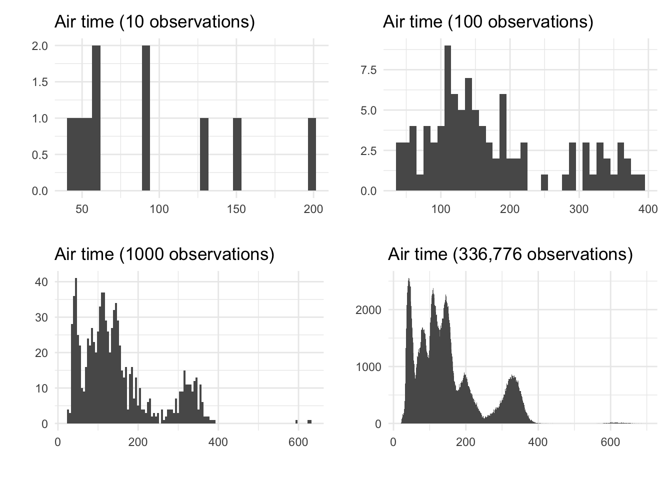
Notice how, as we have more observations to put into bins, we can make our bins smaller. This leads to the histogram looking smoother - in the fourth panel, we can barely even tell that this is a shape made up of bars. It is clear in the fourth panel that this variable has six modes, or peaks; perhaps this corresponds to six common destinations from New York.
Now imagine if, instead of all ~300,000 observations, we had infinitely many observations, and we could make our bins infinitely small. Then, we wouldn’t really have bars at all; we’d just have a smooth curve showing the shape of the variable.
This curve - the smooth shape that a histogram is trying to estimate - is called a density curve. Although we can never know the true density from the population, we can make our best guess by drawing a smooth line over the histogram that seems to fit the shape.
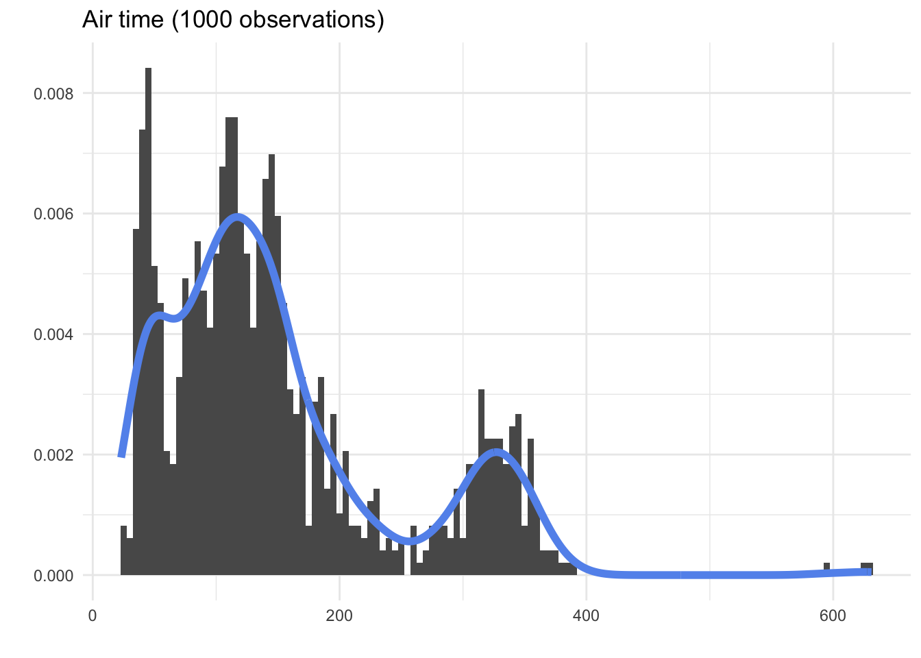
Of course, the density curve we draw from observed data is just a guess; we can see above that the curve that was automatically drawn by a computer program based on the 1000 observation histogram did not quite capture all six of the modes. Still, it may be useful to look at densities instead of histograms, because they remind us that we are trying to make claims about the whole population.
3.2.3.1 Proportions from density curves
Suppose we had only observed 1000 flights, and we wanted to ask the question, “What percent of flights from the NYC area are shorter than one hour (60 minutes)?”
One way to answer this question would be to calculate summaries from the observed data. We can make a binary, categorical variable telling us whether the air_time variable was above or below 60 minutes:
air_time < 60 | n |
|---|---|
FALSE | 813 |
TRUE | 161 |
26 |
Here, we see that 161 of the flights were below 60 minutes; 813 were at or above 60 minutes; and 26 of the observations were missing this data. Therefore, we would calculate
\frac{161}{813 + 161} = 0.1653
and we would state that about 16.5% of flights from NYC are less than an hour.
This is all correct - but it took a little bit of work. Wouldn’t it be nice if we could just look at our visualization, and get a quick estimate to answer our question?
If we look at the histogram, we can get a pretty good idea:
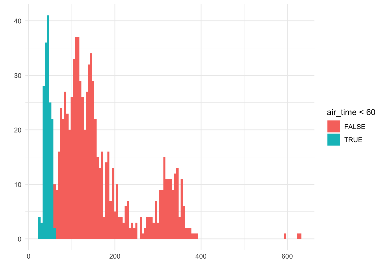
We see that the blue bars make up about 10-20% of the bars in the histogram. That is, if this were a dotplot, we would have about 10-20% of the dots colored blue on the left.
This idea of area is very important: In a histogram, it’s clear that the amount of bars filled corresponds to the number of observations in the data. In a density, the same is true, except we no longer have the notion of bars or dots to count. Instead, we look at the area under the curve:
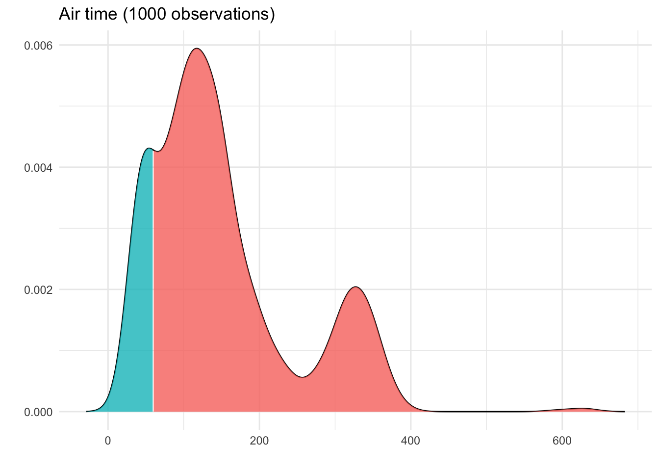
Here, we can see that around 15% of the area is shaded blue.
Because the density curve deals with areas, not bar heights or dot counts, something a bit different is going on with the y-axis. To see what this is, let’s do some quick math: The width of the blue section above, on the x-axis, is 60. The height goes from 0 to 0.004. If we think of this blue section as approximately triangular, we get:
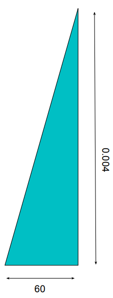
This leads us to an area under the curve of
\frac{1}{2} \times 60 \times 0.004 = 0.12
Not too far from our estimate of 15%!
So, what exactly does the 0.004 on the y-axis represent? It’s called the density, and it’s not an intuitive value: it’s simply “The number needed so that the total area under the curve is 100%”.
In other words, we don’t really use the y-axis in a density curve. We simply use the visualization to figure out approximate areas under the curve, to make claims about how often we see certain results - like “The flight is less than 60 minutes” - in our data.
3.3 The Grammar of Graphics
When you are planning a visualization, there are a few key decisions to make. Because these types of decisions are consistent across most data visualizations, we give each step a formal name. Let’s use our barplot of the penguin species as an example as we walk through each step.

3.3.1 Data: What dataset are you using to make this plot?
It’s important to not jump straight to the visualization process. First, take stock of the information you have. Ask yourself where the data came from, who created it, and what population it is a sample from. This will help ensure that the message you are trying to communicate in your plot is indeed a reasonable conclusion from the data.
Information about the source and structure of the data is usually included in a caption, a subtitle, or in some accompanying explanatory text.
3.3.2 Aesthetic: What variable(s) will be involved in this plot, and how?
Once we have decided on some variables to visualize, we need to decide where in our plot they should appear. This decision - about how to use each variable in the visualization - is called the mapping.
In the penguins plot, we have mapped the variable species to the x-axis. The three different species are displayed as values along the horizontal part of the plot.
You might be tempted to say that there is also a mapping on the y-axis, but be careful! There is no variable in the palmerpenguins dataset called count. The count in each species is in fact a summary statistic that we calculated - so this is not a part of the aesthetic step.
3.3.3 Geometry: What type of plot will you make?
This is the moment where the Data Scientist chooses a plot shape (e.g. bar plot, histogram, dot plot, etc.) that is appropriate to the variable type being plotted, and that they believe will tell the best story.
While some geometries are not appropriate in certain situations - for example, we would never make a bar plot from a quantitative variable! - there are often many options to choose from. You, as the analyst, will need to imagine each plot and decide which one communicates the data conclusions most clearly.
3.3.4 Facets: Will you split your visualization by categories?
Often, the questions we ask about the data involve comparing quantities across different categories. For example, we might ask the question, “Do the three species of penguins have different weights?”
One way to address this is to make three different plots, each summarizing the body_mass_g variable, but each one limited to a different species:
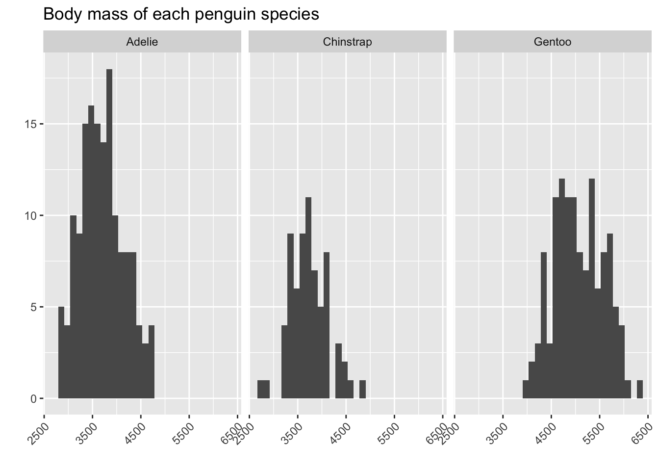
From this, we can see that the Adelie penguins and Chinstrap penguins tend to be a bit smaller than the Gentoo ones!
3.3.5 Statistics: How does our plot summarize the variable(s)?
Recall that the count on the y-axis of a bar plot or a histogram is not part of the aesthetic, because it is not a variable in our dataset.
Instead, the information contained on the y-axis in these cases is a summary statistic. In each of our plots, we have made a decision to label the height of our bars with either a count (in the histograms) or a percent/proportion (in the original species bar plots). That decision involved the choice of a statistic for the summary.
3.3.6 Coordinates or Scale: What space will your plot be drawn in?
Next we need to decide on the scale of our axes.
Sometimes, we simply want to label the axis with different units. For example, earlier in this chapter, we chose to plot our penguin body weights in the units of “Hundreds of grams” instead of “grams”.
There are also scenarios where you might wish to alter the axis in a more extreme way. One common axis scale transformation, which we will talk about more in future chapters, is called the log-transformation. We change the x-axis so that instead of measuring “How many grams does the penguin weight?”, we measure “How many times would we multiply by 10 to get the penguin’s weight?”
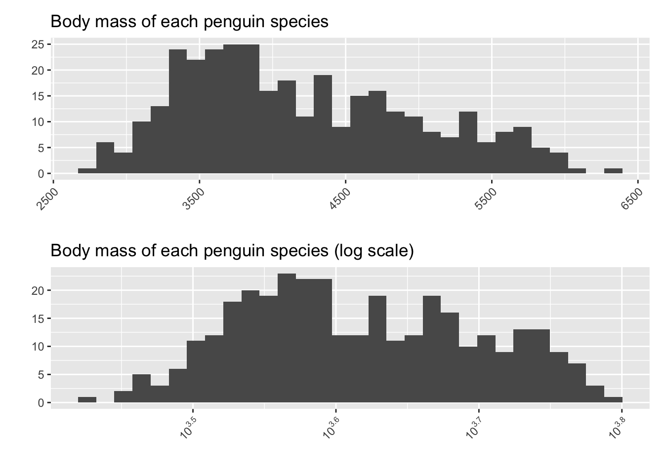
This may seem like a silly thing to do, since it makes the plot a bit less easy to interpret in real-world terms. In future chapters, though, we will encounter reasons why we might want to change the shape of a histogram to help with our analysis.
3.3.7 Themes: How will you annotate and decorate your plot?
Lastly, we will make our decisions about the colors and annotations - everything on the plot that helps make it pleasing to the eye and informative to the reader.
This is where we determine if our axis labels are necessary; if we need a subtitle or caption, if we should add or remove colorings, and if there is anything else we would like to add that might help guide the reader to a correct conclusion.
In our species barplot, we included a subtitle to tell the reader that there were 344 observations, and all were from the Palmer Archipelago. We also included a caption giving the source of the data; although we didn’t put much information here, we made it possible for the readers to find the data source themselves.
3.4 Comparing groups
We have already seen one example of comparing a variable across groups: faceting. This approach is simple and straightforward: effectively, we make totally separate summary visualizations within each group, and then we “glue” them together.
However, there are many other ways to combine a categorical variable with one other variable, to compare across the categories. In this section, we will introduce a few of these options, sticking with our basic building blocks of barplots and histograms.
3.4.1 Side-by-side barplots
Suppose we wish to ask the question, “Were the species proportions the same in every year studied in this dataset?” That is, we’d like to know if the pattern we see - more Adelie than Chinstrap, more Chinstrap than Gentoo - holds true every year.
One way to go about addressing this is to use color to differentiate the categories:
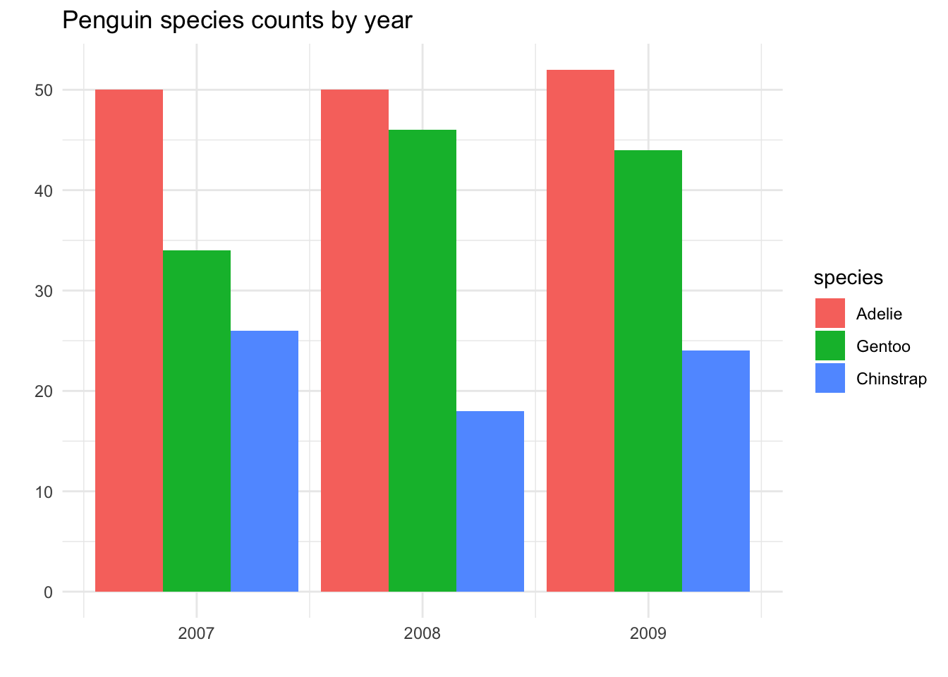
From this plot, we can see that the percentages of each species is roughly the same in every year - but in 2008, there were perhaps a bit more Chinstrap penguins found than usual, compared to the other two species.
This is, of course, not very different from facetting by year:
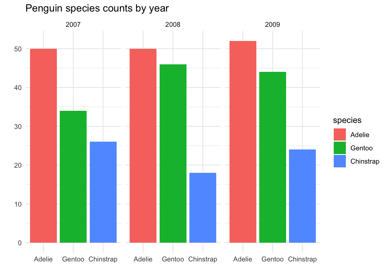
Visually, the only real difference is minor theme elements in the way the plot is presented, and all of these could be tweaked if desired. However, in principle, there is a difference in the aesthetic mapping:
In the side-by-side barplots, there is one plot.
yearis mapped to the x-axis, andspeciesis mapped to the colorIn the faceted plots, there are three plots, faceted by
year. For each plot,speciesis mapped to the x-axis and the color.
3.4.2 Stacked barplots
Now let’s think about a research question involving species and another categorical variable: the island of origin of the penguin. We would like to ask, “Are the different penguin species equally common on all three islands?” If we approach this question by making a side-by-side barplot, we get:
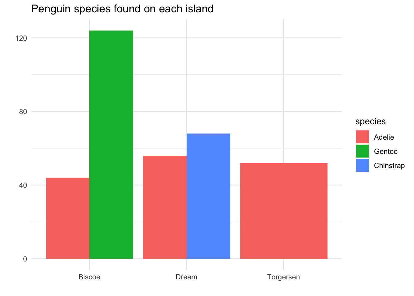
There are some positives about this plot: we can immediately see that Adelie penguins are found on all three islands, while Chinstrap only lives on Dream island, and Gentoo only lives on Biscoe island.
However, there is one big issue: the area principle has been violated. It appears as though there are more Adelie penguins found on Torgersen island than on Dream island, because there is more red-colored area on the visual. However, if we compare bar heights, we see that there were actually slightly more Adelie penguins observed on Dream island.
One way to solve this is to put the colored bars in a stack instead of side-by-side:
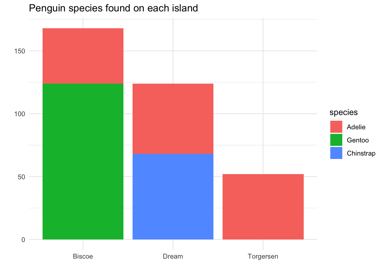
We still get the same immediate takeaway message: Adelie is the only species on all three islands. Now, though, we can see from the area of each color that there were approximately equal numbers of Adelie found on each island.
Furthermore, we are now able to see that overall, the most penguins were found on Biscoe island, followed by Dream, then Torgersen.
3.4.3 Percentage stacked bar plots
Let’s take a moment to think carefully about the statistic that we chose in the previous plot. The height of the bars - and the colored sections in each bar - are determined by the count of penguins observed in our dataset.
This is very useful, because it allows us to get information about quantities: there were more Biscoe penguins than Torgersen penguins in the data.
But what if our question was not about quantities, but percentages? For example, let’s tweak our research question to say, “If I find a penguin on an island, what are the chances that penguin is Adelie species?”
The parameter that would address this question is the true probability of finding each species of penguin on each of the islands. The statistic that would best estimate that parameter is the percentages of the species on each island from this dataset.
Thus, instead of making our bar heights be counts, we will make each island have a bar of height “100%”, and we will see how much of that bar is covered by each species:
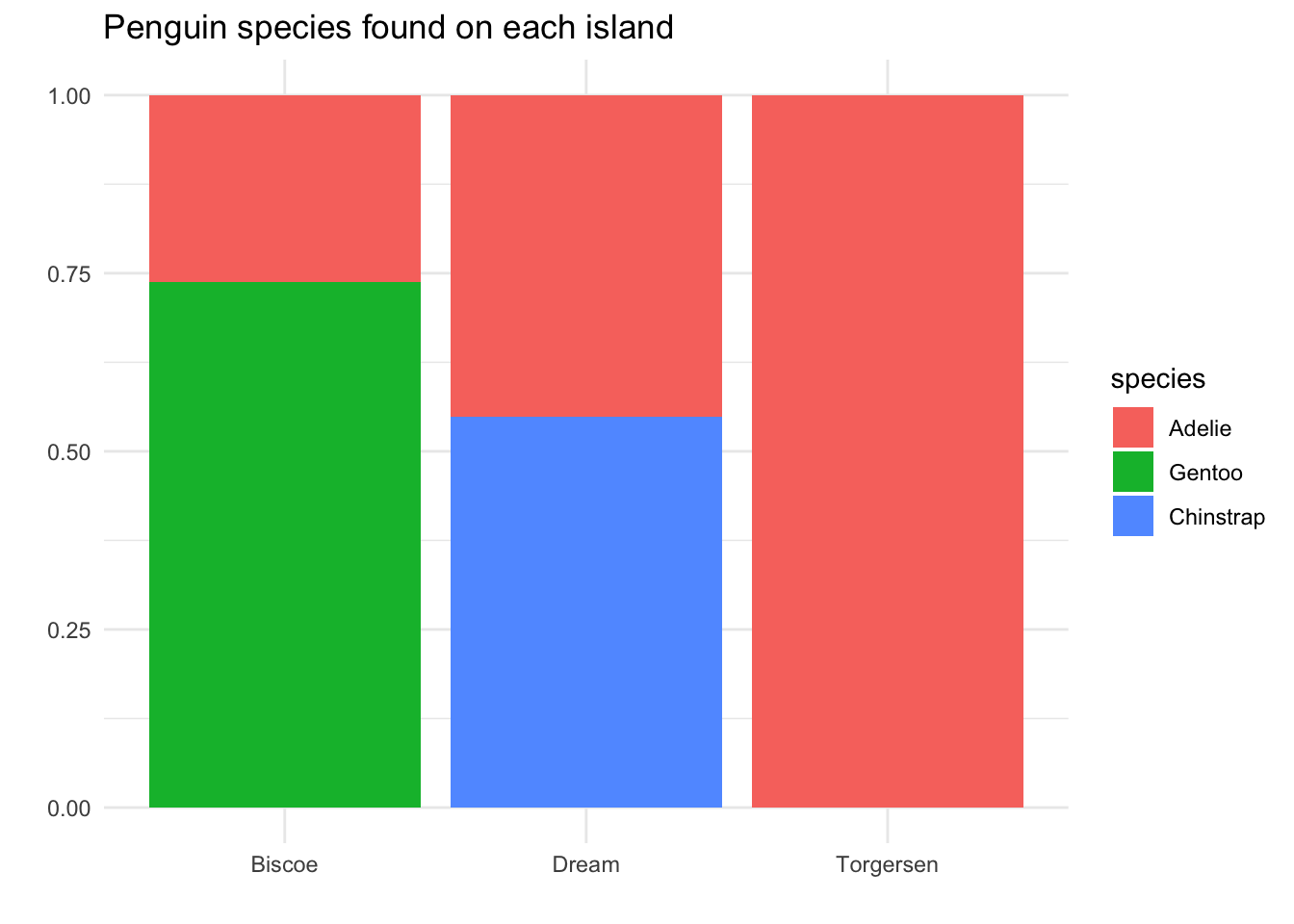
Now we can answer our research question: If we find a penguin on Biscoe island, there is about a 75% chance it is Adelie species; if we find one on Dream island, there is about a 55% chance it is Adelie. Of course, the Torgersen island penguins are still 100% Adelie species!
3.4.3.1 Switching variables
In these stacked bar plots, we are using two categorical variables: species and island. It is important to think carefully about the role each variable is playing in the analysis. Our goal is to compare summaries across categories. Which variable are we summarizing, and which one are we using to separate the categories?
In this case, we have separated our data by island. Within each island category - Biscoe, Dream, or Torgersen - we have calculated summary statistics, namely, the percentage of each species.
What if we were to reverse the research question? Instead of asking, “If I find a penguin on an island, what are the chances that penguin is Adelie species?” perhaps we could ask, “If I find a penguin of a certain species, what are the chances it came from Biscoe island?”
Now, the role of the variables has switched: we want to separate our data into the categories of the three penguin species, and then calculate summary statistics for the island variable within each species.
To update our visualization for the new research question, we want to change our mapping: this time, we will map the species variable to the x-axis, and the island variable to the colors in the bars.
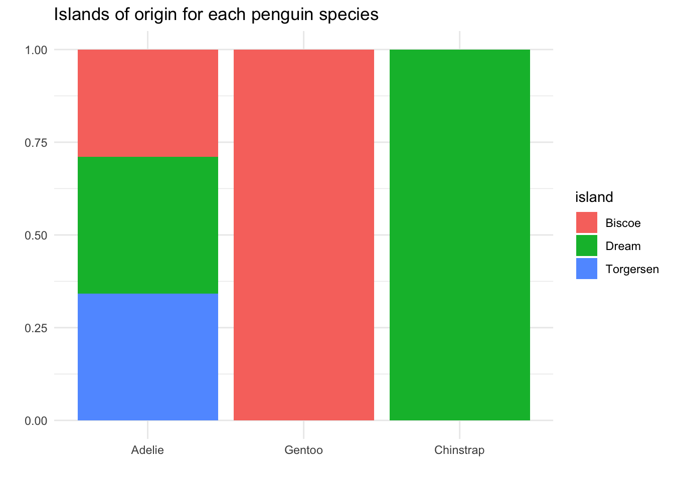
Now we can answer our research question: If I find an Adelie penguin, there is about a 1/3 chance it came from Biscoe island. If I find Gentoo, that chance is 100%, and if I find Chinstrap, 0%.
3.4.4 Overlapping densities
Finally, we now consider looking at a quantitative variable across categories. We will use the same approach as we did with the bar plots: we will map the new variable to the colors in the visualization.
Suppose we want to again ask the question, “Do the species of penguins have different body masses?” We can put our three histograms on the same plot space, but that looks pretty messy!
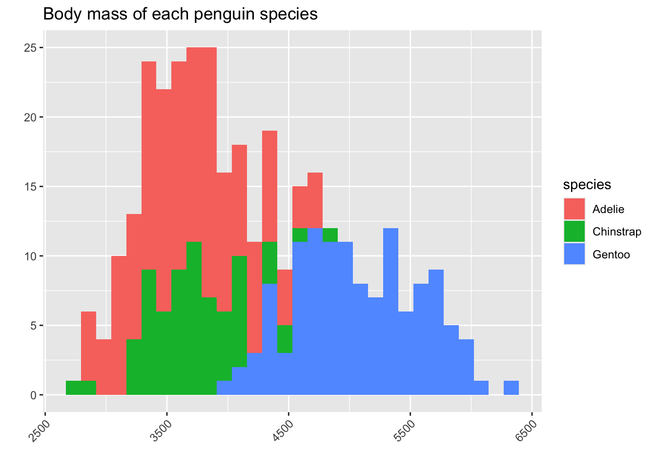
It seems in this plot Adelie is the smallest, then Chinstrap, then Gentoo. But we have a problem: we can’t really see the full shape of the histograms for Adelie and Chinstrap, because they are covered by the Gentoo bars.
In this situation, it is usually much better to use a density curve for each species instead of a histogram. We will color in the area under the density curve corresponding to each species, but we will make this color a little bit transparent, so that the main shape of the curve is still visible.
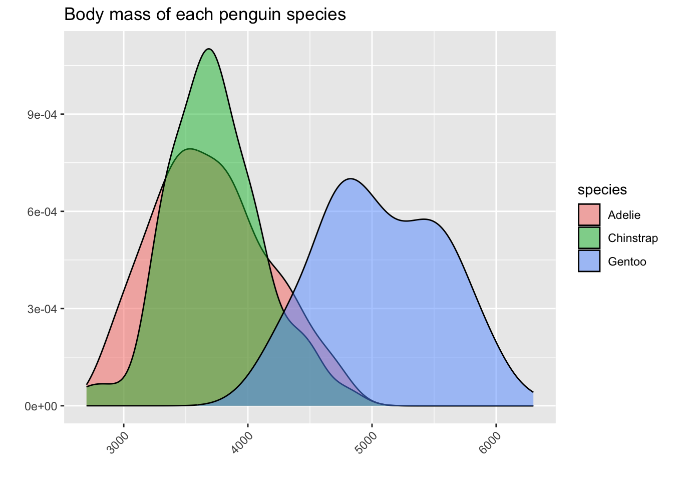
From this plot, we can see that we were a bit misled by the hidden bars in the histograms! In fact, Adelie and Chinstrap have very similar means and medians - it only seemed like Adelie had smaller body mass in the histograms because there were more Adelie penguins overall, and we saw a lot of red area at the lower numbers. Meanwhile, the Chinstrap bars were partially hidden by the Gentoo bars.
The density curves tell us a more complete story about the shape of the variable body_mass_g within each of the three species.